Portfolio
UX, UI & Product Design
Turning complex problems into digital experiences that feel simple, intuitive, and useful.
Areas of Focus
UX Strategy · Product Design · UI Design · Responsive Design · Design Systems · Information Architecture · Customer Journeys
CVS
Brand Shop System
Modular e-Commerce Experiences at Scale
UX/UI · Responsive Design · Design Systems · E-Commerce · Developer Collaboration
Project Overview
My ROLE
Lead UX & UI Designer
Industry
Retail Pharmacy & Healthcare
Challenge
Create distinct branded experiences for diverse advertisers while working within an established modular system and CVS technical, UX, and responsive requirements.
While working on the CVS account at Triad Retail Media, our team developed a modular brand shop system that allowed advertisers to create immersive shopping experiences while working within CVS's technical and e-commerce requirements.
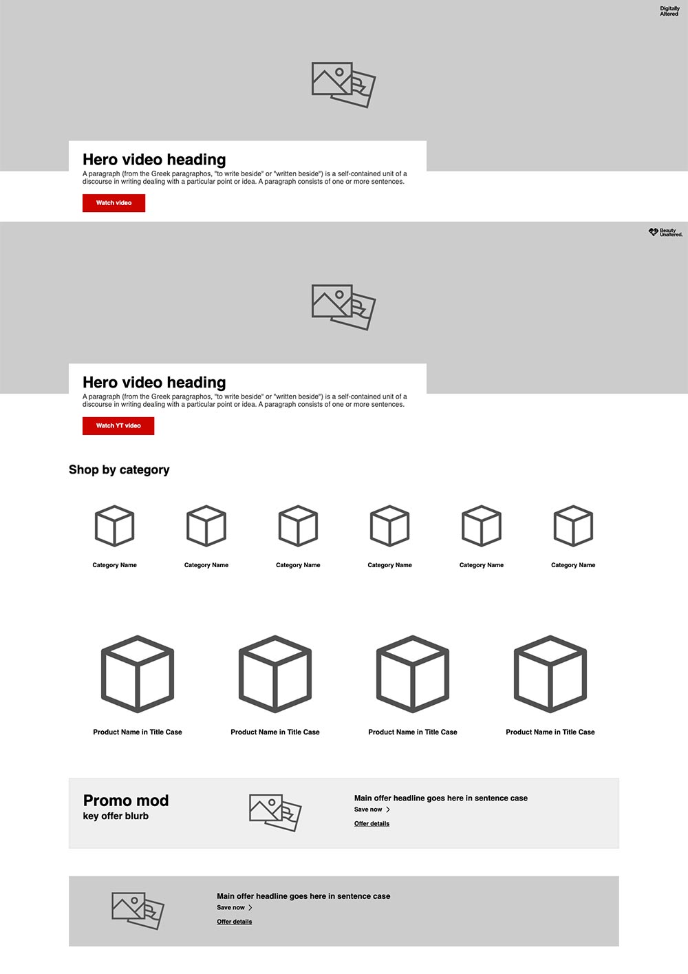
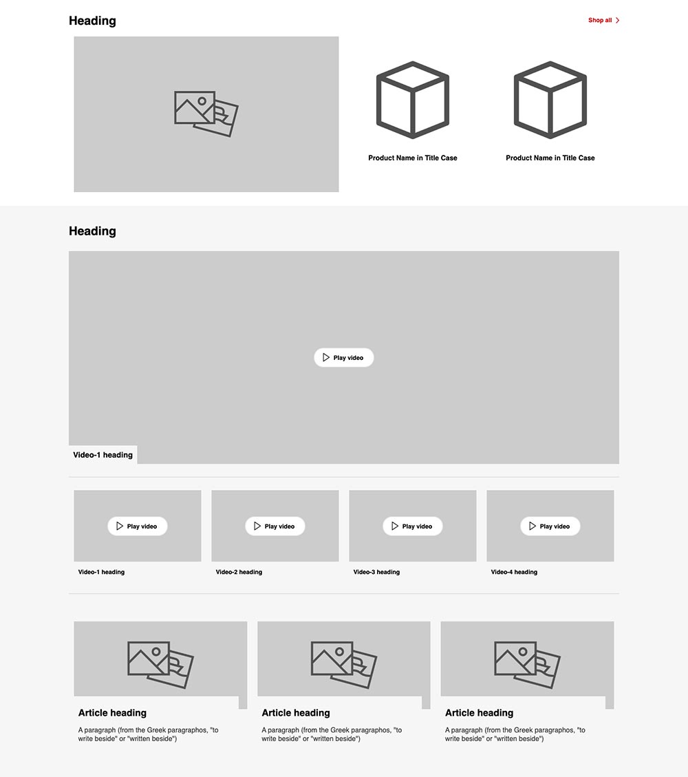
The platform included a flexible library of reusable desktop and mobile components that could be combined in different ways to support hundreds of unique campaigns without redesigning every page from scratch.
My role was to translate each advertiser's brand and campaign creative into that framework, determining how to use the available components to create experiences that felt distinct while maintaining usability, responsive behavior, and consistency across CVS.com.
Building a Scalable Design System
The template established reusable layouts for hero content, product storytelling, promotional modules, product grids, editorial content, navigation, calls to action, and other common brand-shop needs. Desktop and mobile behaviors were defined within the system, helping designers and developers work from a consistent framework across campaigns.

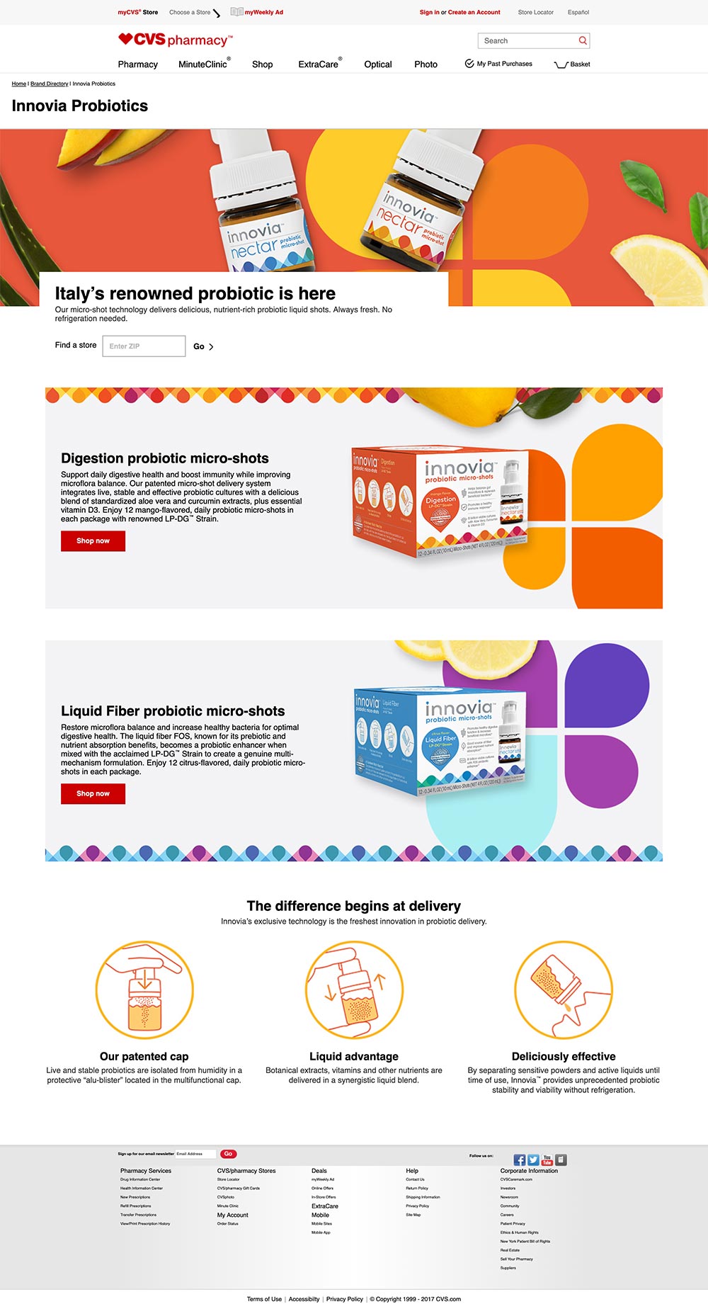
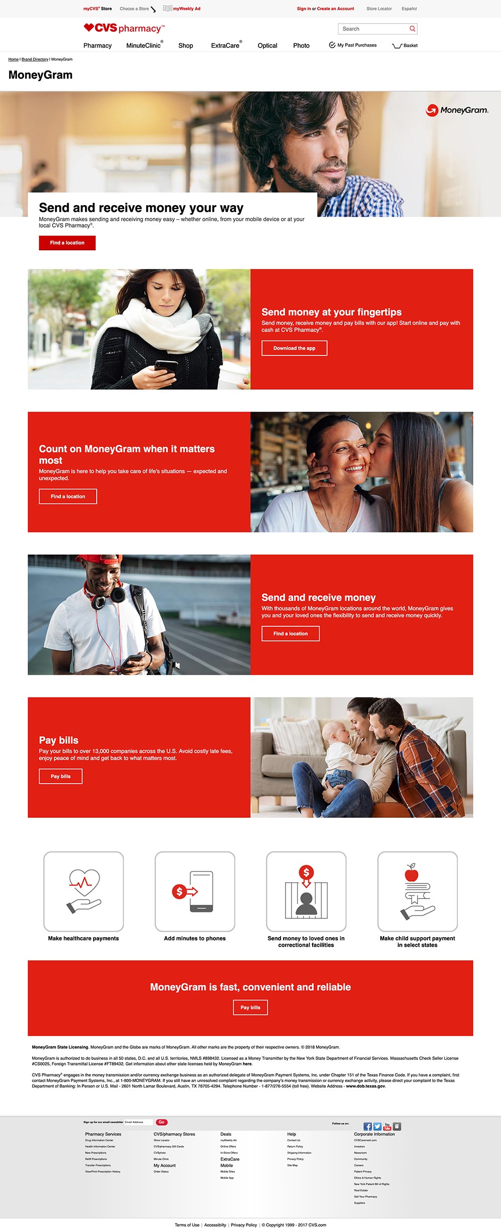
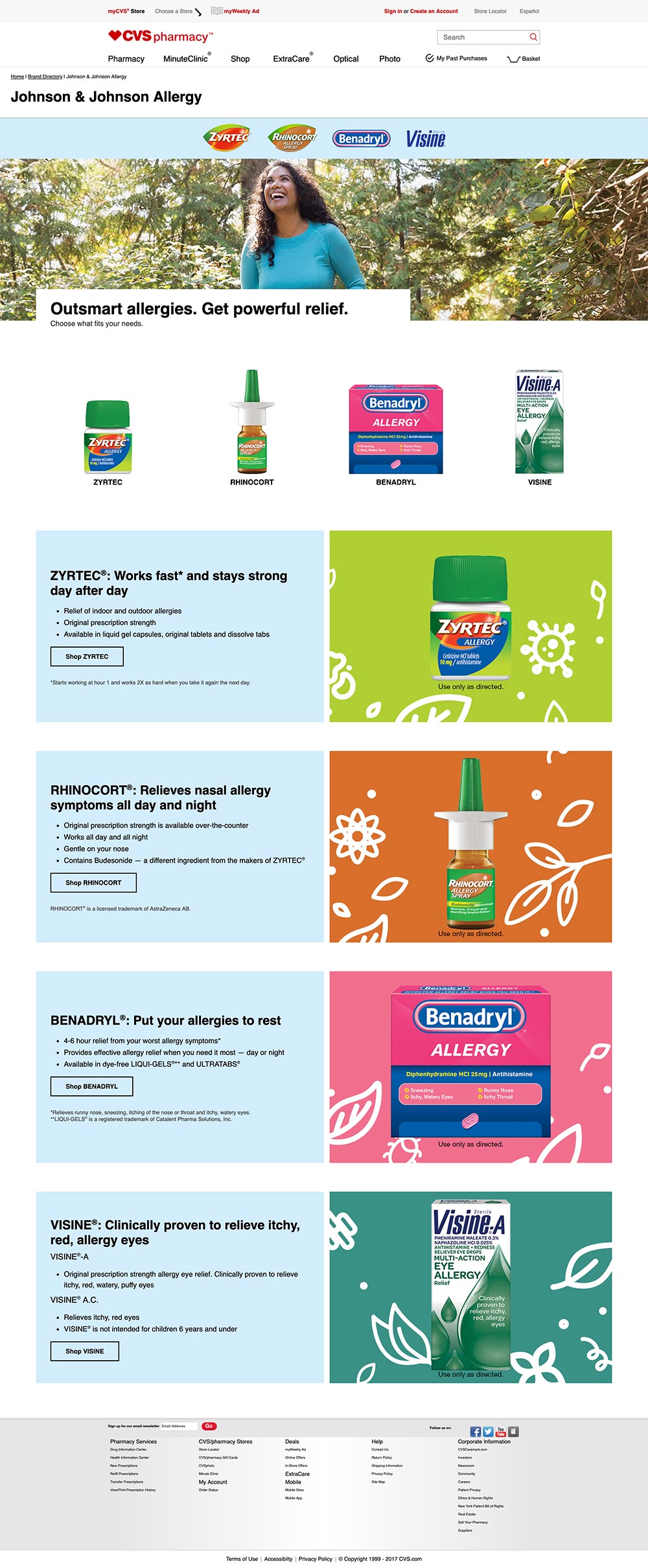
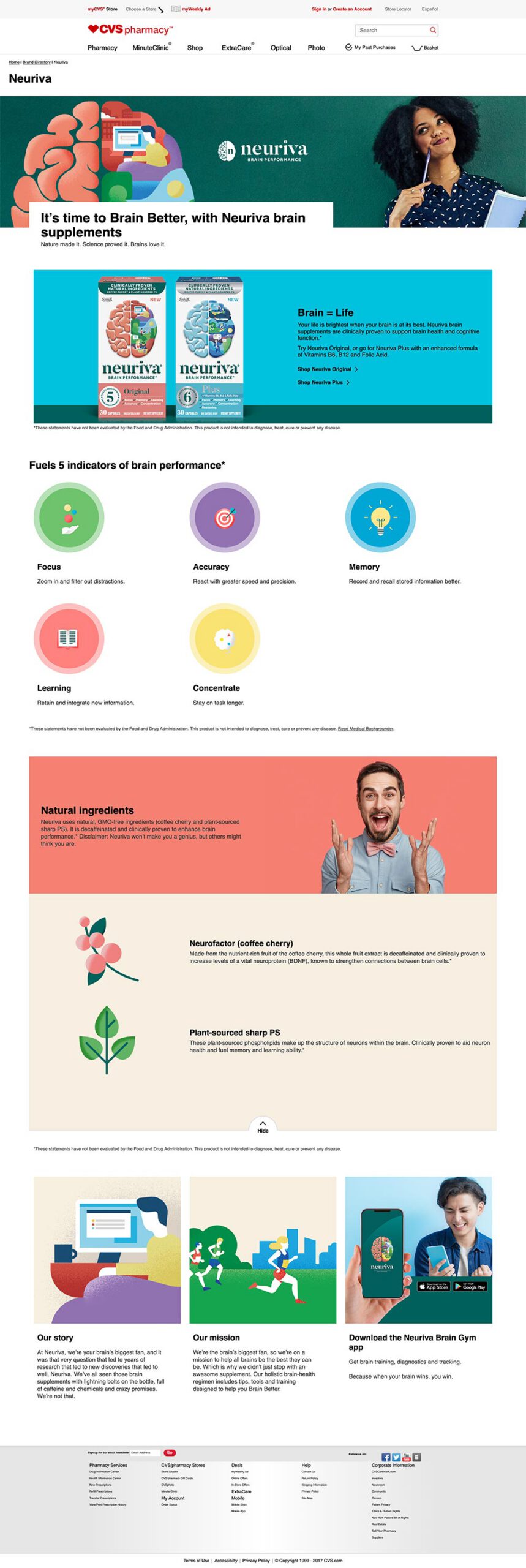
One System. Very Different Brands.
The framework provided consistency without forcing every advertiser into the same visual identity. Brand colors, typography, imagery, product photography, messaging, and campaign creative could be carried into the CVS environment while the underlying experience remained structured and familiar to shoppers.
CVS
UX/UI Design
Wireframing · Guided Shopping · UX/UI Design · E-Commerce · Developer Collaboration
Project Overview
My ROLE
Lead UX Designer
Industry
Retail Pharmacy & Healthcare
Challenge
Help customers navigate complex home healthcare needs through an intuitive guided shopping experience.
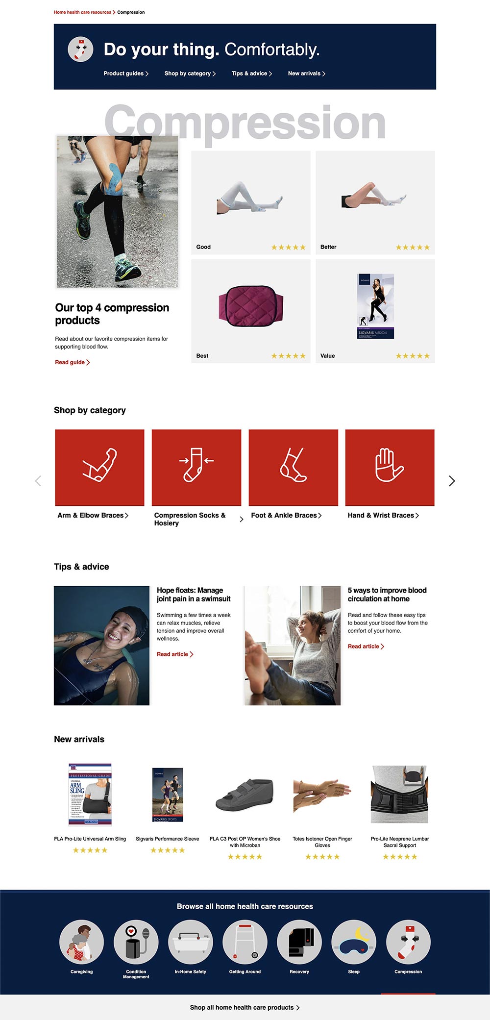
I worked closely with the Art Director on the design and production of a Home Health Care resource hub for CVS. The experience was created to help customers find products, information, and resources for care at home — whether they knew exactly what they needed or needed some help getting there.
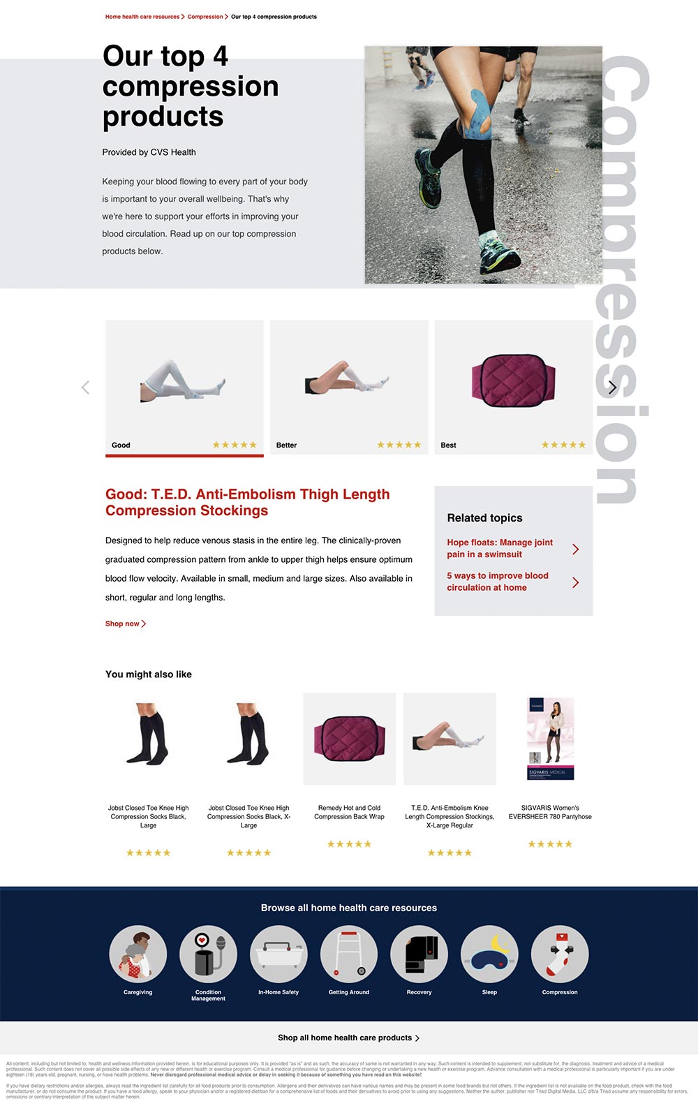
Customers could browse independently by category or follow a guided experience that used a series of questions to direct them toward relevant products and resources, with products available for purchase directly through CVS.
My Contribution
Working directly with the Art Director, I helped move the experience from early UX exploration through final production and developer handoff.
Wireframing · UX & UI Design · Design Revisions · Stakeholder Feedback · Image Research · Product & Lifestyle Imagery · Production Assets · Developer Handoff
I created and refined wireframes, explored design solutions within CVS requirements, incorporated stakeholder feedback, sourced and prepared imagery, and built production-ready assets for development. I also worked directly with developers — including an overseas development team — to help ensure the approved experience translated accurately into the final build.
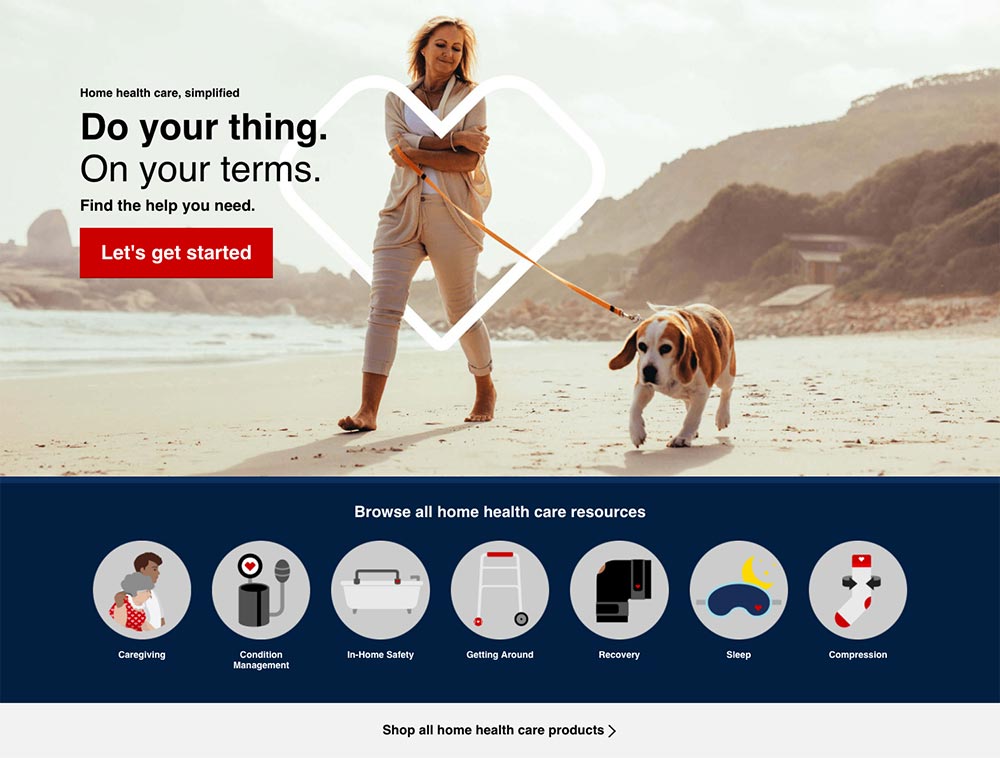
Guided or Self-Directed
Product Discovery · Information Architecture · Guided Shopping
The experience needed to work for customers arriving with very different levels of familiarity. Someone who already knew what they needed could browse directly through product categories, while customers who needed more guidance could answer a series of questions designed to help narrow their options.
Both paths ultimately connected customers with relevant products, educational resources, and the ability to purchase through CVS.
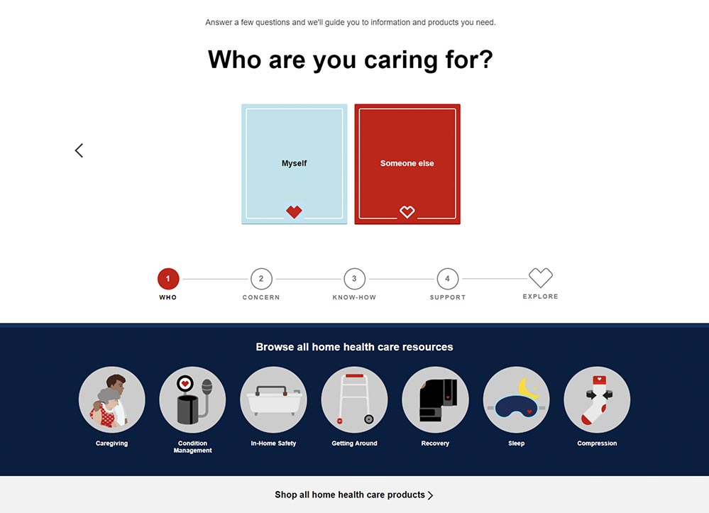
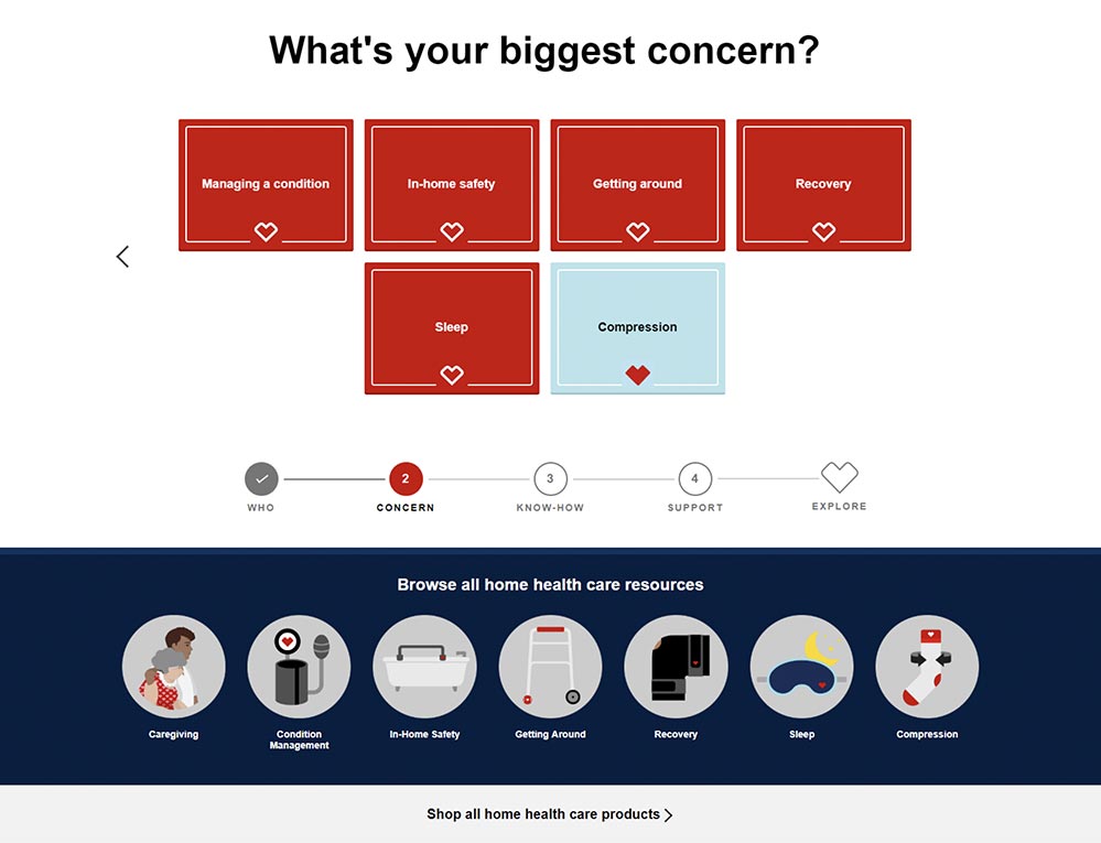
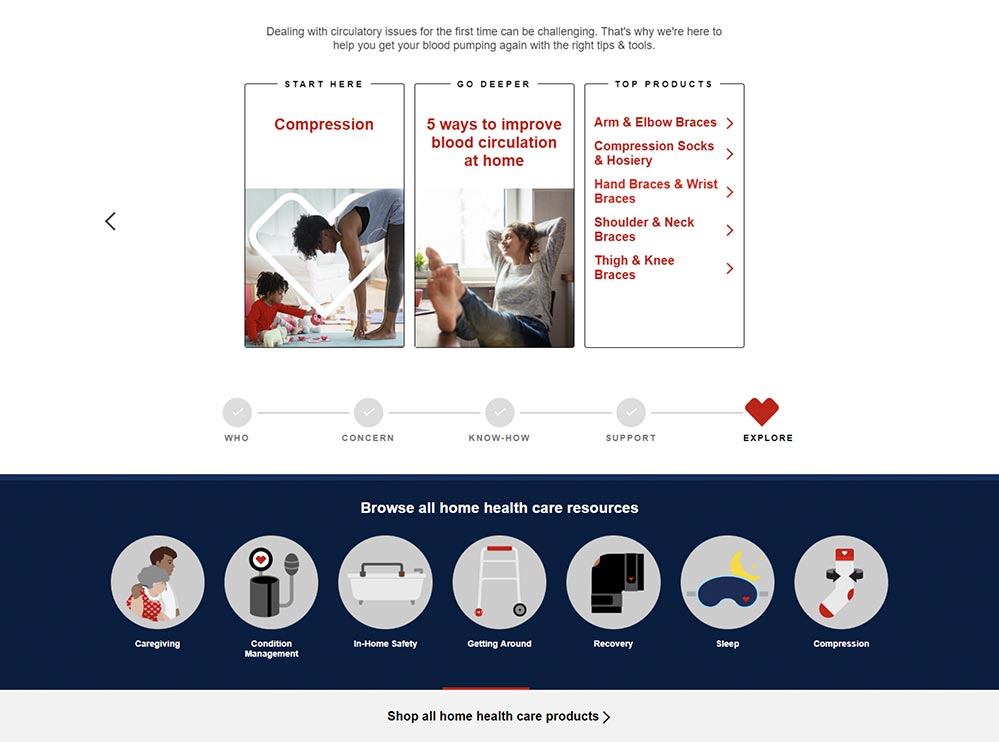
MORE THAN A PRODUCT CATALOG
Educational Content · Product Integration · E-Commerce
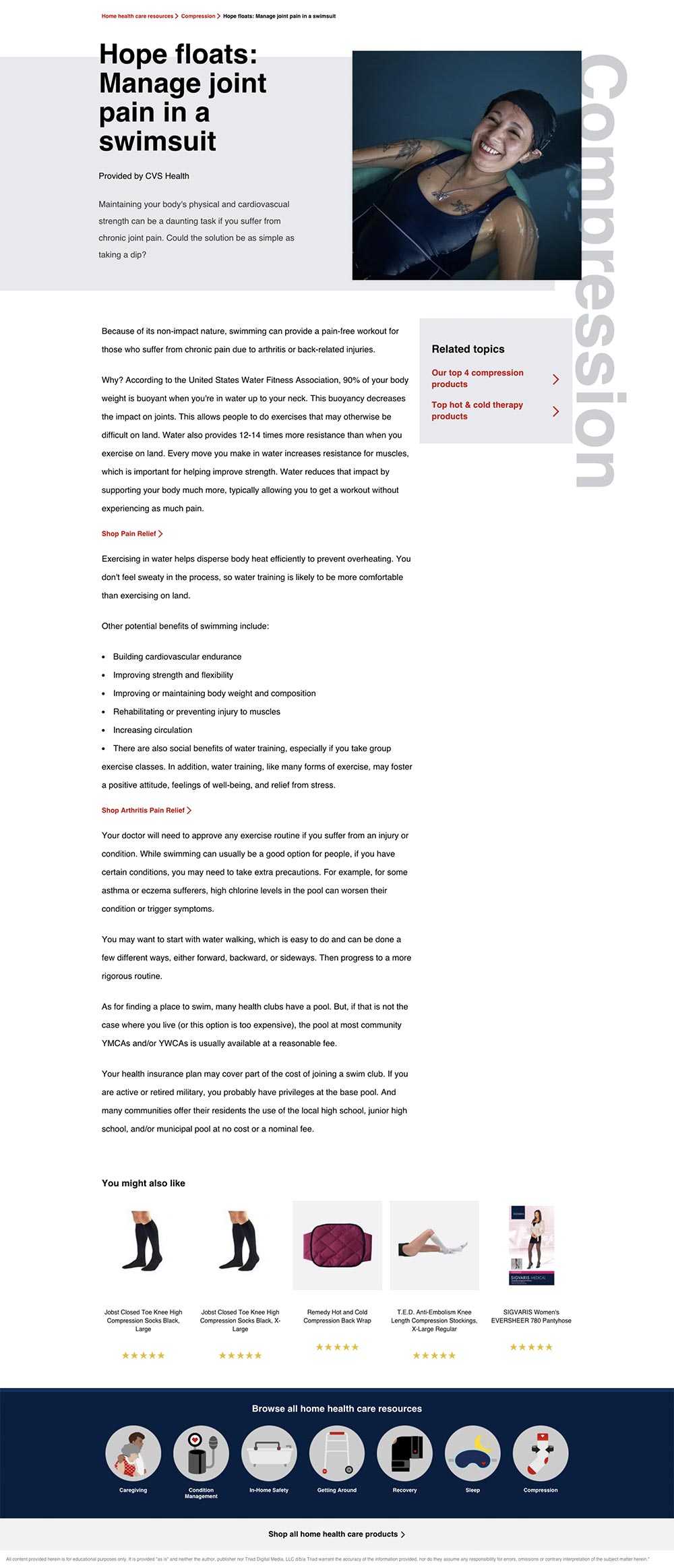
The hub combined commerce with educational content, giving customers access to products alongside guides and resources related to home health care. The goal was to make a potentially overwhelming category easier to explore within the familiar CVS shopping experience.
Designing While the Brand Was Changing
Stakeholder Management · Brand Standards · Rapid Iteration
The project moved on an aggressive timeline while CVS was simultaneously transitioning its brand guidelines. That meant designs weren't being created against a completely static system.
I worked closely with the Art Director while incorporating feedback and approvals across multiple teams, adapting work as requirements and brand standards evolved. With numerous stakeholders involved, keeping designs, assets, feedback, and development handoffs aligned was an important part of moving the project forward.
From Approved Design to Production
Responsive Design · Asset Production · Developer Collaboration · Handoff
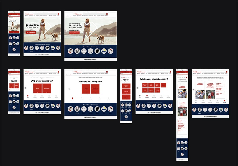
My involvement continued through production and development handoff. I prepared and sized assets, organized imagery for implementation, and created responsive design comps in Sketch to communicate how layouts should adapt across breakpoints.
Working with a largely overseas development team made clear documentation and communication especially important. These breakpoint comps helped developers understand the intended responsive behavior and translate the approved designs accurately across screen sizes.
Shown: Working breakpoint comps created for developer handoff. These represent layout and responsive behavior rather than final creative.
The Final Experience
The completed hub brought guided product discovery, educational resources, and e-commerce together within CVS.com — creating a centralized resource for customers navigating home health care needs.
BatchBlitz
macOS Image Compression App
Product Design · UX/UI · Figma · AI-Assisted Development · Xcode
Project Overview
My ROLE
Product Designer & AI-Assisted Developer
Industry
Creative Technology / Productivity
Challenge
Replace a trusted but soon-to-be unsupported image compression tool with a faster, purpose-built workflow designed around more than a decade of real-world use.
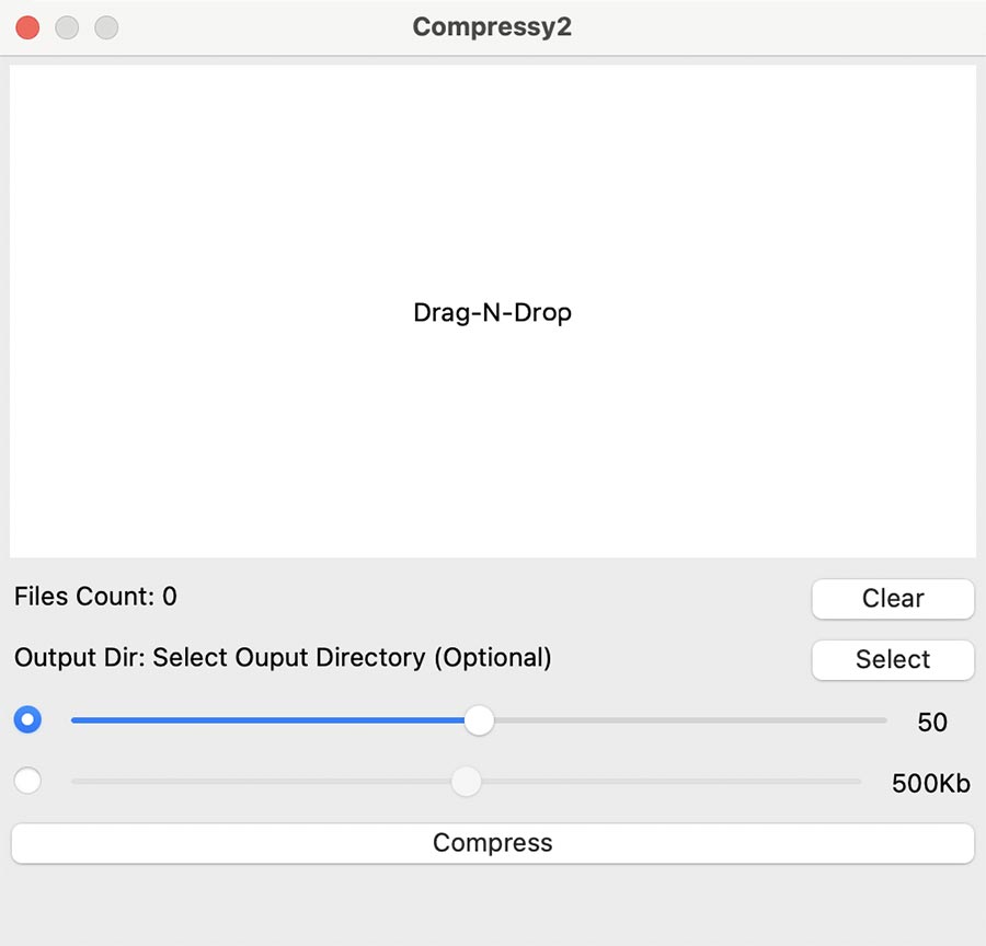
For more than 10 years, I relied on a simple macOS app called Compressy to batch-compress images for web, e-commerce, advertising, and production work. When I learned the app would no longer be supported in an upcoming macOS release, I decided to build the replacement I wanted myself.
Years of using the original gave me a very specific understanding of what worked, what I wanted to keep, and what could make the workflow better. BatchBlitz became both a solution to a real production problem and an opportunity to explore Figma, Xcode, and AI-assisted development for the first time.
From Compressy to BatchBlitz
Keeping What Worked. Rethinking What Didn't.
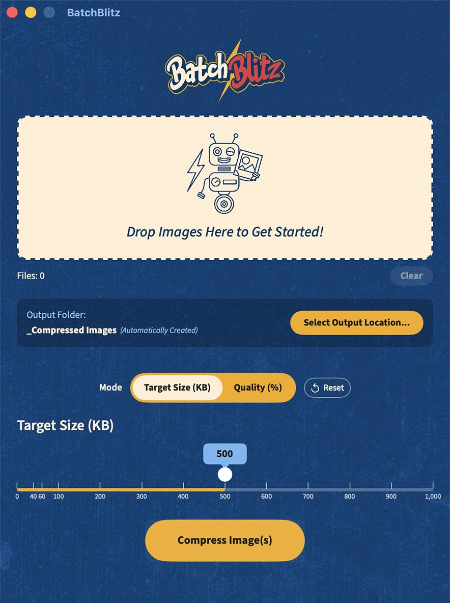
After more than a decade of using Compressy, I knew which parts of the experience were essential: drag-and-drop input, batch processing, file counts, clearing files, and control over the output location.
BatchBlitz keeps that simplicity while adding the controls and feedback I repeatedly wished I had — including target file size and quality modes, exact numerical input, clearer batch results, and safeguards for preserving original files.
Designing Around Real Production Needs
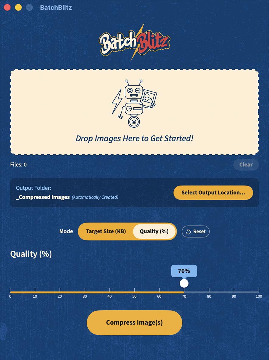
Two Ways to Compresss
Target a specific file size or compress according to image quality depending on the production need.
Precision When It Matters
Sliders make common adjustments fast, while values can also be entered directly when an exact KB or percentage target is required.
Protecting the Originals
Compressed images retain their original filenames but are automatically saved to a dedicated _Compressed Images folder, preventing accidental overwrites and keeping batch output easy to find.
AI As a Creative + Development Tool
I intentionally used BatchBlitz to explore where generative AI could accelerate my existing design workflow. AI helped with naming and early visual exploration, which I used as creative starting points before developing the final BatchBlitz logo and app icon in Illustrator.

AI-Generated
Final Design, Created in Illustrator Using Manually Modified Fonts

AI-Generated
Final Design, Created in Illustrator Using Manually Modified Fonts
During development, I worked iteratively with Grok to translate my Figma designs and detailed functionality requirements into a working macOS application in Xcode. I provided screenshots, defined interactions and expected behaviors, tested builds, identified problems, and refined both the interface and functionality as the application took shape.
FIRST FIGMA PROJECT · FIRST XCODE PROJECT · ~16 HOURS FROM CONCEPT TO WORKING APP
Solving Through Production
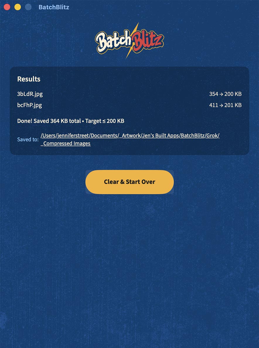
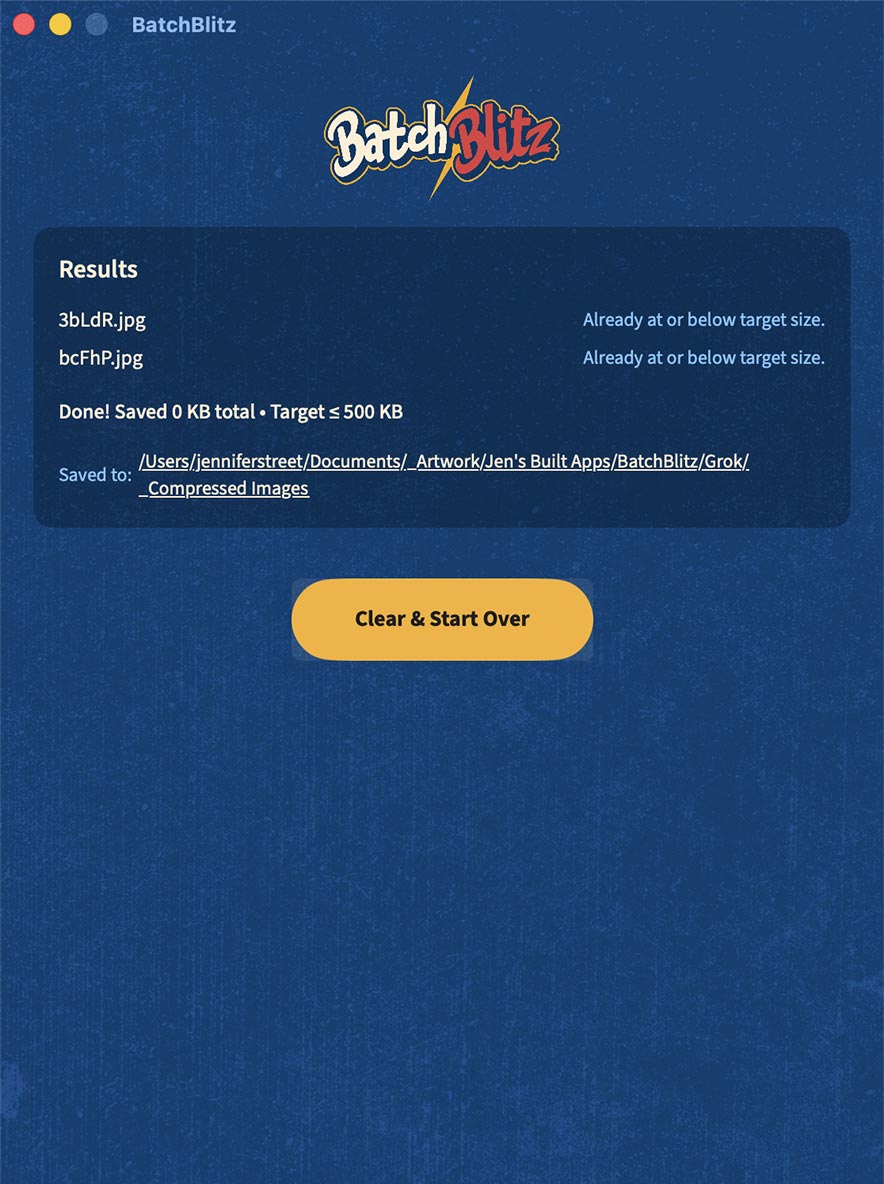
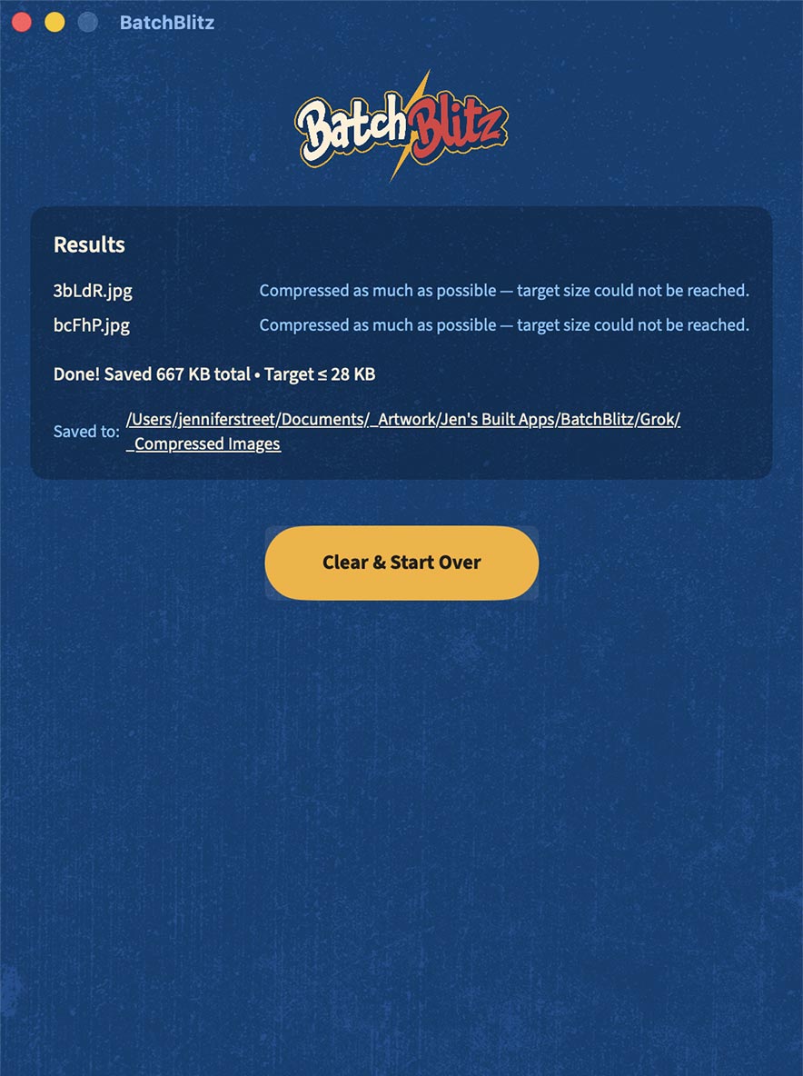
Once I began using the working app, additional UX questions emerged that weren't obvious in the static comp. What happens when a file is already below the requested size? What if the target simply can't be reached? How does the user know how much space was saved or where the batch went?
Those discoveries led to clearer result states, batch summaries, total file-size savings, reminders of the selected compression target, output-location feedback, and an easy path to begin another batch.
Fleet Management Software
Product Design · UX/UI · User Flows · Information Architecture · Visual Systems
Project Overview
My ROLE
Product Designer
Industry
Transportation Technology
Challenge
Fleet operators needed to quickly interpret large amounts of real-time operational data and act with confidence.
I worked on the UX/UI design of a fleet management platform for a GPS tracking company serving businesses that manage drivers, vehicles, and time-sensitive operations.
The software paired with GPS tracking technology to help businesses monitor fleet activity, driver productivity, and operational performance. The challenge was taking a large amount of real-time information and functionality and making it understandable and usable for people with very different needs and levels of technical experience.
My work spanned the product experience from early visual direction through interface design, including color systems, iconography, user flows, navigation, information hierarchy, and overall usability.
Designing for Complex Information
Usability · Data Hierarchy · Navigation · Interaction Design
This wasn't a marketing website — it was software people relied on to do their jobs.
The interface needed to make complex operational information easier to understand, prioritize important actions and data, and help users move efficiently through workflows without unnecessary complexity.
I considered both the people managing fleet operations and the drivers interacting with the system, designing around different goals, environments, and levels of familiarity with the technology.
Building the UI System
Color · Iconography · Components · Visual Hierarchy
My role extended into the visual language of the product. I explored color palettes, developed iconography and established interface patterns that could communicate different types of information consistently throughout a large application.
These decisions weren't purely aesthetic. Color, icons, hierarchy, and interaction patterns needed to help users quickly understand what they were seeing and what required their attention.
NDA-Protected Work
This project is protected by an NDA.
Because the platform contains proprietary functionality and workflows, I'm unable to publicly share interface designs, screens, user flows, or other project materials. I'm including the project here because it represents a substantial portion of my UX/UI and product design experience.
Amazon Brand Store & e-Commerce UX
E-Commerce UX · UI Design · Information Architecture · Marketplace Design · Content Strategy
Project Overview
My ROLE
Founder, UX Designer & Creative Director
Industry
E-Commerce
Challenge
Build a recognizable brand experience within Amazon's rigid marketplace constraints.
As a registered brand on Amazon, Forged Flare® has access to enhanced brand content and a dedicated Brand Store that lives at www.amazon.com/forgedflare. I designed and built the experience within Amazon's strict templates and requirements, adapting our visual identity to the platform while keeping the experience distinctly ours.
Because customers often discover us through Amazon search or advertising, many arrive on a product page knowing nothing about the company behind it. That made the product page an important introduction to the brand — not just another place to complete a purchase.
Across product listings, enhanced content, and the Brand Store, I focused heavily on communicating what differentiates us: handcrafted in Texas, created by real people, and produced by a small business rather than mass-produced overseas.
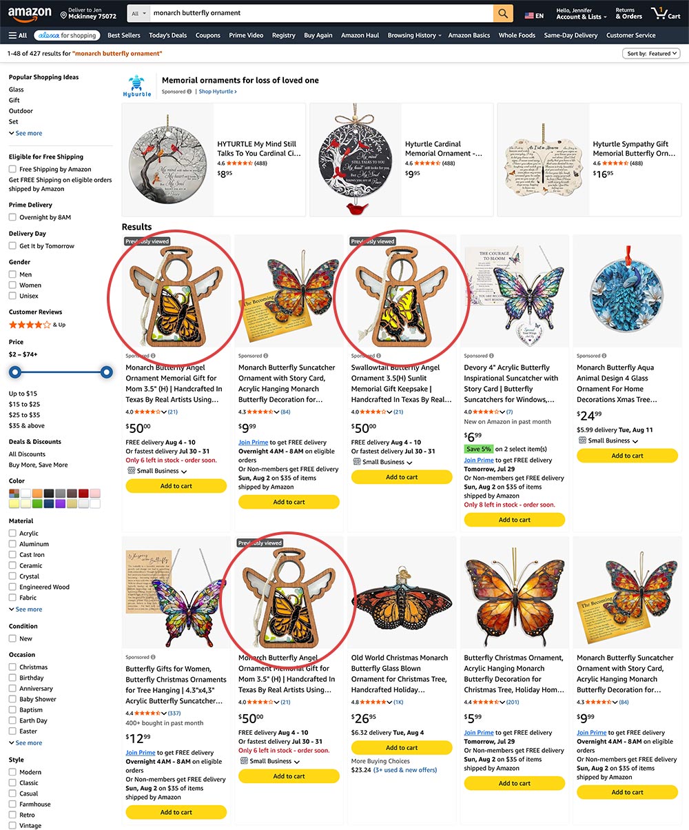
1) Discovery
Search & Advertising
Customers typically enter through Amazon search results, recommendations, or sponsored product advertising. Product imagery and listing content have to communicate value quickly within a crowded marketplace.
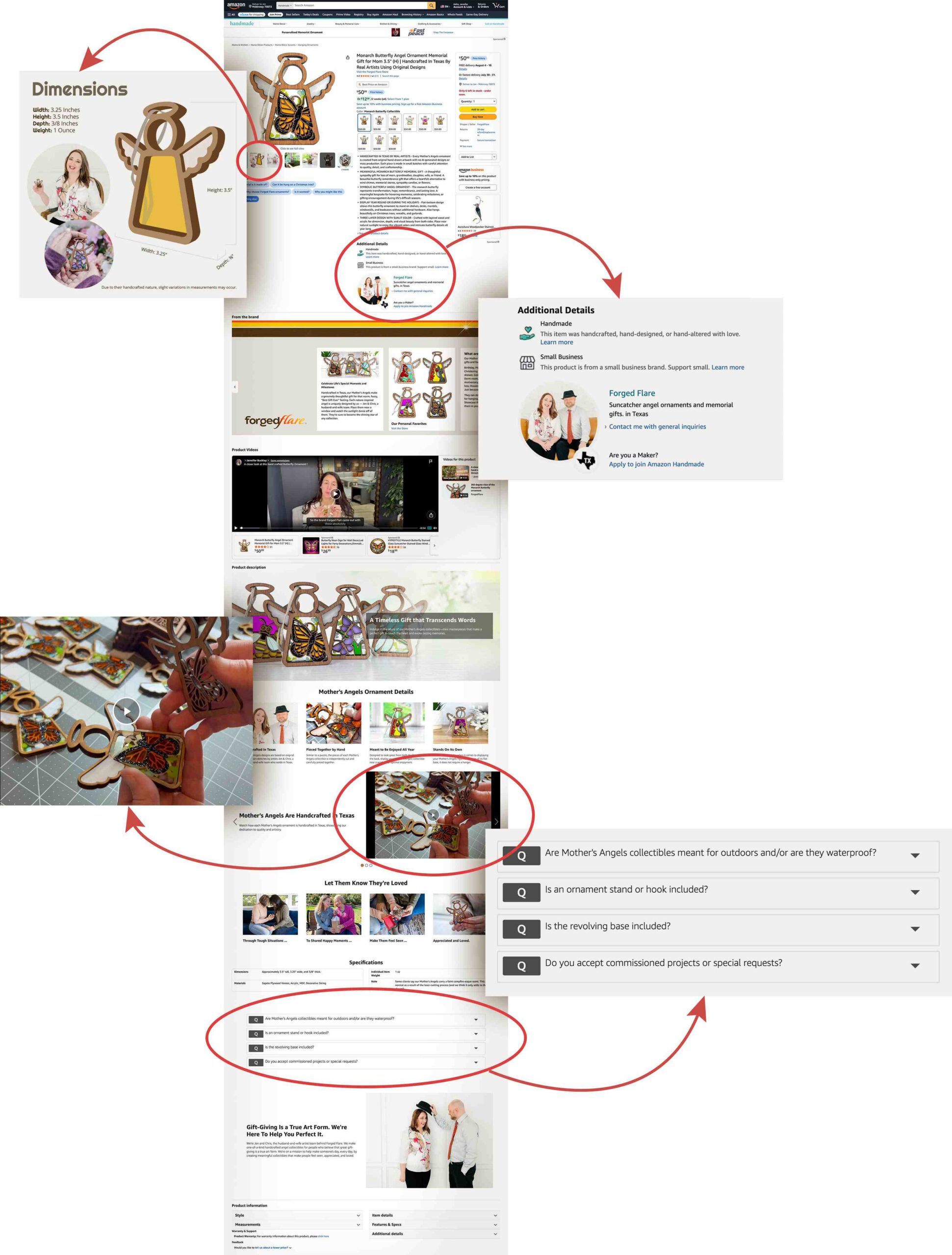
2) Product Detail
Answering Questions Before They're Asked
Amazon shoppers often make quick decisions based on skimming a page. Because of this, I use product imagery and enhanced content to communicate important information visually — including size, craftsmanship, materials, and what makes the product different from mass-produced alternatives.
3) Brand Store
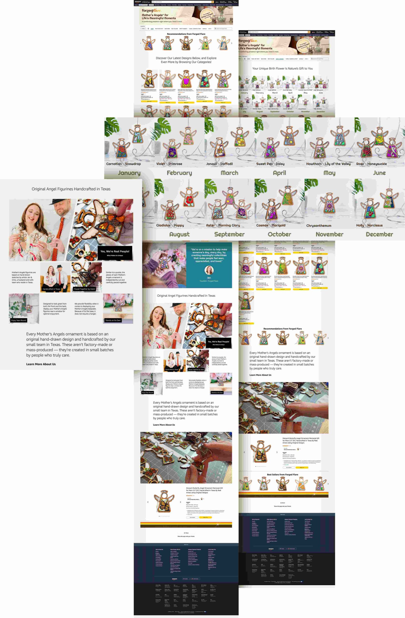
From Product to Brand
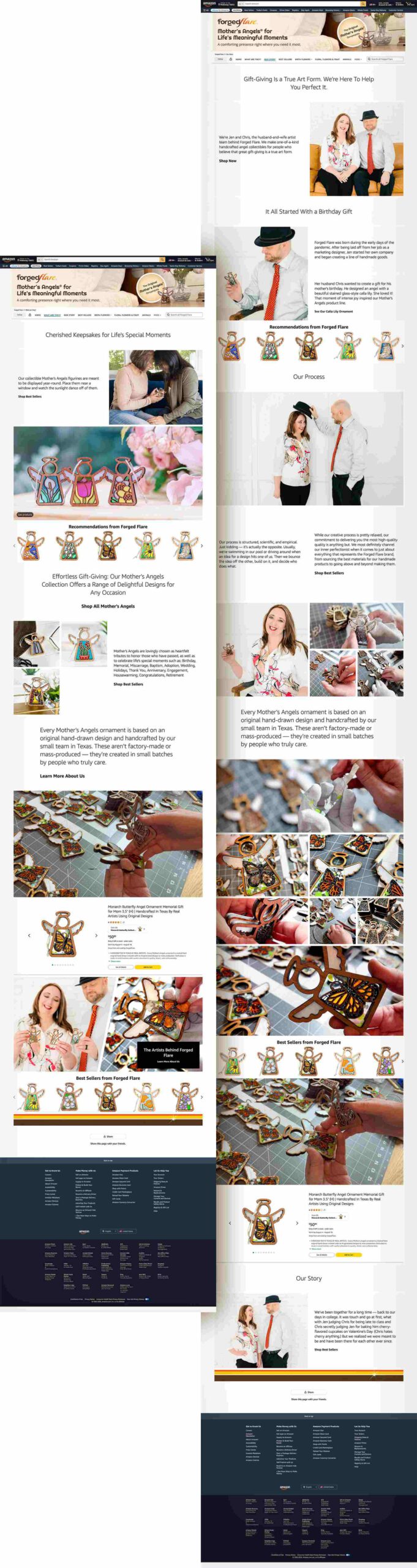
From the product page, customers can enter the Forged Flare® Amazon Brand Store, where I expanded the experience beyond an individual product. I designed category pages, merchandising, educational content, brand storytelling, and cross-selling opportunities to help customers explore the broader collection.
4) Building Trust Within Amazon
Throughout the Brand Store, I intentionally incorporated photography of our team, production process, products being made, and customers interacting with our work. For a handmade business selling alongside thousands of mass-produced products, showing the people and process behind the brand is an important part of establishing trust and communicating value.
Designing Within Platform Constraints
Unlike a standalone website, an Amazon Brand Store has a predefined design system, templates, content modules, technical requirements, and navigation patterns that I can't change. The challenge is determining how to use those constraints effectively while still creating an experience that feels consistent with the Forged Flare® brand.
I also design around differences in how Amazon surfaces content across devices. That means prioritizing the most important product imagery and information first rather than assuming every customer will encounter every piece of content.
CVS +
Shawn Johnson East
Responsive Web Design · UI Design · Retail Media · Developer Collaboration
Project Overview
My ROLE
UX & Visual Designer
Industry
Retail Healthcare
Challenge
Integrate a celebrity campaign into the existing CVS ecosystem without sacrificing usability or brand consistency.
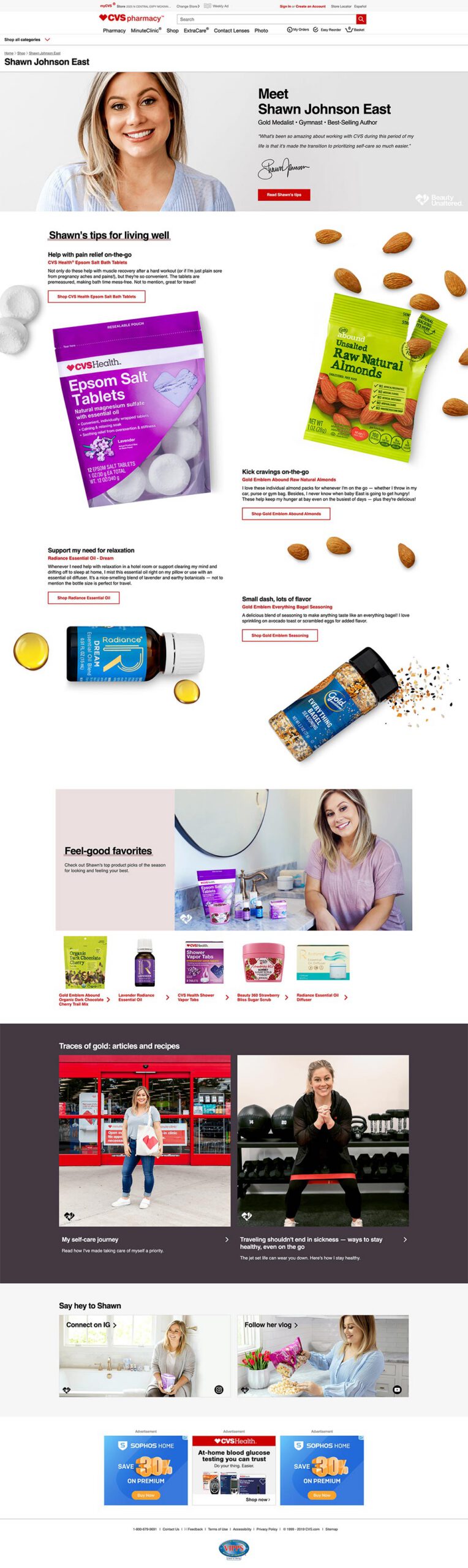
As part of a collaboration between CVS and Shawn Johnson East, I worked on a branded content experience that brought Shawn's wellness tips, product recommendations, editorial content, and shoppable products together within CVS.com.
The challenge was balancing a distinctive campaign look with the existing CVS brand, site architecture, and the capabilities of the CVS.com CMS. Designs also needed to translate into an experience our development team could realistically build within those constraints.
I was responsible for the design of the experience shown here, including the overall page layout, visual hierarchy, product presentation, imagery, and integration of the campaign creative within the CVS.com environment.
Designing Within an Existing Ecosystem
The goal wasn't simply to create an attractive standalone landing page. The experience had to feel distinctive while still belonging within CVS.com — and remain achievable within the capabilities of the retailer's CMS.
ASDA Recipes
Designing a recipe discovery experience for ASDA (Walmart UK).
UX Design • Wireframing • Visual Design • International Collaboration • Responsive Design • Development Handoff
Project Overview
My ROLE
Lead UX Designer
Industry
Grocery Retail
Challenge
Create a recipe platform that seamlessly connected editorial content with online grocery shopping.
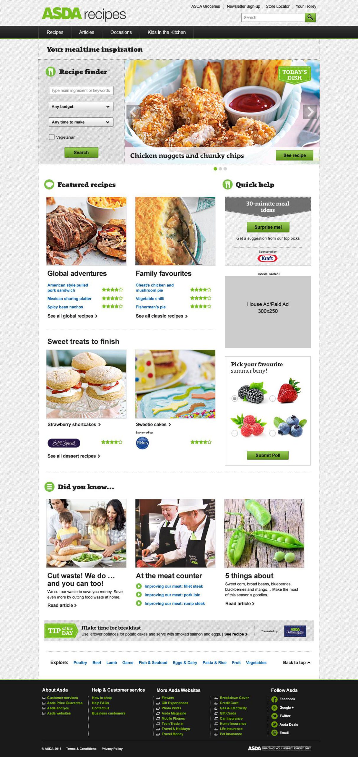
As part of Triad Retail Media's first international project, I collaborated with a UK-based Art Director and cross-functional team to help launch the recipe experience for ASDA, Walmart UK's grocery retailer.
The platform combined recipe discovery, editorial content, and online grocery shopping into a seamless customer experience. My role spanned the entire design process — from wireframes and responsive interface design to production-ready assets, developer handoff, implementation reviews, and quality assurance.
The challenge was designing an experience that made it easy for customers to discover recipes, learn new ideas, and move naturally from inspiration to adding ingredients to their shopping cart.
Designing Across Continents
UX Design • International Collaboration • Project Management
This project required close collaboration between teams in Florida, California, and England. Working across three time zones meant every decision required thoughtful communication, efficient design reviews, and clear development handoffs to keep the project moving on schedule.
Partnering directly with the UK-based Art Director, I contributed throughout the design process—from early wireframes and client presentations through production-ready assets, developer handoff, and quality assurance. Despite the compressed timeline, our distributed team successfully delivered a polished experience for one of Walmart's largest international brands.
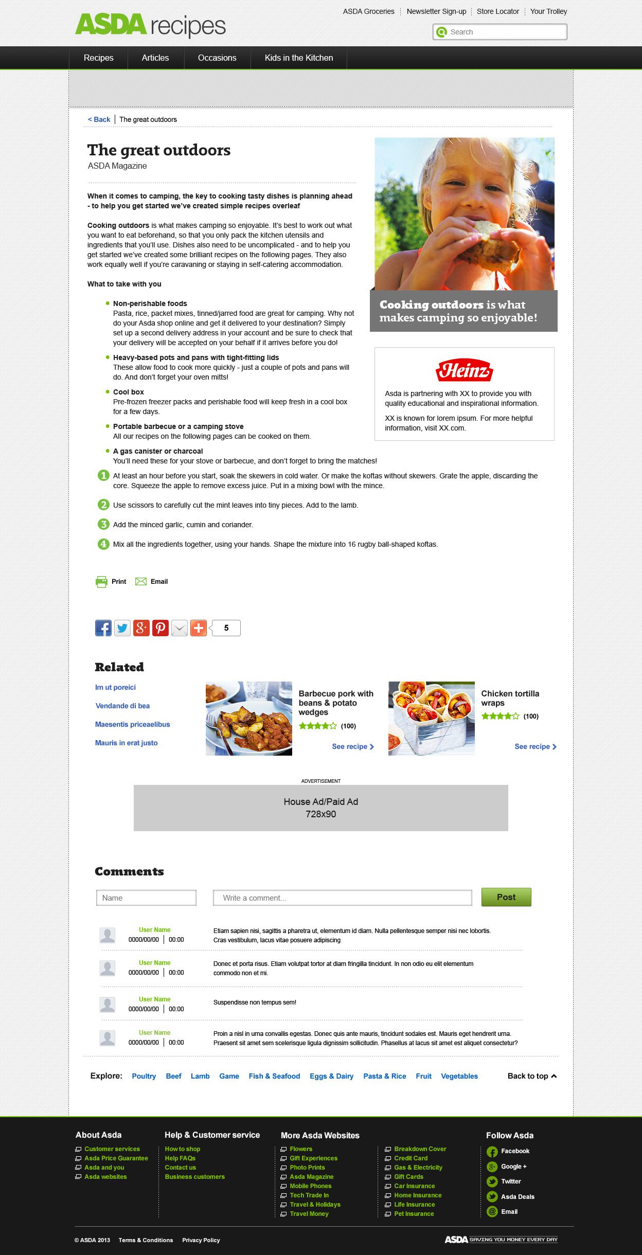
Recipe Discovery & Content Hierarchy
UX Design • Visual Design • Editorial Experience
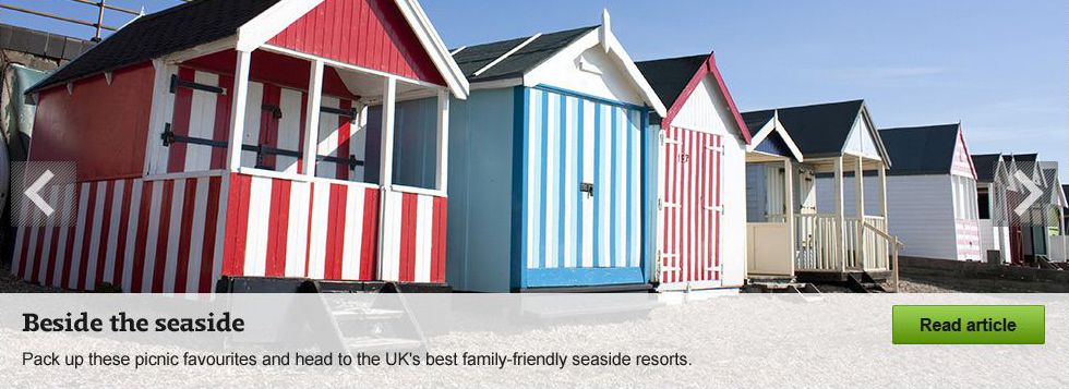
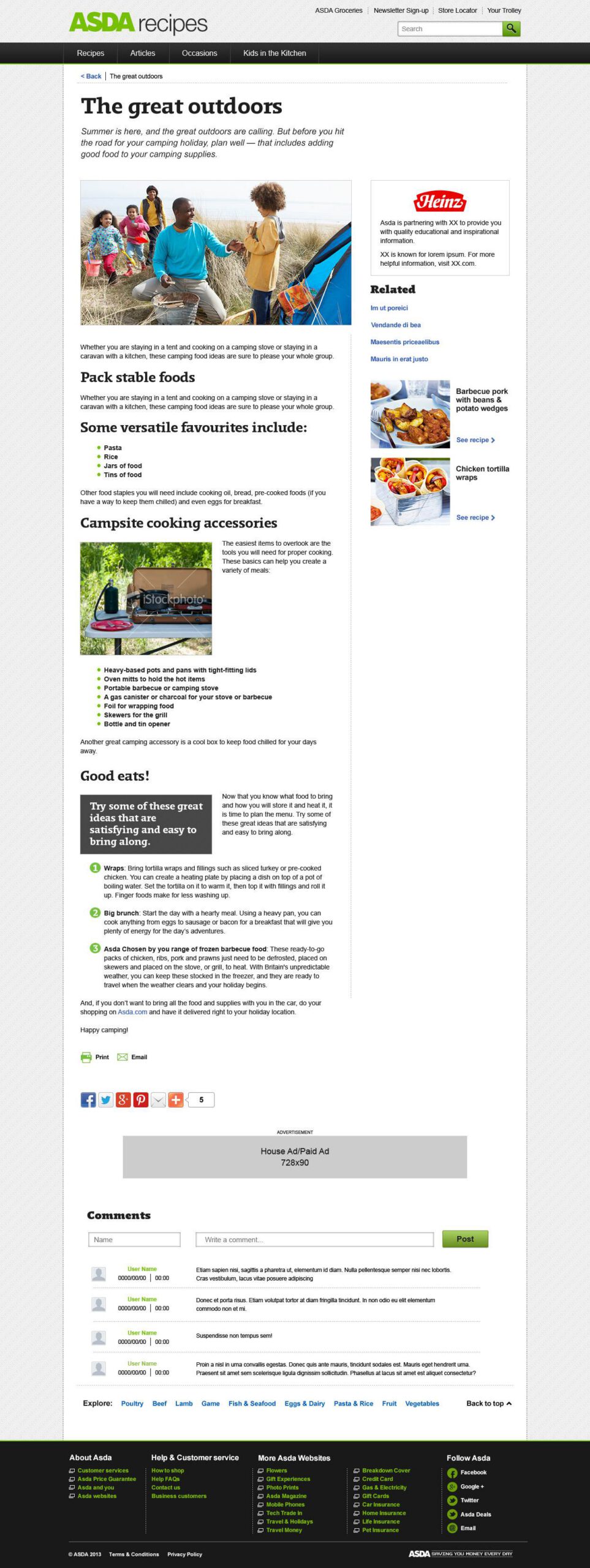
Recipe pages needed to balance beautiful photography with practical cooking information. Clear visual hierarchy helped users quickly understand ingredients, preparation steps, nutritional information, and related content while keeping the experience inviting and easy to scan.
Throughout the project, I collaborated with copywriters, developers, and stakeholders to refine layouts that supported both usability and editorial storytelling.
From Recipe to Shopping Cart
UX Design • User Education • Workflow Design
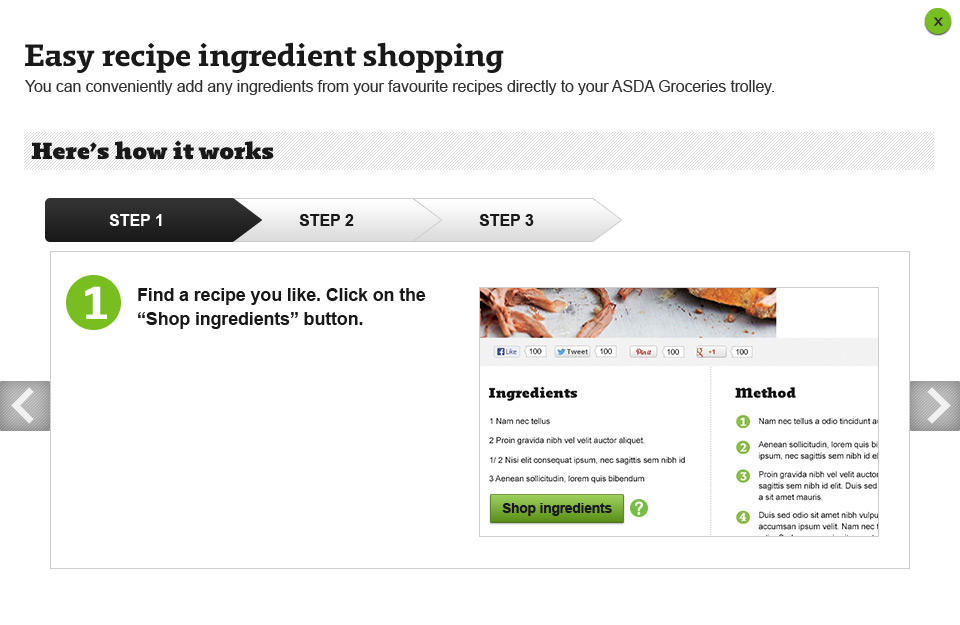
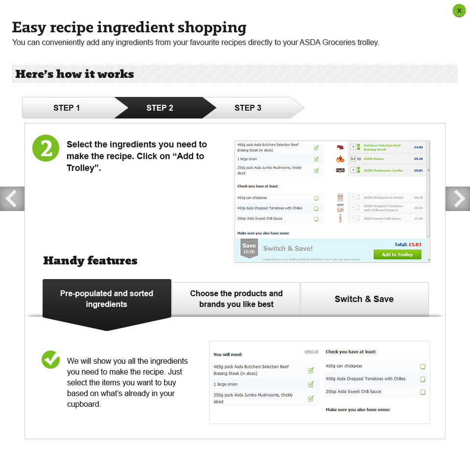
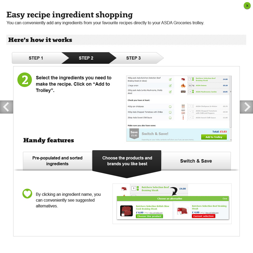
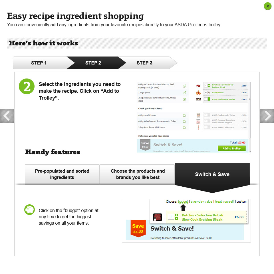
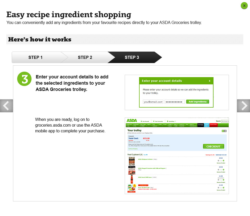
One of the platform's most innovative features allowed customers to add recipe ingredients directly to their ASDA grocery cart. Because this was a new shopping workflow, we designed a guided experience that introduced the feature step-by-step while helping customers understand how ingredient selection, substitutions, and budgeting worked.
The goal was to make the transition from meal inspiration to grocery shopping feel simple, intuitive, and approachable.
Designing for Discovery
Scalable Design • Component Thinking
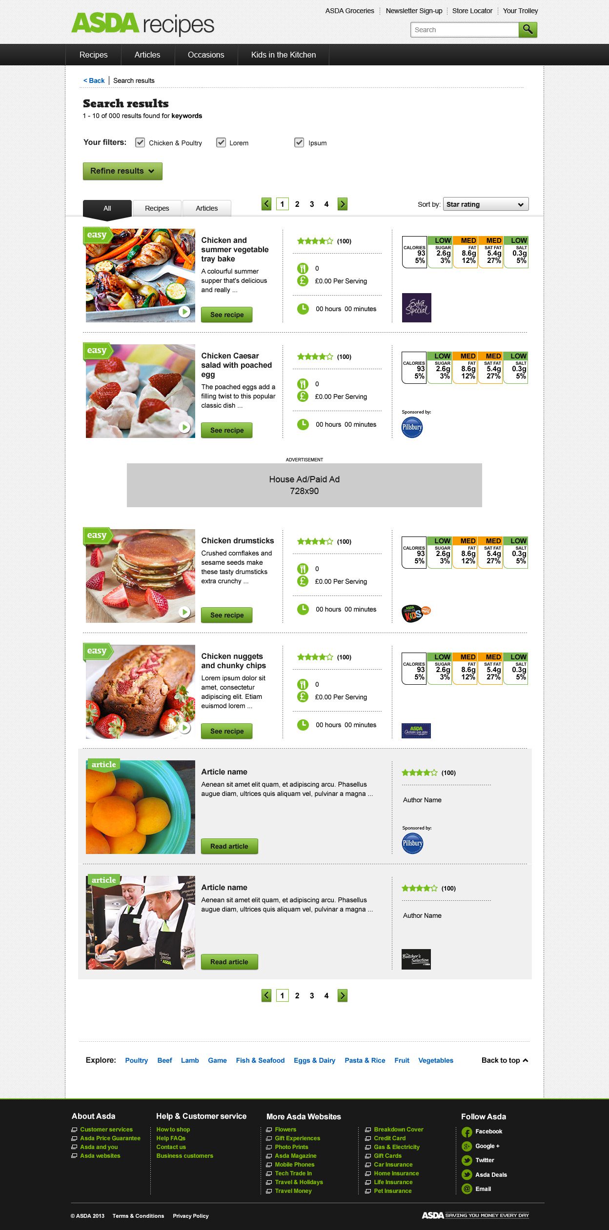
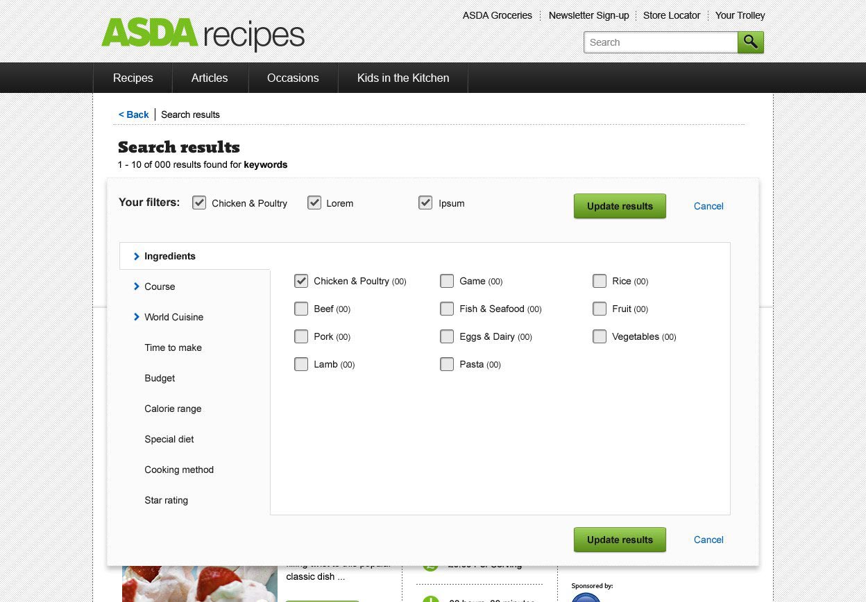
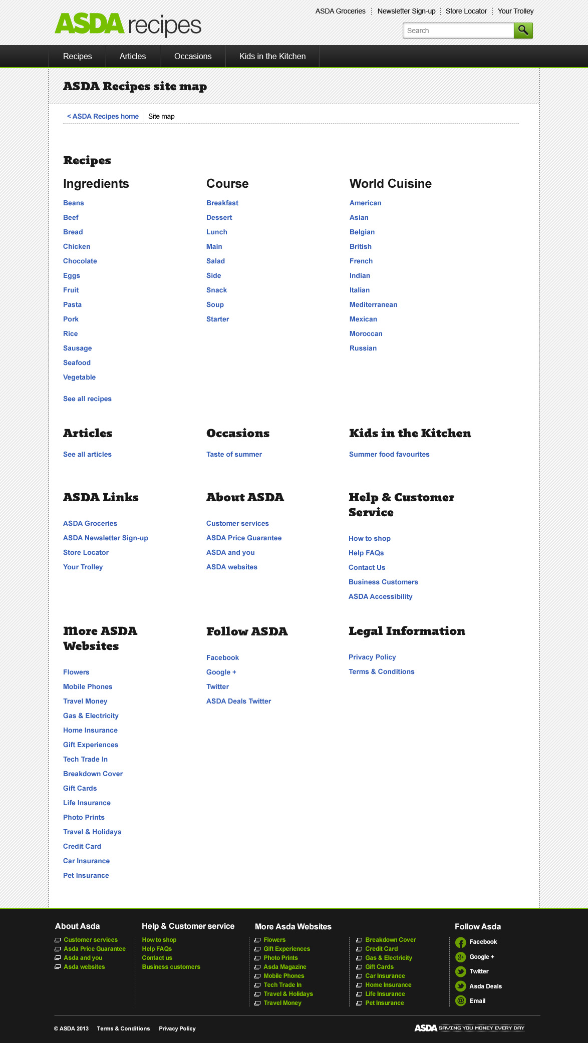
One of the project's biggest challenges was creating a flexible browsing experience that could accommodate recipes, editorial articles, sponsored content, and advertising while remaining easy to navigate. Rather than designing a single search page, we developed a modular system that allowed content to be filtered, organized, and surfaced in multiple ways throughout the experience.
The search results interface supported recipes and articles side by side, while allowing users to refine results by ingredient, cuisine, course, preparation time, budget, dietary preferences, cooking method, and more. Under the hood, the same reusable components were leveraged across browse pages, search results, category landing pages, and navigation, creating a consistent experience while simplifying future expansion.
How To Business
Content Discovery Platform
UX Design · UI Design · Information Architecture · Content Strategy · Search & Filtering · Responsive Design
Project Overview
My ROLE
Lead Designer
Industry
Small Business Education
Challenge
Make complex business topics approachable through a content-rich educational platform.
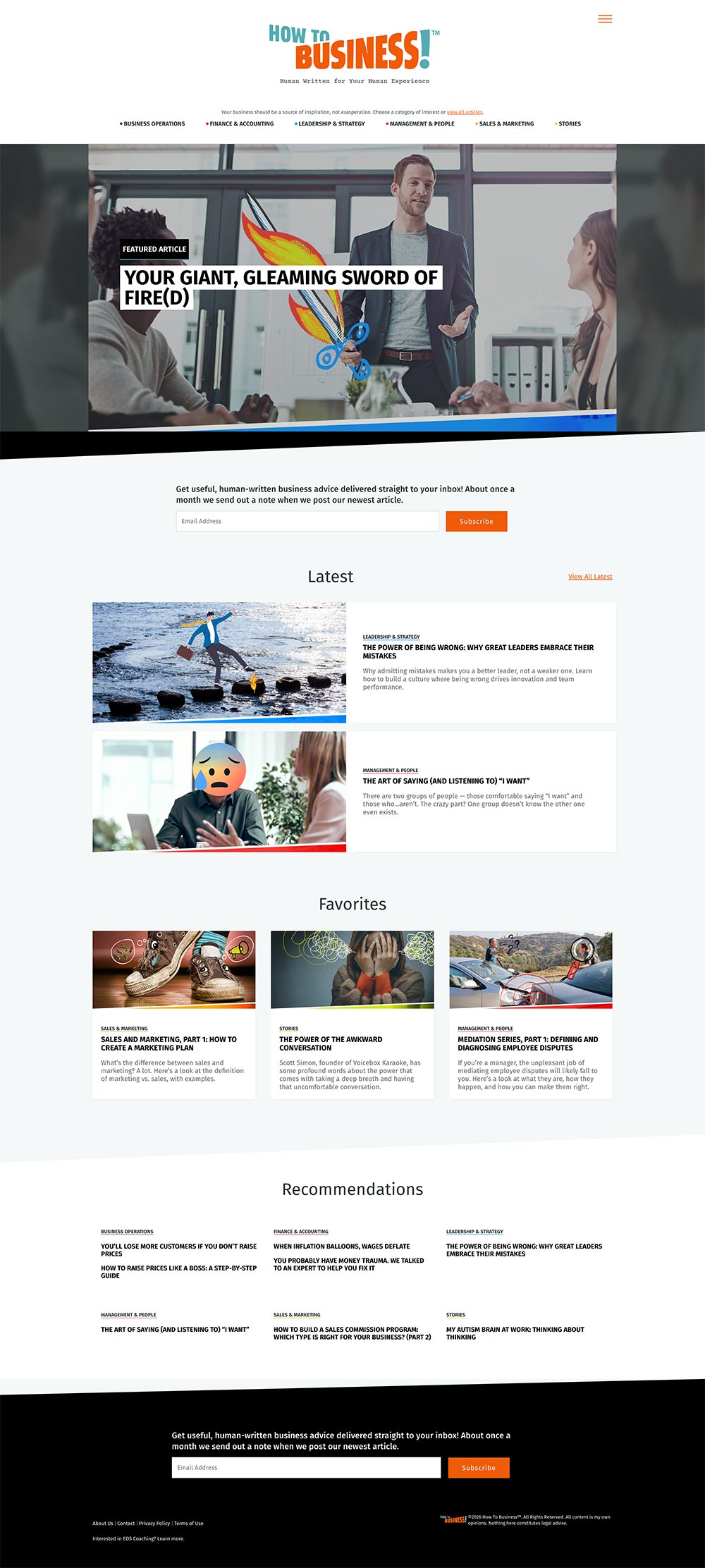
How To Business was an educational platform built to help entrepreneurs and small business owners navigate the challenges of running and growing a business. Unlike a traditional marketing website, the platform centered around a large library of long-form articles covering topics such as finance, operations, leadership, sales, and marketing.
I designed the user experience and visual interface with a focus on making complex information approachable and easy to navigate. As the content library continued to grow, the experience needed to remain intuitive, helping readers quickly discover relevant articles while encouraging deeper exploration across related topics.
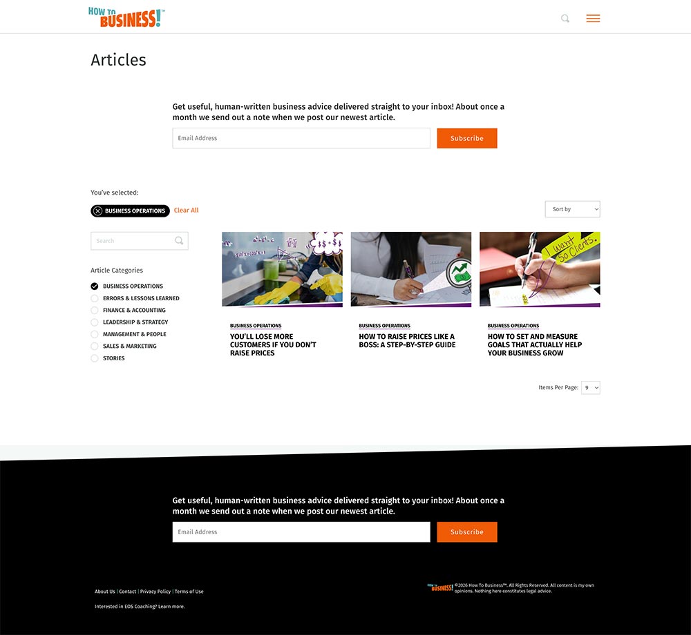
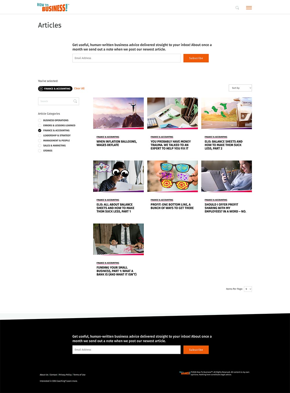
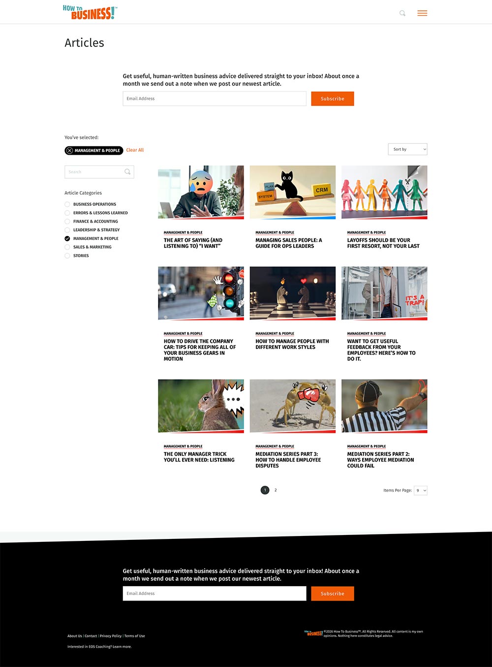
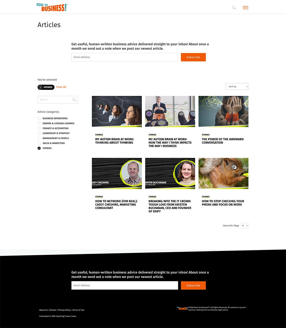
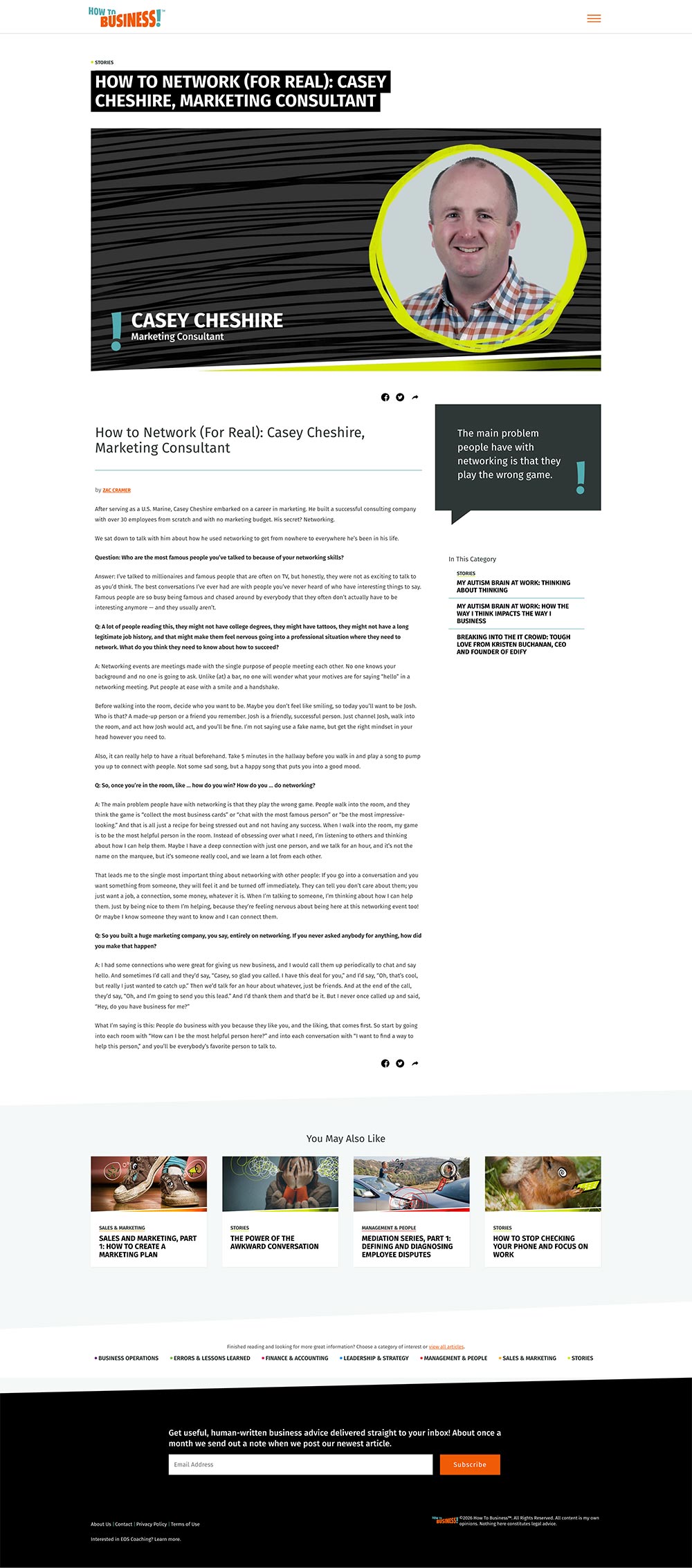
The platform included scalable article listings, category browsing, search, filtering, long-form reading experiences, and related content recommendations. Every page was designed to support readability while maintaining a consistent visual system that could easily expand as new content was published.
By combining thoughtful information architecture with a clean editorial design system, the platform transformed a growing collection of articles into an organized learning resource that encouraged users to stay engaged and continue exploring.
Design Highlights
- Designed a scalable content platform capable of supporting dozens of educational articles across multiple business topics.
- Created category navigation, search, and filtering experiences that helped readers quickly discover relevant content.
- Developed reusable page templates for article listings, category pages, and long-form editorial content.
- Established a clear visual hierarchy to improve readability and reduce cognitive load during extended reading sessions.
- Designed recommendation modules that encouraged continued exploration through related articles and category navigation.
- Built a flexible design system that maintained consistency while supporting future content growth.

IT Assurance
UX Design, Information Architecture & Visual Direction
Website Design · UI Design · Information Architecture · Art Direction · Photography Treatment · Content Strategy
Project Overview
My ROLE
Lead Designer
Industry
Technology & Cybersecurity
Challenge
Present technical IT services in a way that businesses could quickly understand and trust.
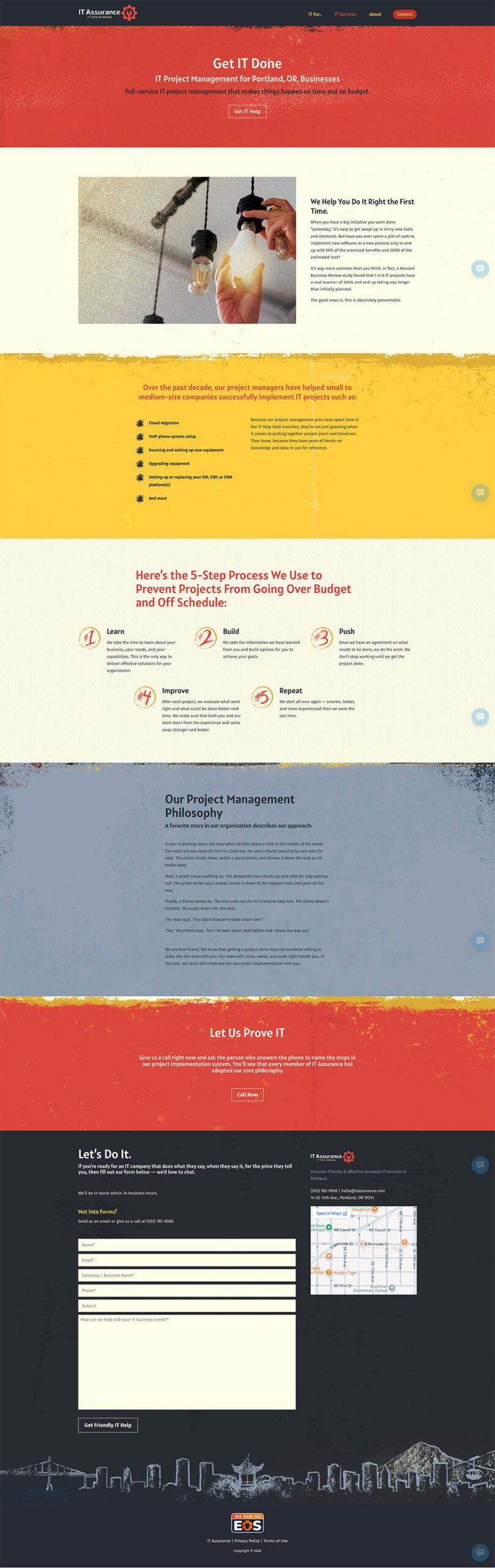
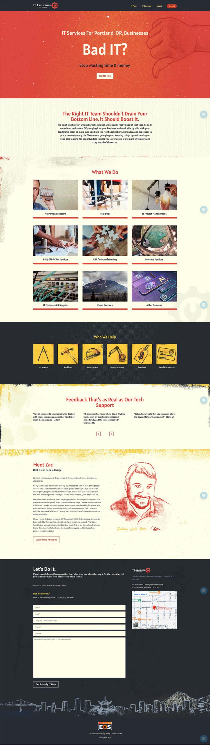
IT Assurance was a content-driven website designed to educate businesses about technology, security, and compliance topics. Working within an established CMS, I designed the user experience, created page layouts, developed the site's visual language, and treated photography to give the brand a distinctive, recognizable look.
Unlike many corporate technology websites that rely on generic stock imagery, I developed a consistent photographic treatment that helped unify the experience across hundreds of pages while giving the site its own personality.
Beyond the visual design, I was responsible for organizing content into an intuitive information architecture, creating reusable page templates, and designing interfaces that made complex technical information easier to browse and consume.
The result was a flexible content platform that balanced editorial needs with usability, allowing new content to be published while maintaining a cohesive visual identity throughout the site.
Visual Direction & Image Design
Art Direction · Digital Illustration · Photo Compositing · Image Optimization · Asset Production · Developer Handoff
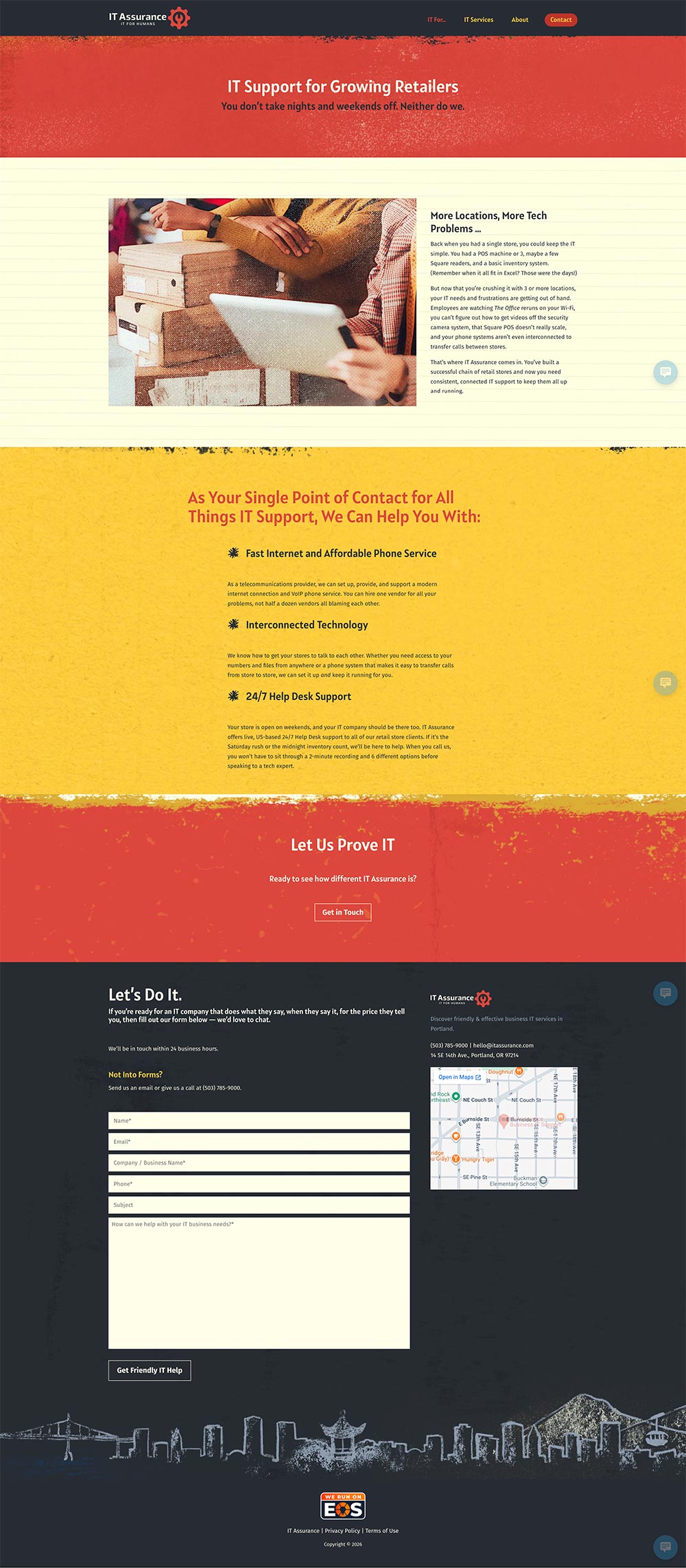
Every visual element on the site was created or customized specifically for the brand. I designed original graphics, illustrated custom elements, developed the site's signature grunge-inspired aesthetic, and transformed stock photography into a cohesive visual system that felt unique and recognizable.
Beyond the creative work, I optimized every asset for fast loading, prepared production-ready files for development, and ensured imagery scaled cleanly across responsive layouts without sacrificing quality or performance.