Portfolio
Brand, Identity, & Graphic Design
From logos and visual identity to storytelling, trademarks, and long-term brand strategy.
My work spans more than two decades of brand and graphic design — from logos and identity systems to packaging, point-of-sale, marketing collateral, environmental graphics, and digital publications.
Areas of Focus
Brand Identity · Graphic Design · Print Design · Packaging · Environmental Graphics · Publication Design · Illustration · Production
SELECTED LOGO & IDENTITY WORK
These logos represent a selection of identities created over the course of my career. Each was developed through research, typography, color exploration, and brand strategy to reflect the personality and goals of the organization it represents.
From concept and typography to color and application, each identity was created to reflect the personality and needs of the brand it represented.
SELECTED PRINT & MARKETING WORK
Design created to communicate, promote, inform, and connect — across everything from posters and signage to campaigns and customer-facing materials.
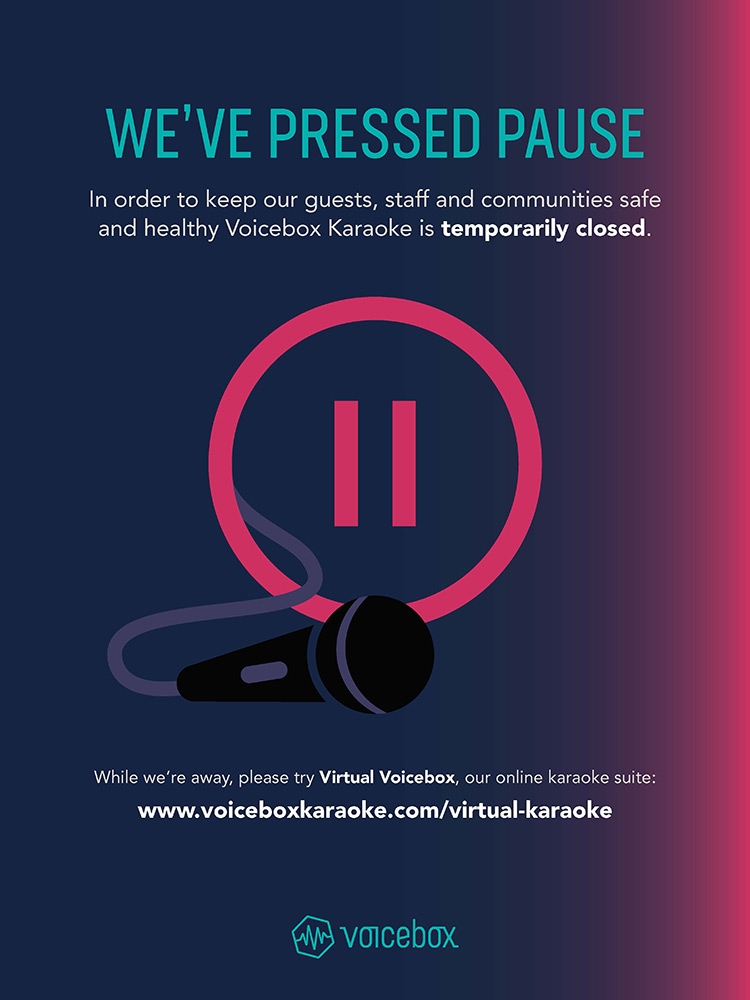
Voicebox Karaoke
In-Venue Signage · Environmental Graphics · Illustration · Print & Digital
Project Overview
My ROLE
Brand Designer
Industry
Entertainment / Hospitality
Challenge
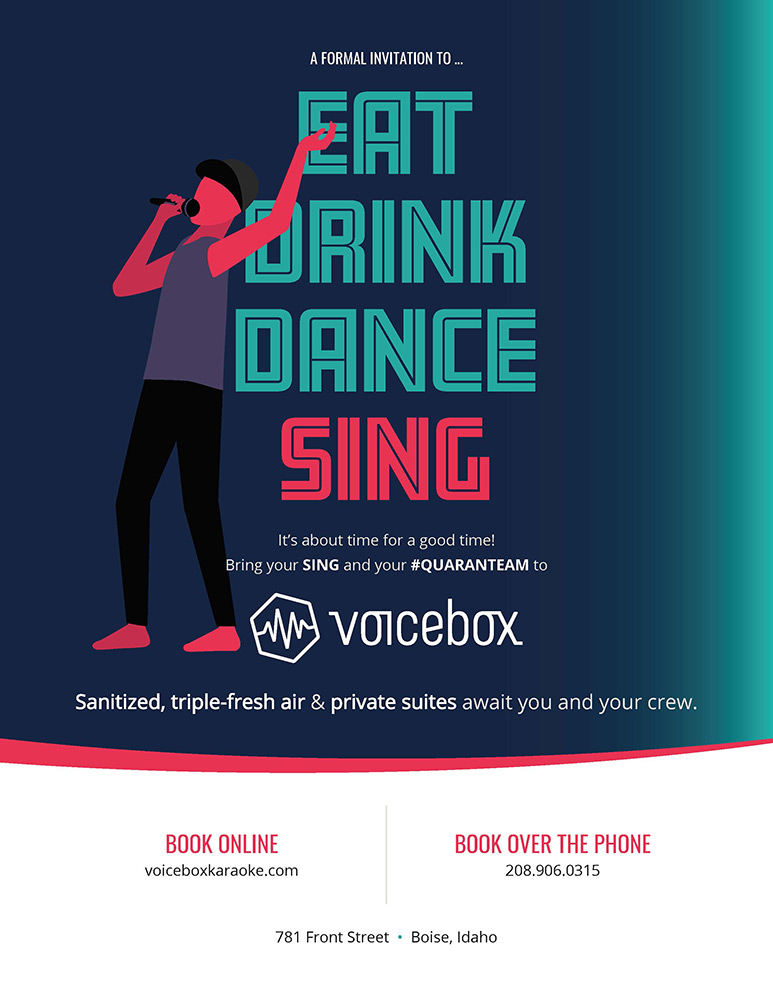
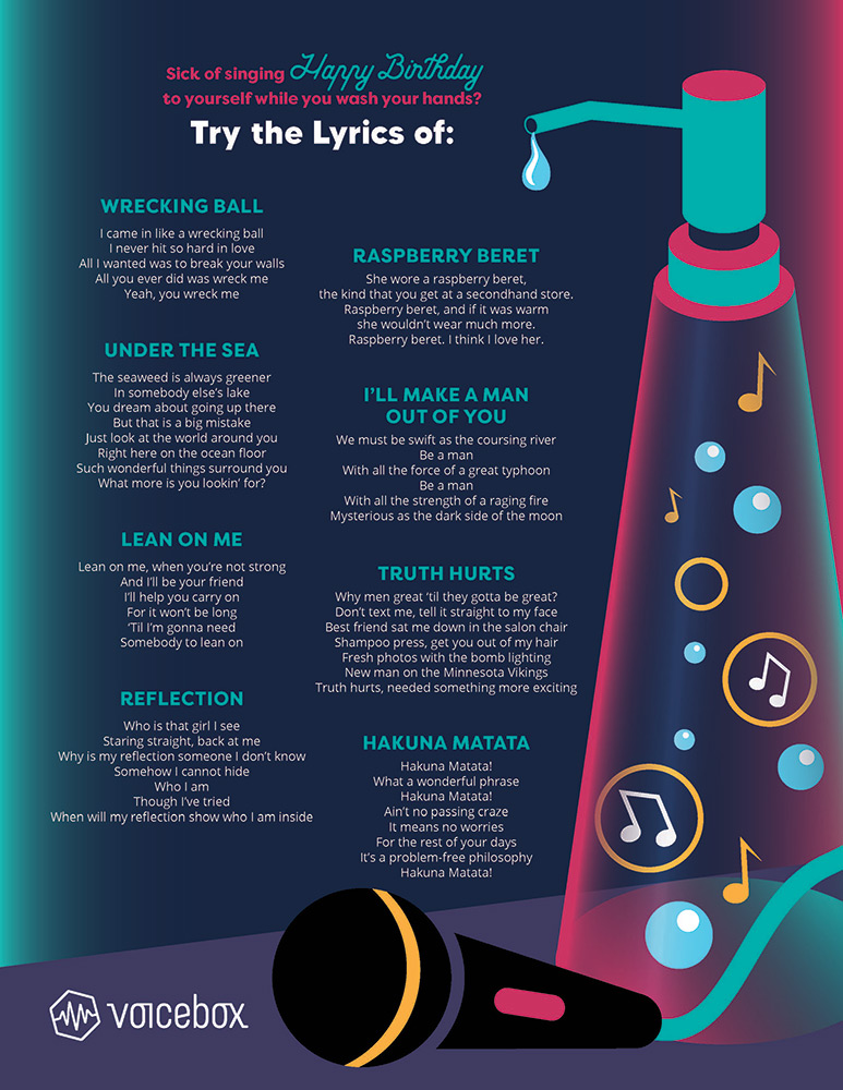
Create branded customer communications that worked equally well for everyday promotions and rapidly changing operational needs during the pandemic.
I designed a range of customer-facing signage and branded materials used across Voicebox venues. The work included promotional and informational displays, as well as rapidly developed communications created during the uncertainty of COVID-19, when businesses needed to clearly communicate temporary closures and changing safety protocols to customers.
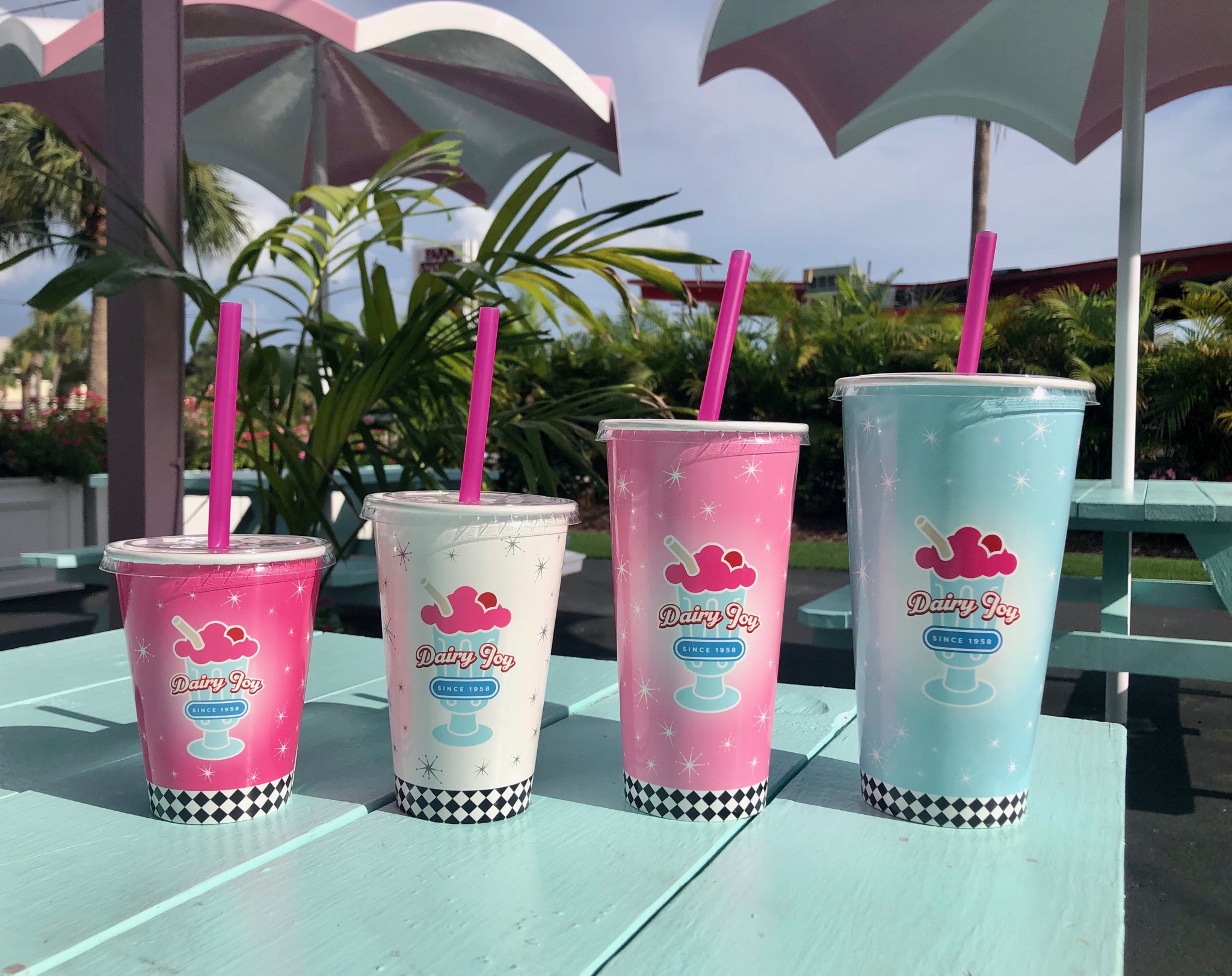
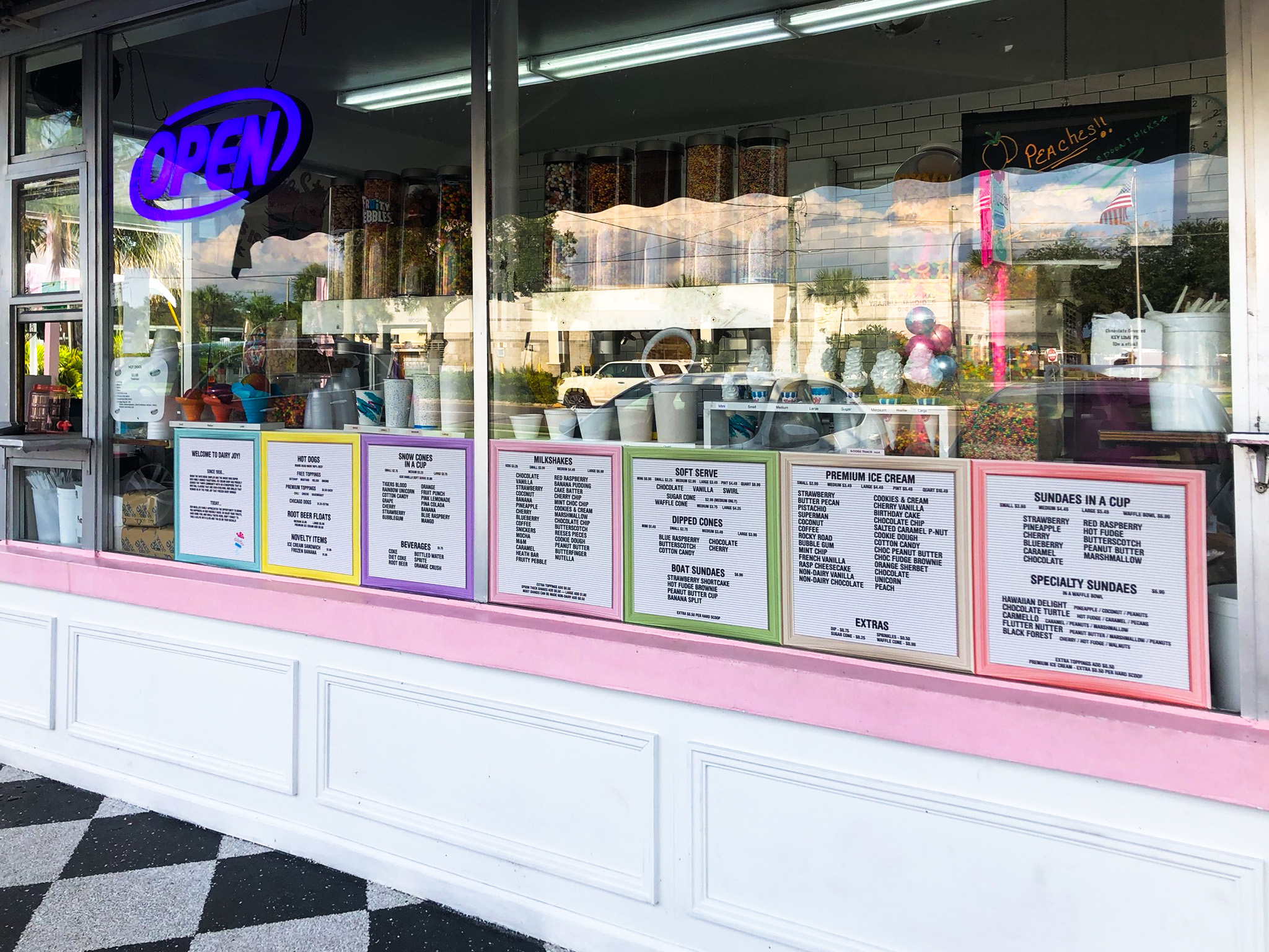
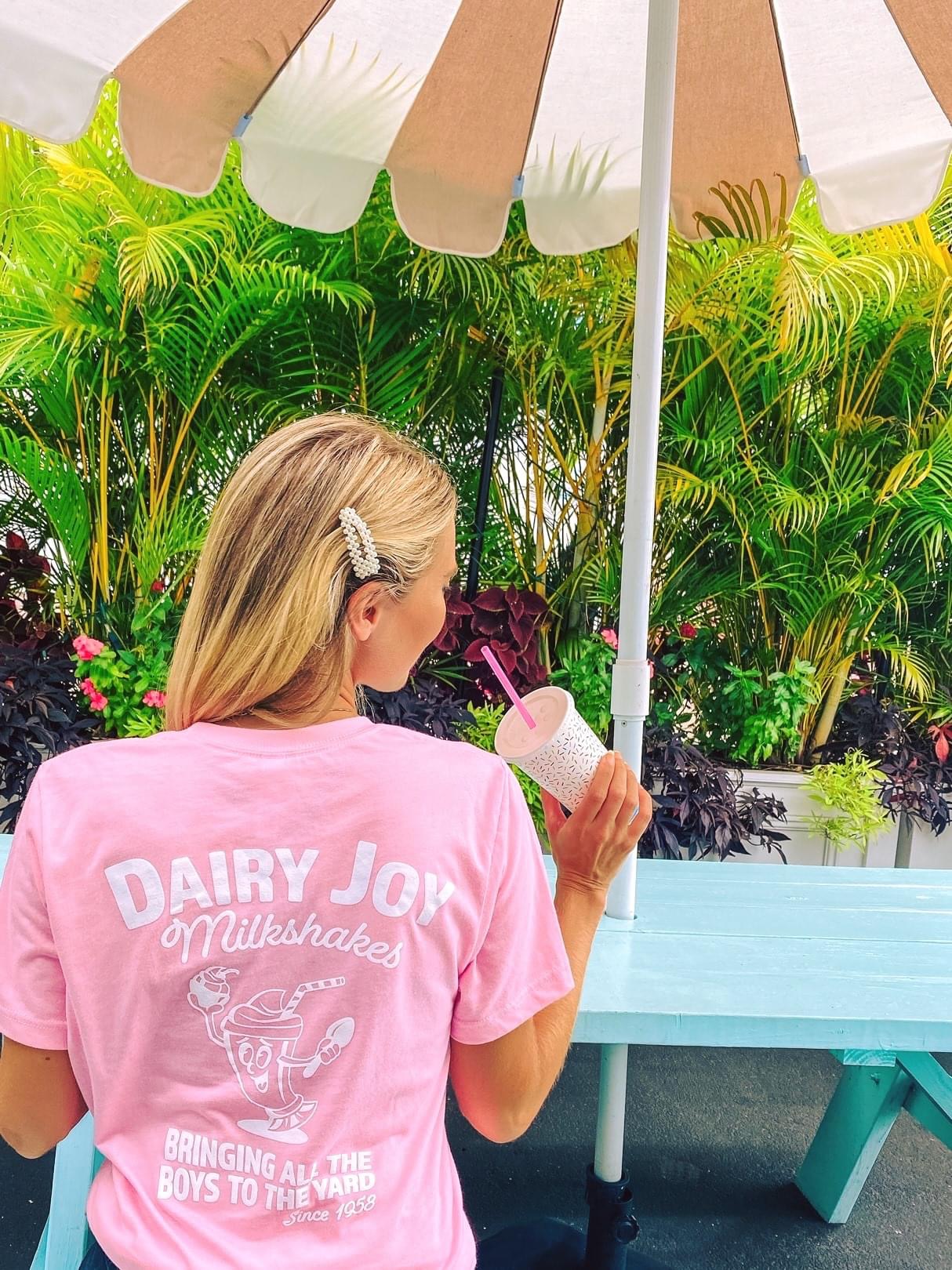
Dairy Joy Brand Applications
Print Design · Signage · Apparel
Project Overview
My ROLE
Brand Designer
Industry
Food & Beverage
Challenge
Extend a nostalgic local brand across every customer touchpoint while maintaining a fun, cohesive identity.
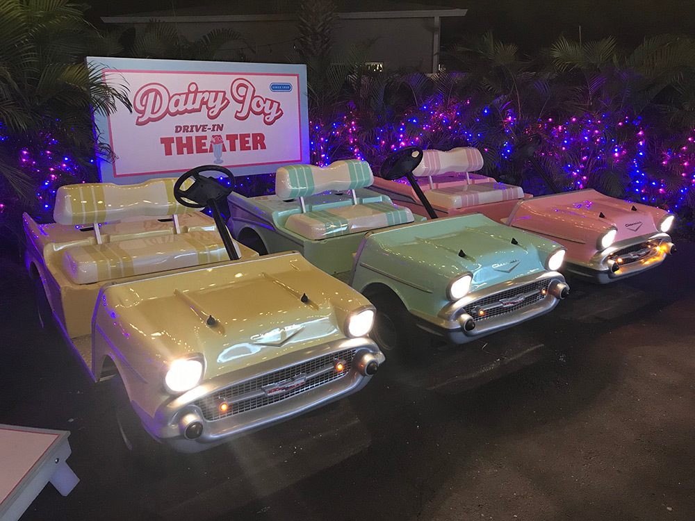
A collection of branded materials created for the historic Tampa ice cream shop, including drink cups, menu boards, signage, and apparel.
XTREME JUICE — CUSTOM ENVIRONMENTAL GRAPHICS
Brand Application · Custom Illustration · Environmental Design · Large-Format Production
Project Overview
My ROLE
Illustrator & Brand Designer
Industry
Food & Beverage
Challenge
Translate the company's energetic visual identity into a physical retail environment through custom environmental graphics.
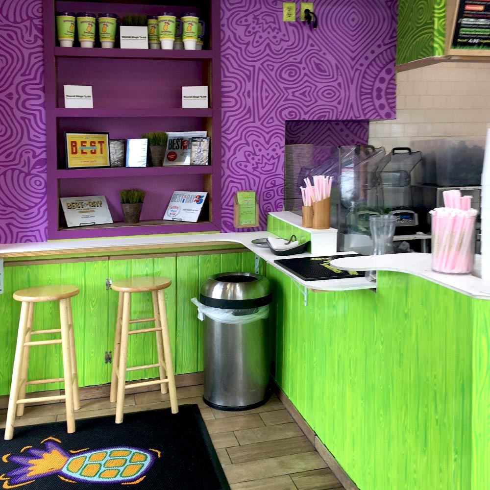
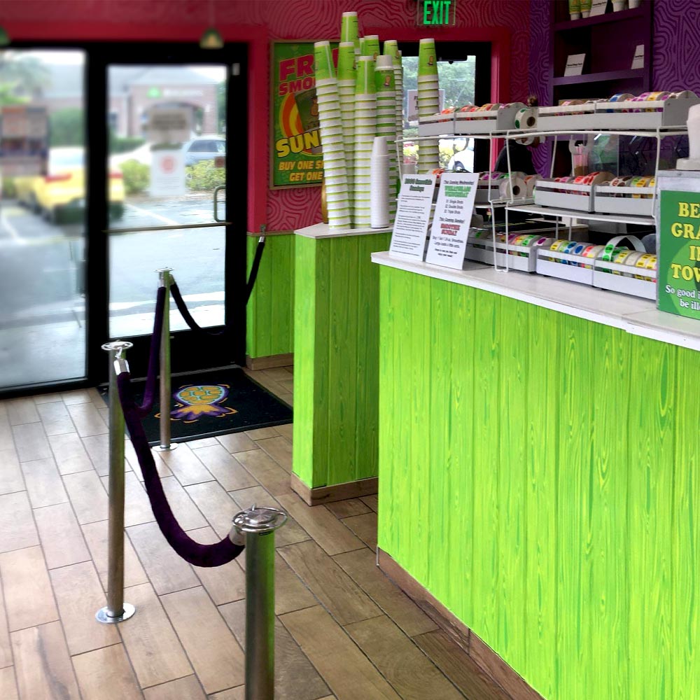
Xtreme Juice wanted to carry its bold visual identity into its physical retail environment with a custom wood-grain treatment for its storefront counters.
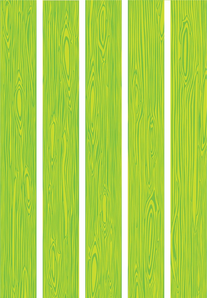
Rather than relying on an existing texture, I illustrated five individual wood-grain patterns using the brand's bright green palette. The variation allowed the boards to be mixed and repeated across large surfaces without creating an overly repetitive pattern.
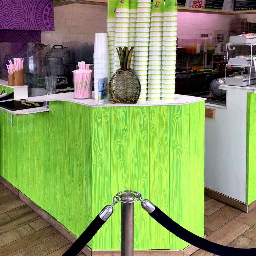
The finished artwork was produced as large-format wraps and installed throughout the space, turning a functional surface into another extension of the Xtreme Juice brand.
Carib Beer Ketch Dat T'ing Sweepstakes
Promotional Campaign · Print Design · Traditional Illustration · Point-of-Sale
Project Overview
My ROLE
Graphic Designer & Illustrator
Industry
Food & Beverage, Consumer Products
Challenge
Create a promotional campaign that could scale from tabletop materials to large-format restaurant displays.
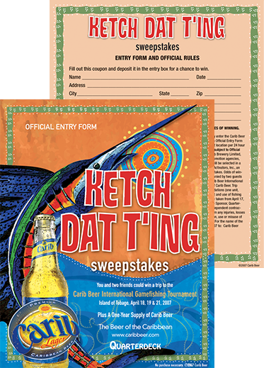
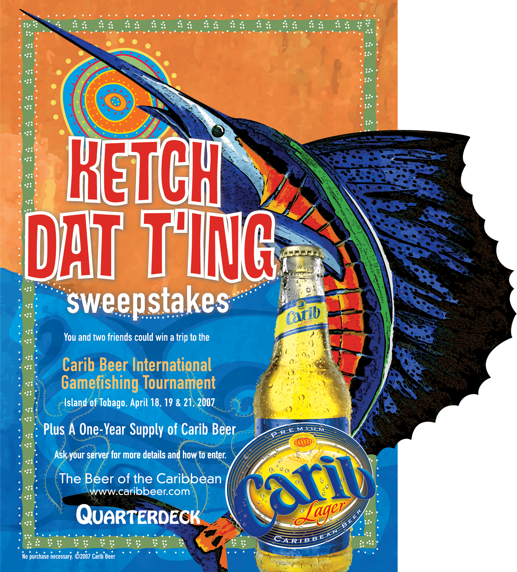
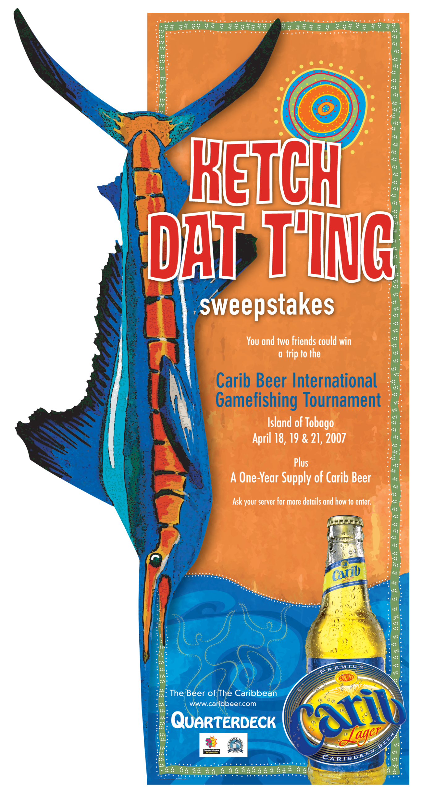
I designed a multi-piece promotional campaign for Carib Beer that ran across a chain of restaurants in the South Florida and Miami area. The campaign included an entry card, tabletop tent, and six-foot promotional standee designed to capture attention throughout the restaurant experience.
The campaign featured my original marker illustrations, which I then cleaned up and refined in Photoshop before incorporating them into the final designs. I adapted the artwork and campaign concept across each format, creating a cohesive visual experience from tabletop pieces to large-scale displays.
BRAND IDENTITY & STYLE GUIDES
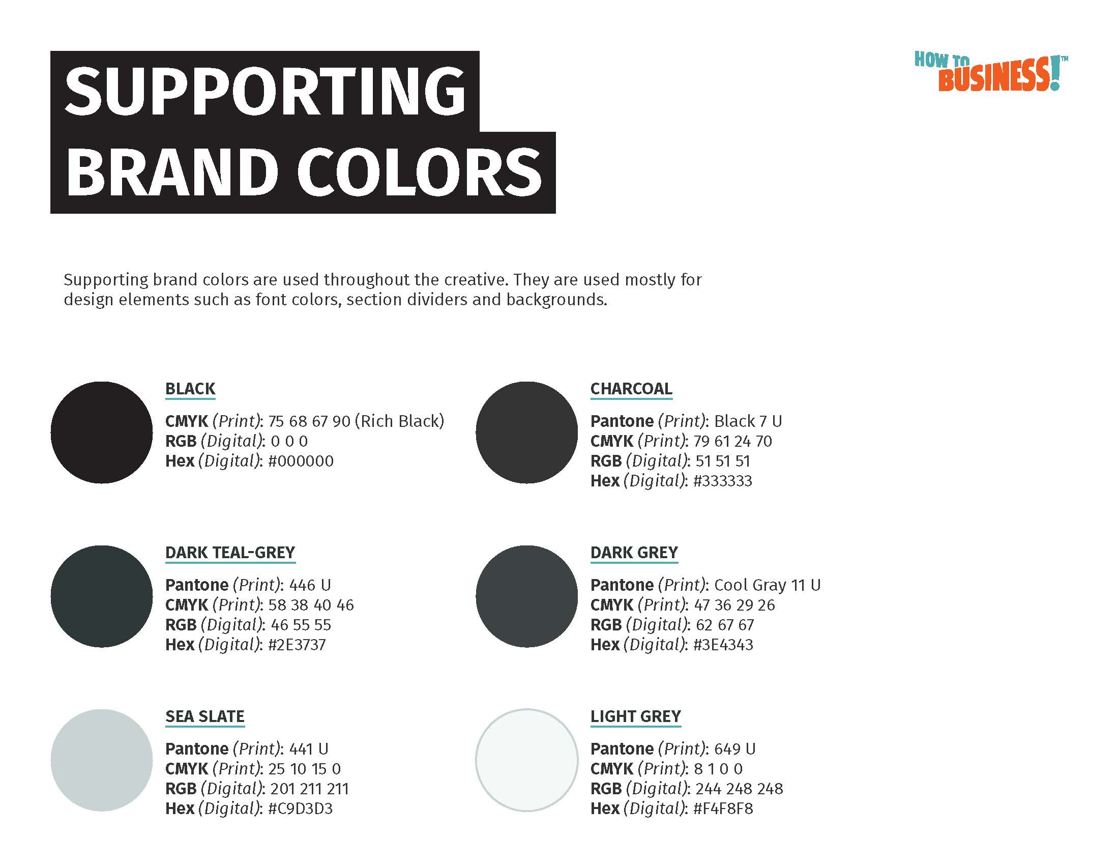
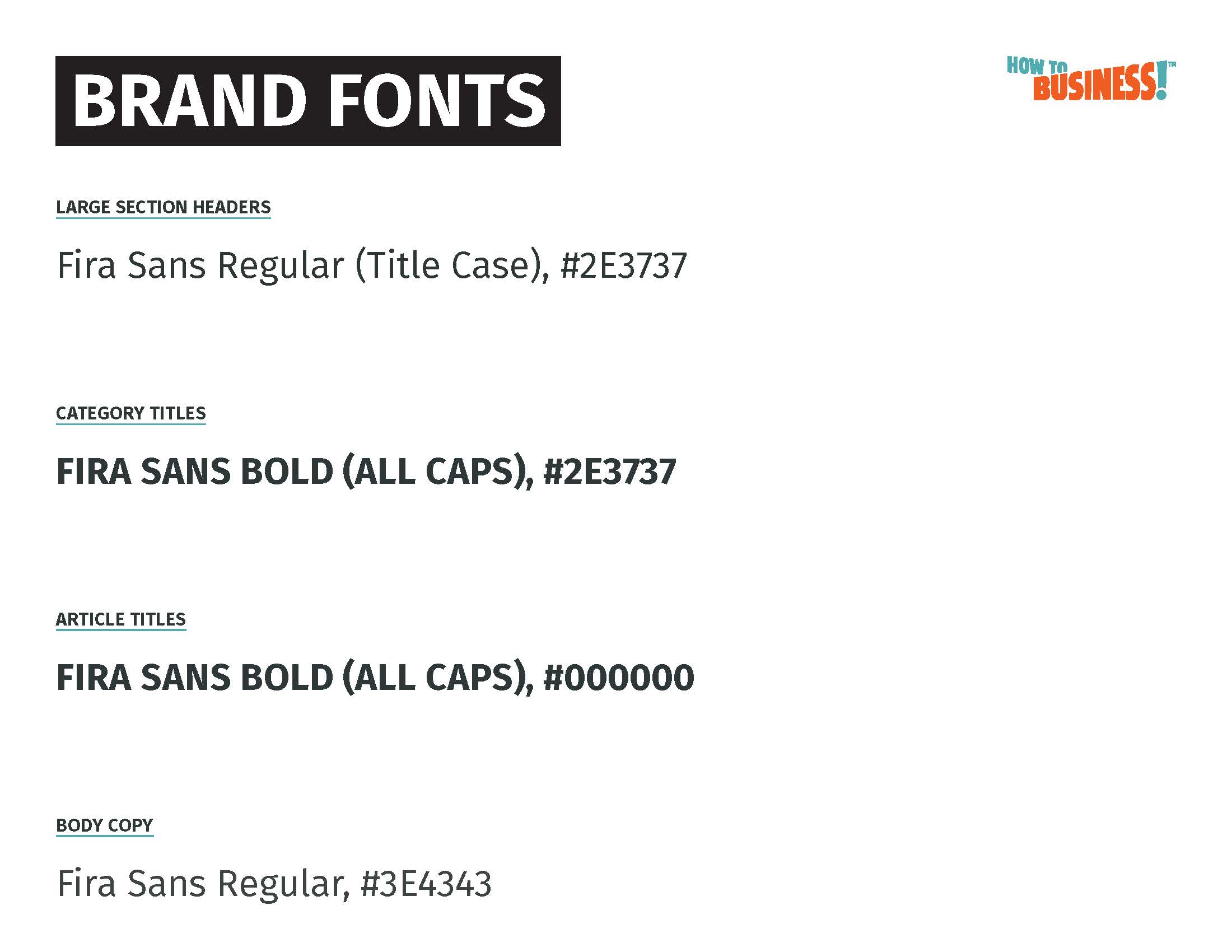
A strong identity goes beyond a logo. I’ve developed complete visual systems that establish how a brand looks, communicates, and stays consistent across digital and print applications. These guidelines bring together logo usage, typography, color, imagery, illustration, and supporting graphic elements into a practical system others can use.
HOW TO BUSINESS
Brand Identity · Logo Design · Style Guide · Illustration · Image Treatment
Project Overview
My ROLE
Brand Designer
Industry
B2B Education
Challenge
Develop a flexible visual identity system that made business education approachable while remaining professional.
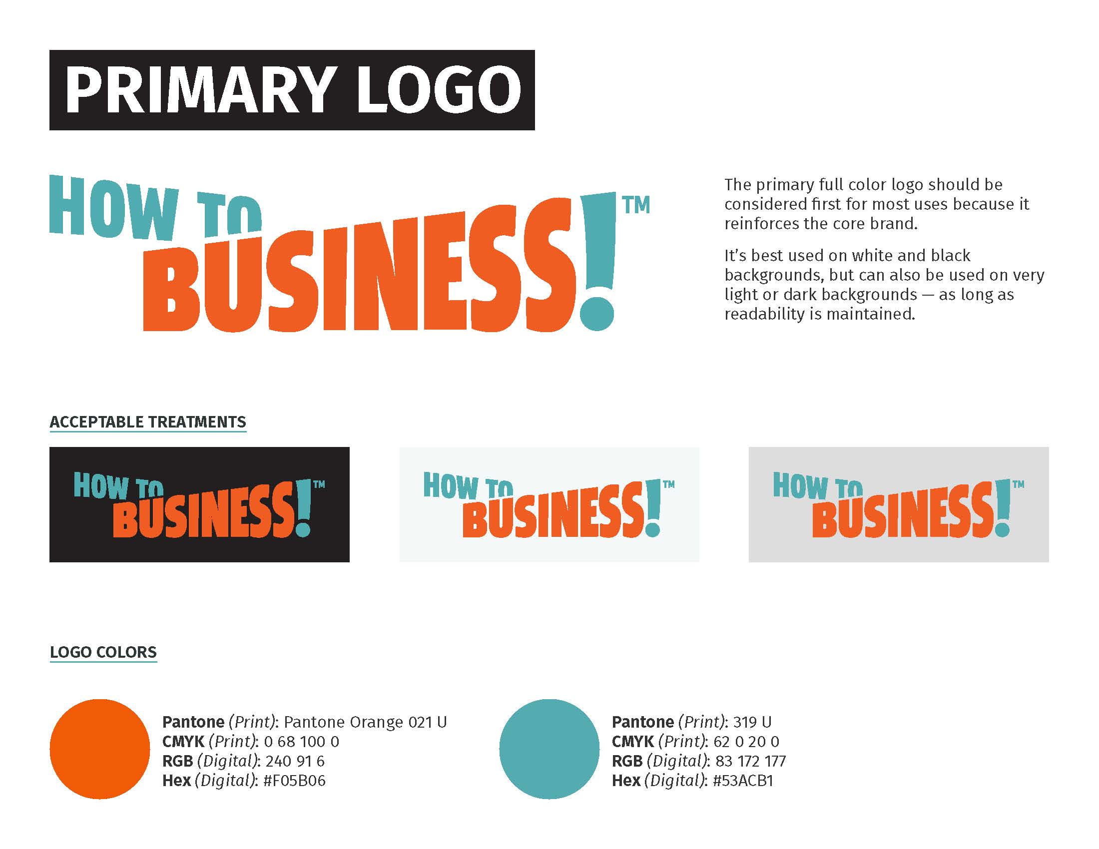
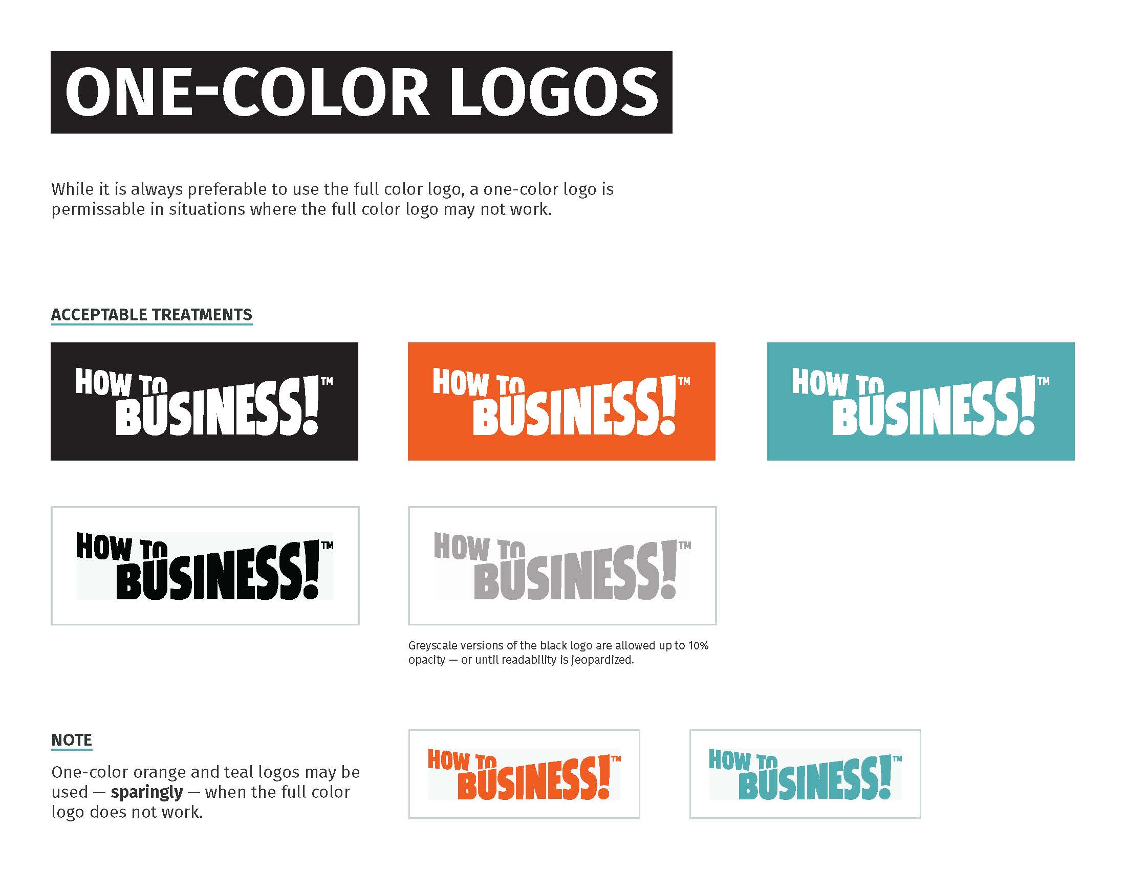
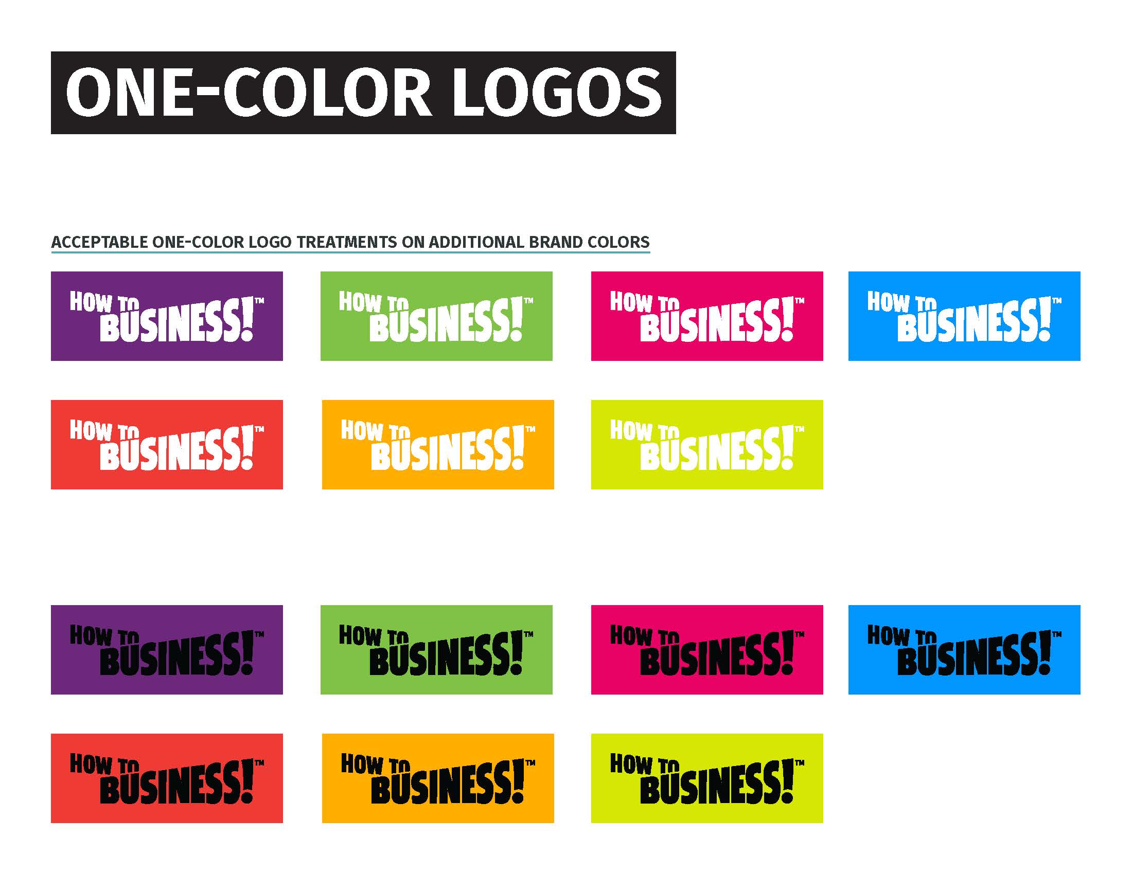
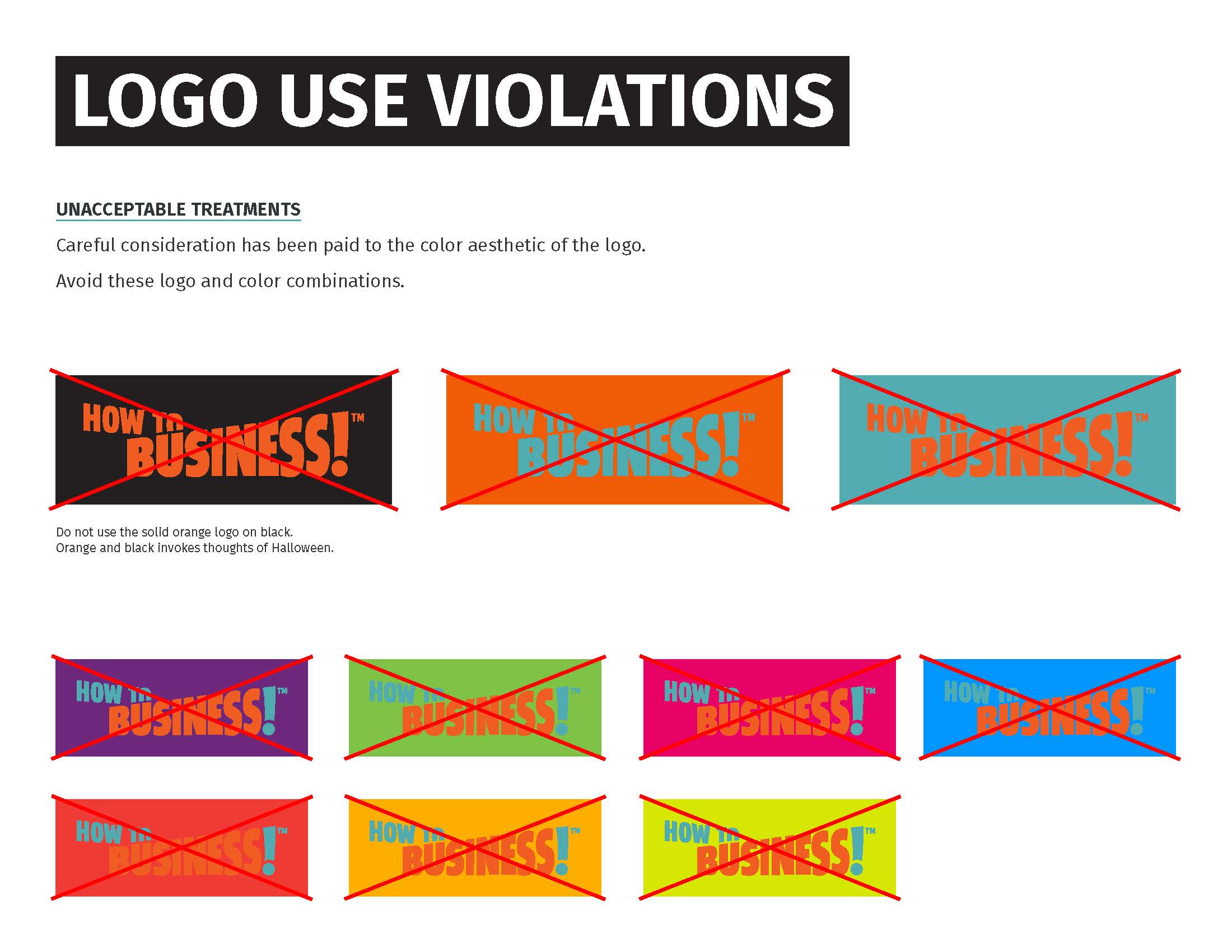
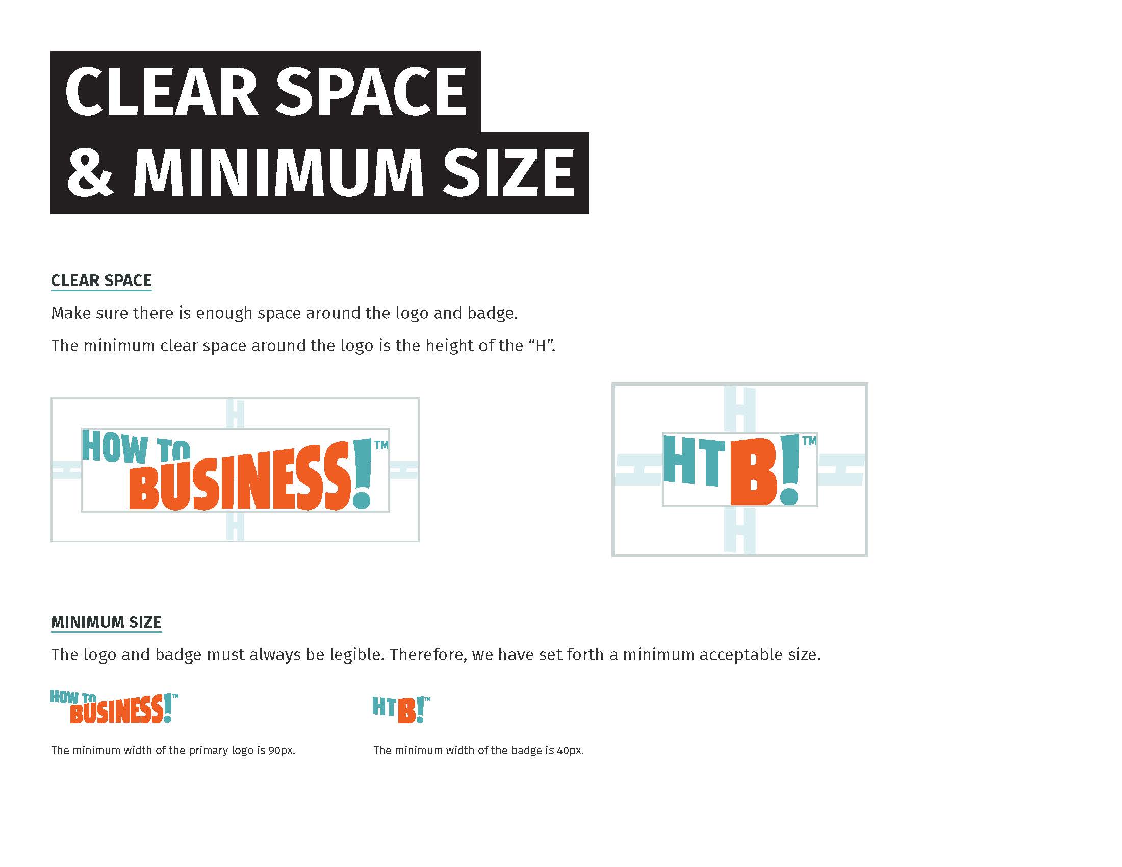
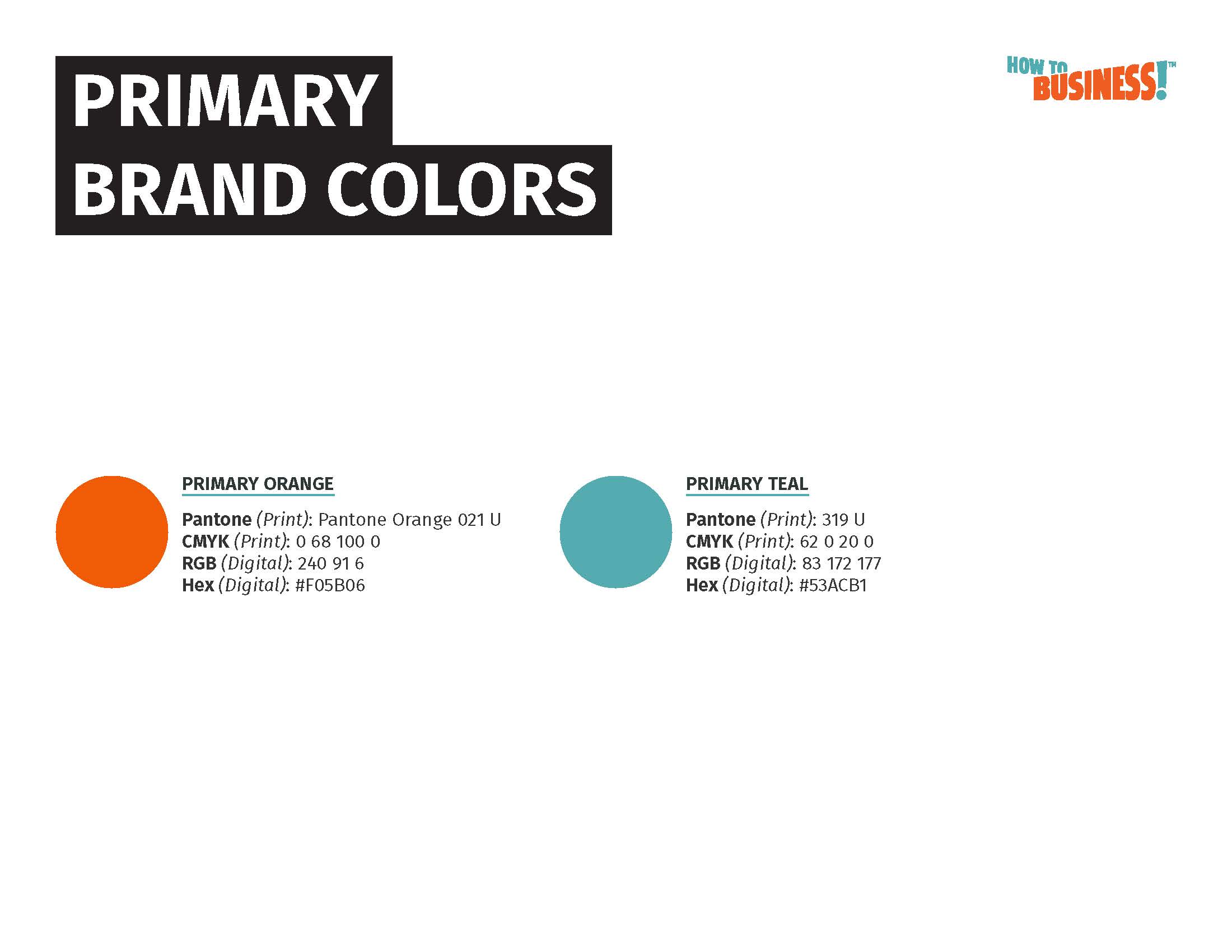
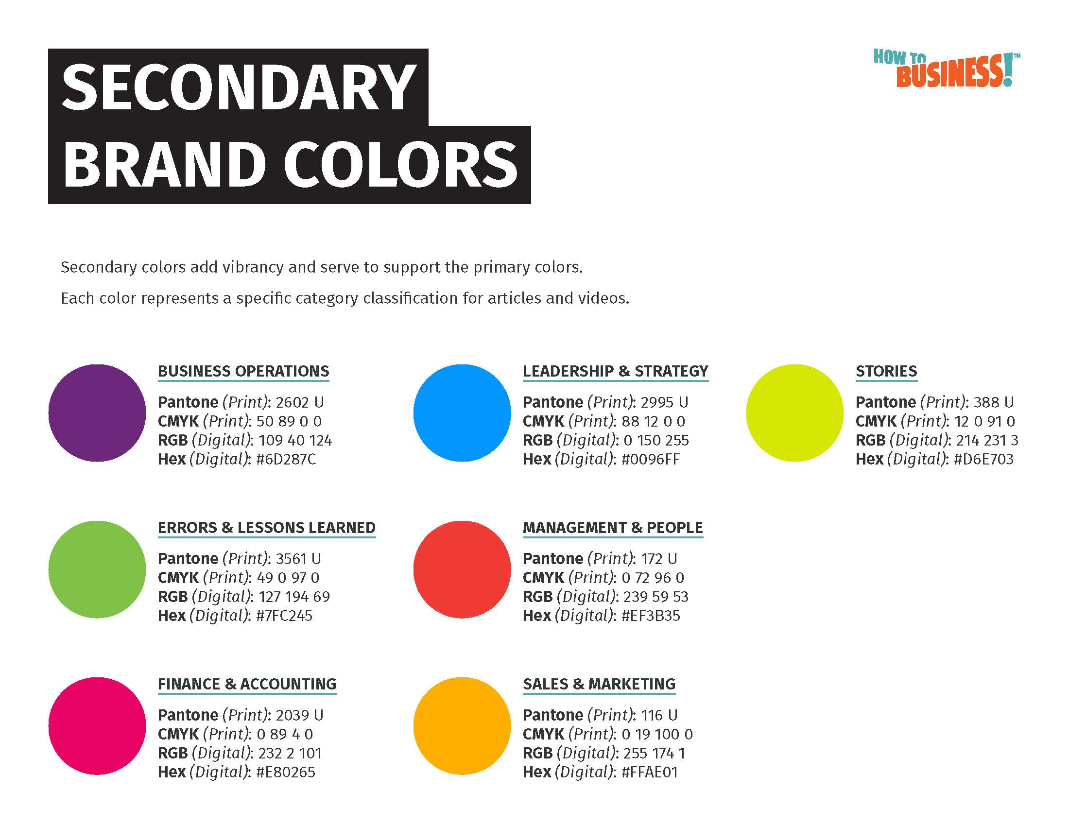
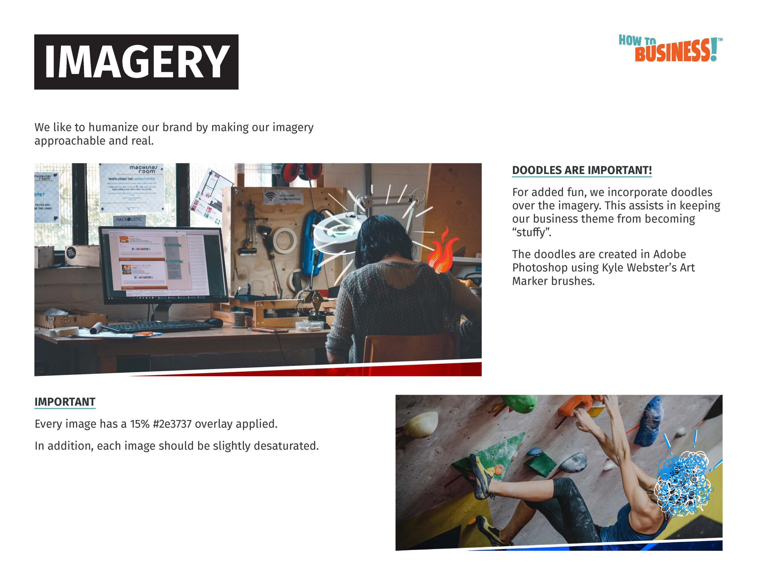
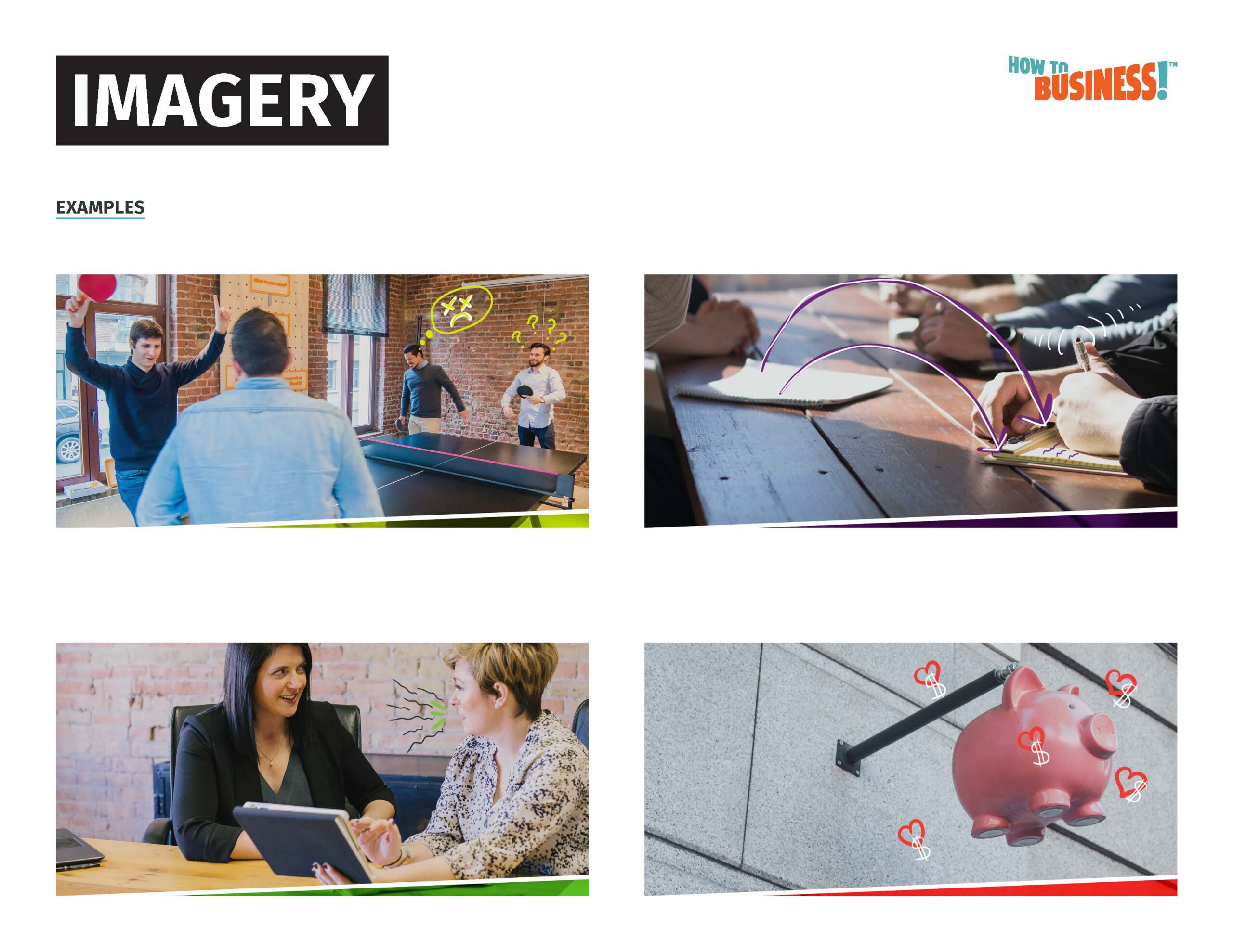
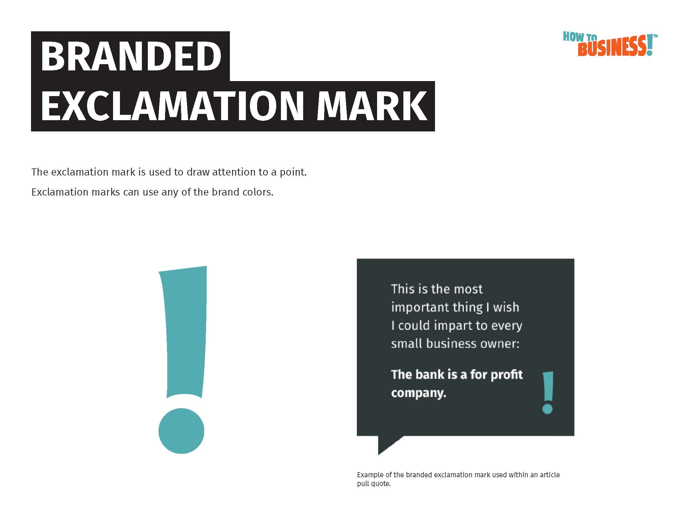
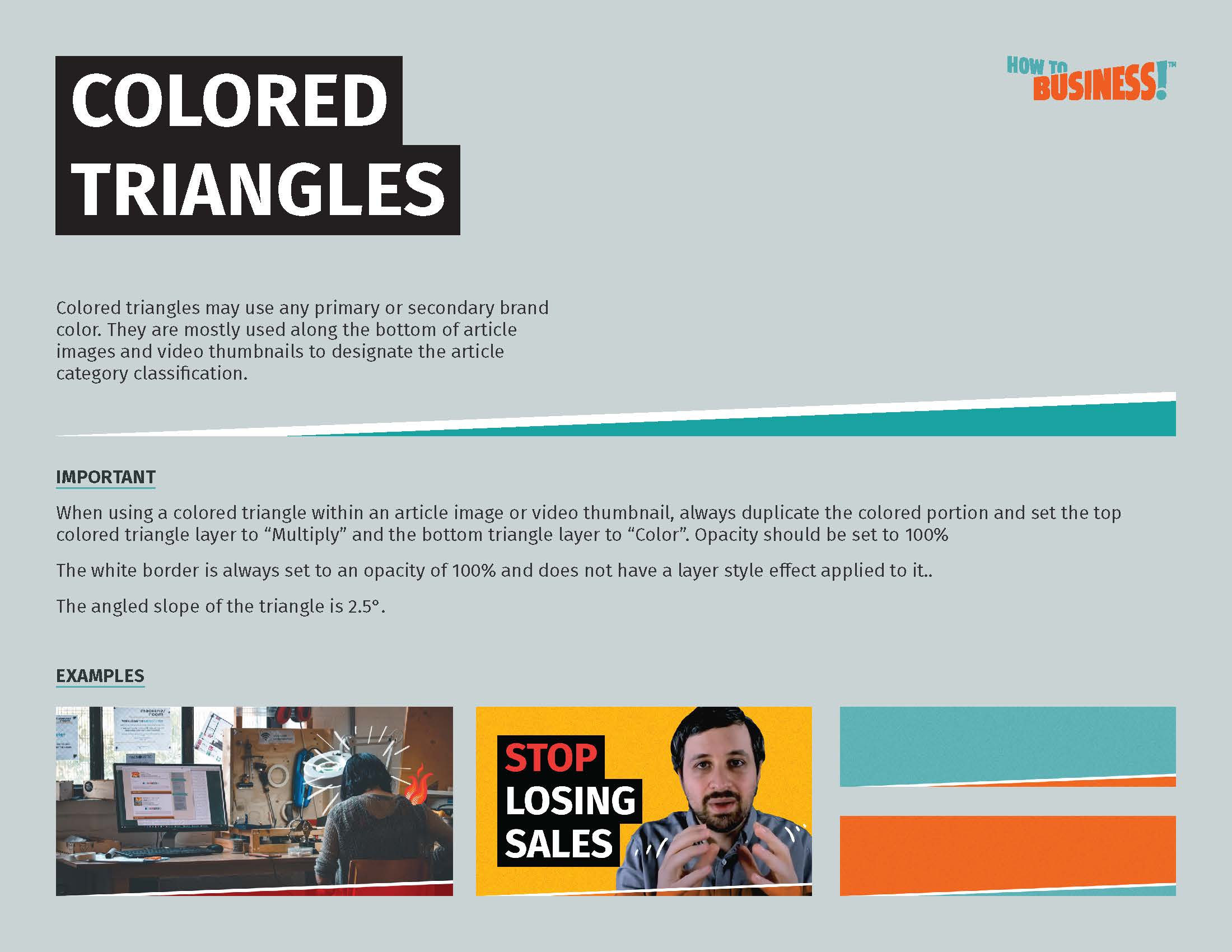
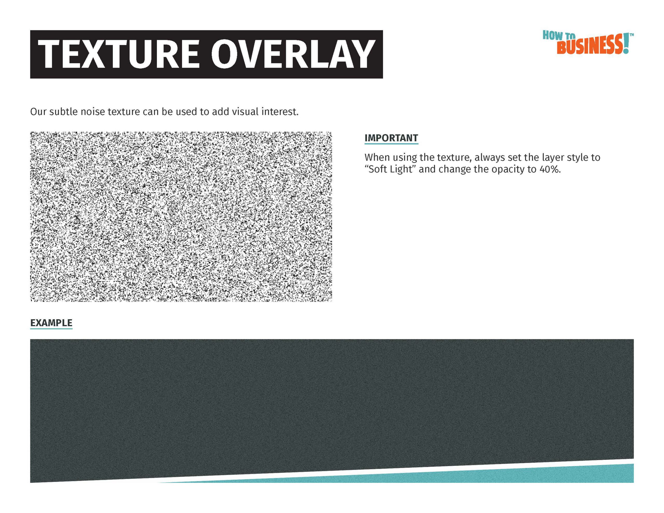
I developed the visual identity for How To Business, a B2B educational resource designed to make business information feel useful, approachable, and anything but stuffy. I designed the logo and identity, built the brand guidelines, developed the imagery treatment, and created the illustrated elements used throughout the brand.

IT ASSURANCE
Brand Identity · Logo Design · Style Guide · Illustration · Photography Treatment
Project Overview
My ROLE
Brand Designer
Industry
Technology & Cybersecurity
Challenge
Humanize a technical IT consulting brand without sacrificing credibility.
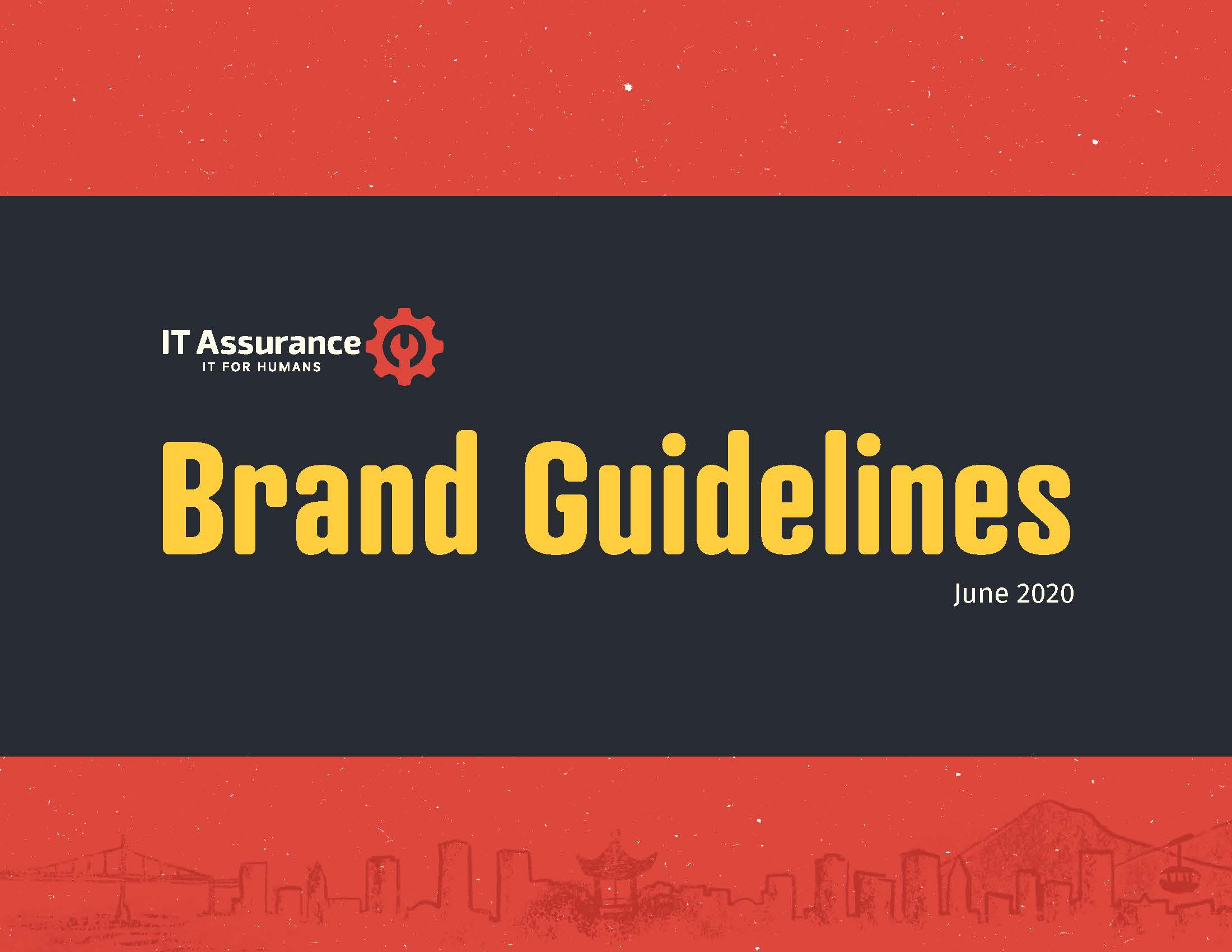
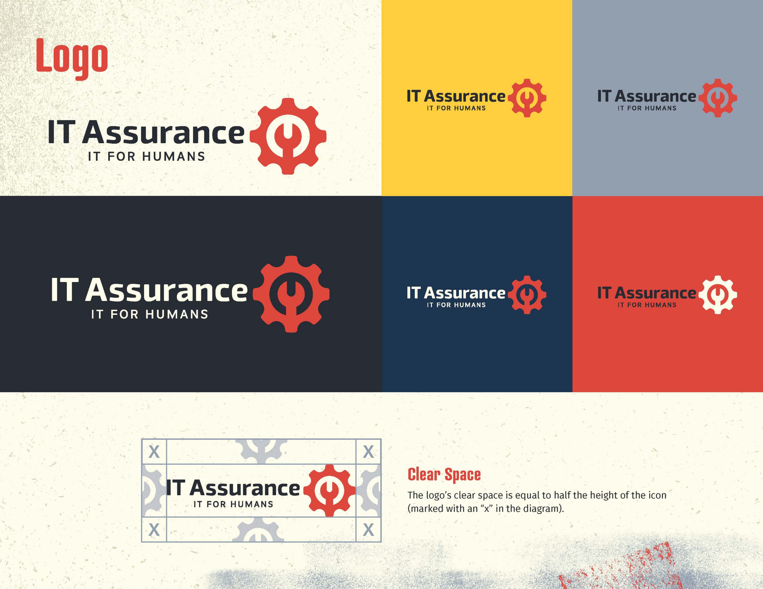
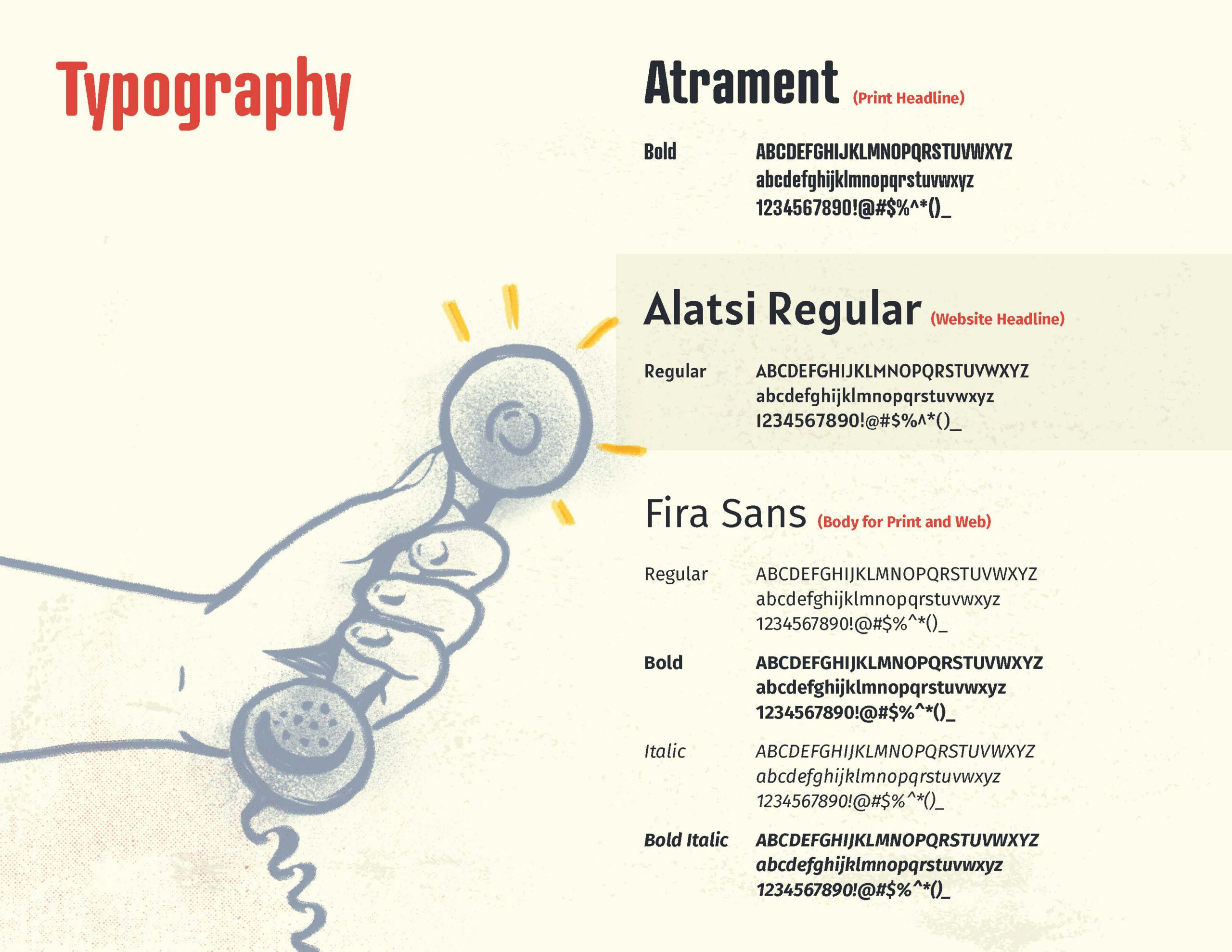
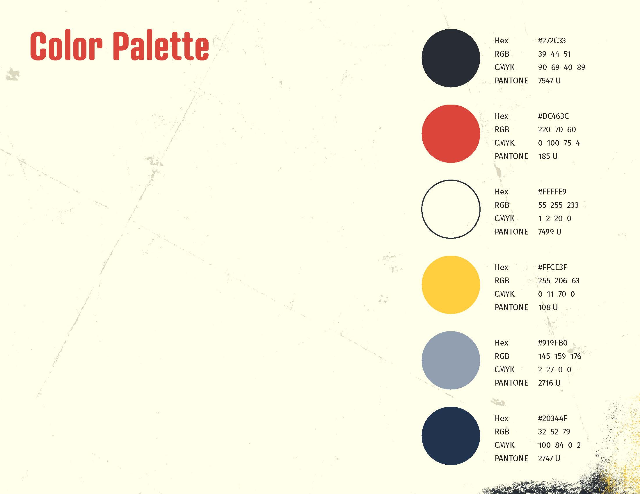
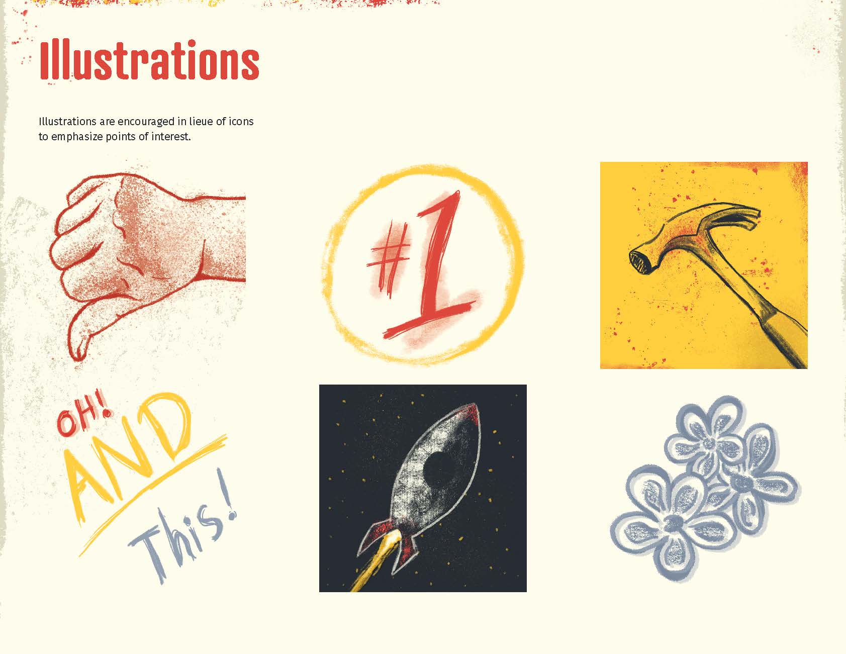
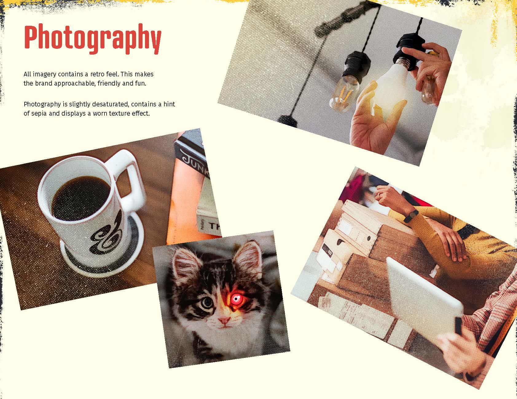
IT Assurance needed an identity that could make technology feel more human and approachable without losing credibility. I designed the logo and visual identity, developed the style guide, established the typography and color system, created the illustration style, and defined a distinctive retro-inspired treatment for photography.
Building the Forged Flare® BRAND
Building Forged Flare® has given me the opportunity to design across nearly every customer and business touchpoint — from packaging and printed inserts to media materials, digital publications, and instructional content.
MEDIA & PRESS KIT
Publication Design · Brand Storytelling · Art Direction
Project Overview
My ROLE
Founder & Creative Director
Industry
E-Commerce, Consumer Products
Challenge
Position a small handmade business as an established, professional brand while overcoming the “hobbyist” perception often associated with the handmade market.
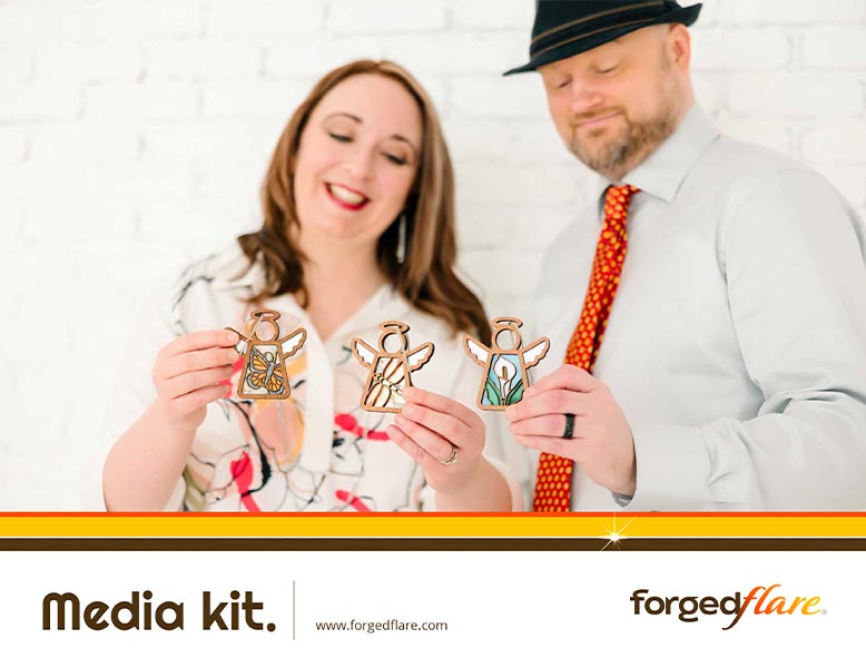
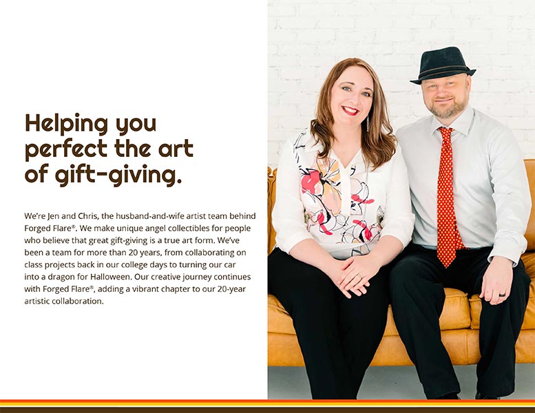
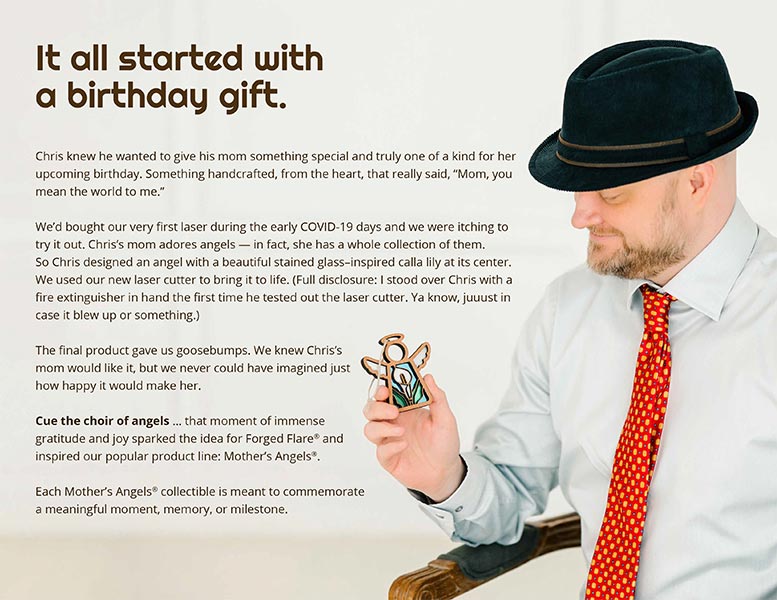
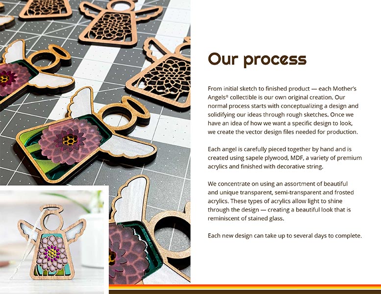
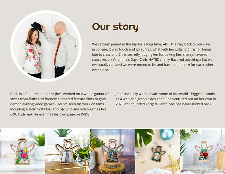
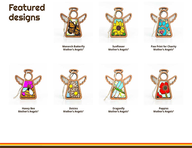
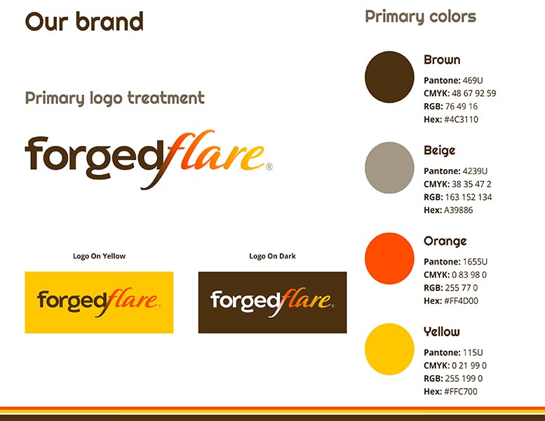
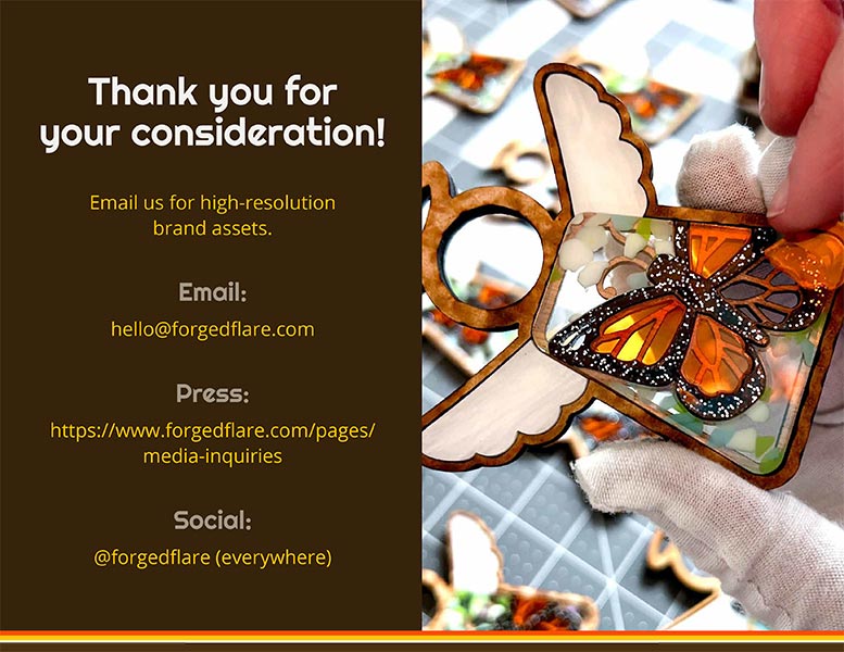
A multi-page media and press kit designed to present Forged Flare® as a polished, established consumer brand. I brought together our story, creative process, product photography, press information, and brand standards into a cohesive resource for media, editors, and potential partners.
DIGITAL INSTRUCTION GUIDES
Information Design · Technical Illustration · Visual Communication · Customer Experience
Project Overview
My ROLE
Creative Director & Designer
Industry
Digital Products, Maker Market
Challenge
Make detailed laser-cut assembly processes easy to understand for customers with widely varying levels of technical and crafting experience.
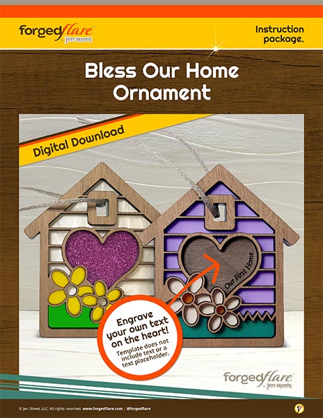
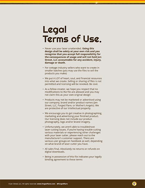
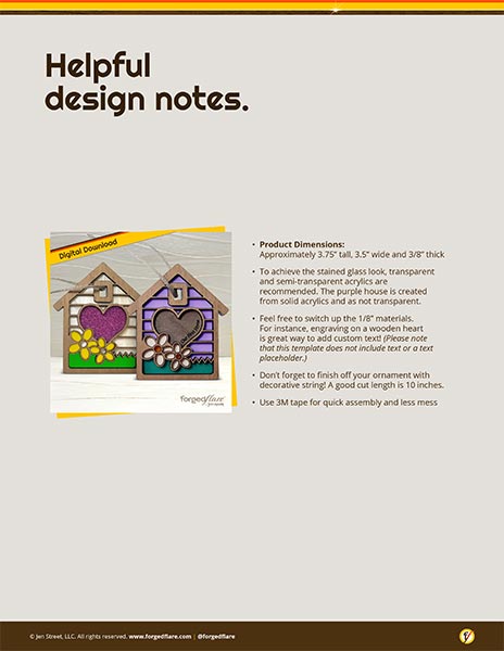
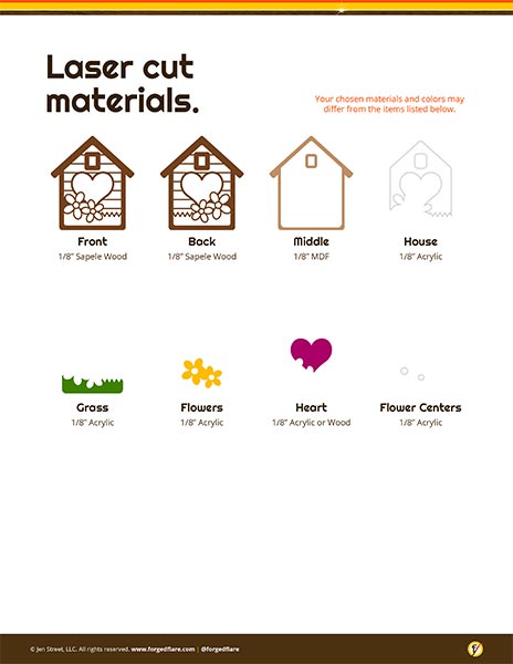
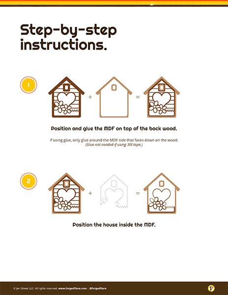
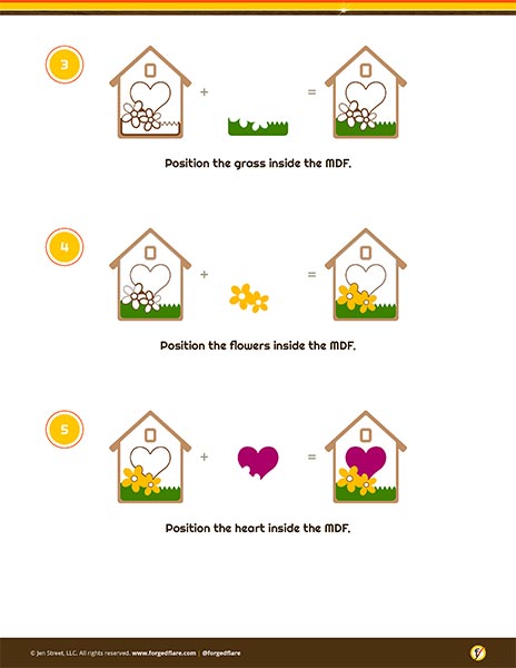
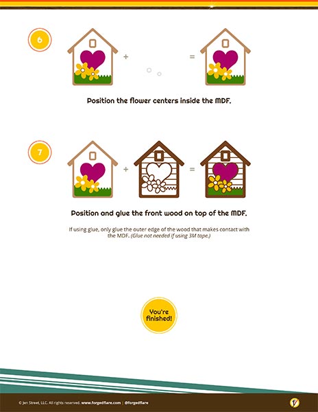
For several years, Forged Flare® sold digital laser-cut design files to other makers and laser artists. Because customers ranged from experienced professionals to first-time hobbyists, the accompanying instructions needed to make assembly as intuitive and foolproof as possible. I created step-by-step guides using clear information hierarchy, custom illustrations, diagrams, and visual cues to break complicated builds into manageable steps. The guides consistently received positive customer feedback for being clear and easy to follow.
CUSTOMER EXPERIENCE MATERIALS
Customer Experience · Print Design · Marketplace Strategy · Brand Communication
Project Overview
My ROLE
Founder & Creative Director
Industry
E-Commerce, Handmade Retail
Challenge
Create a consistent branded experience across multiple marketplaces while building a direct relationship with customers beyond the platform where they purchased.
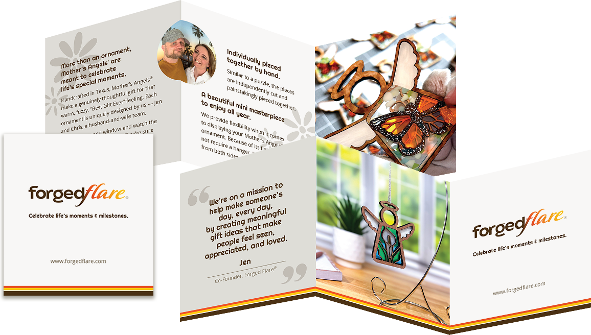
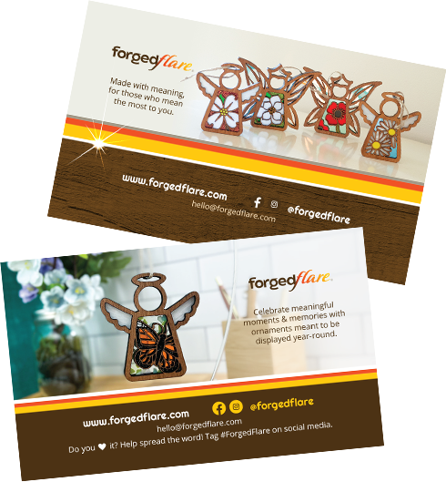
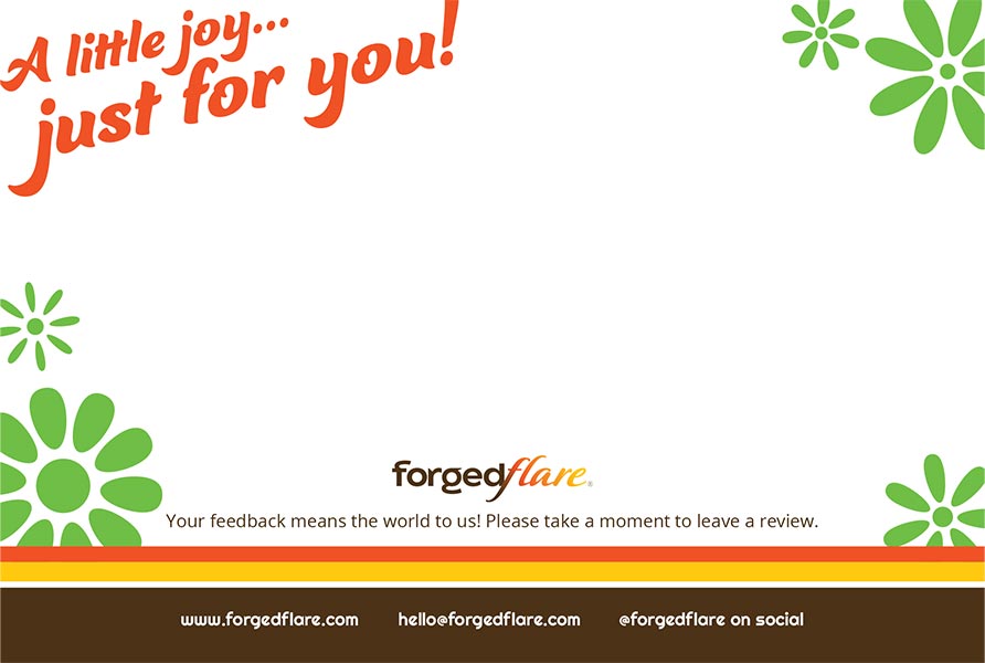
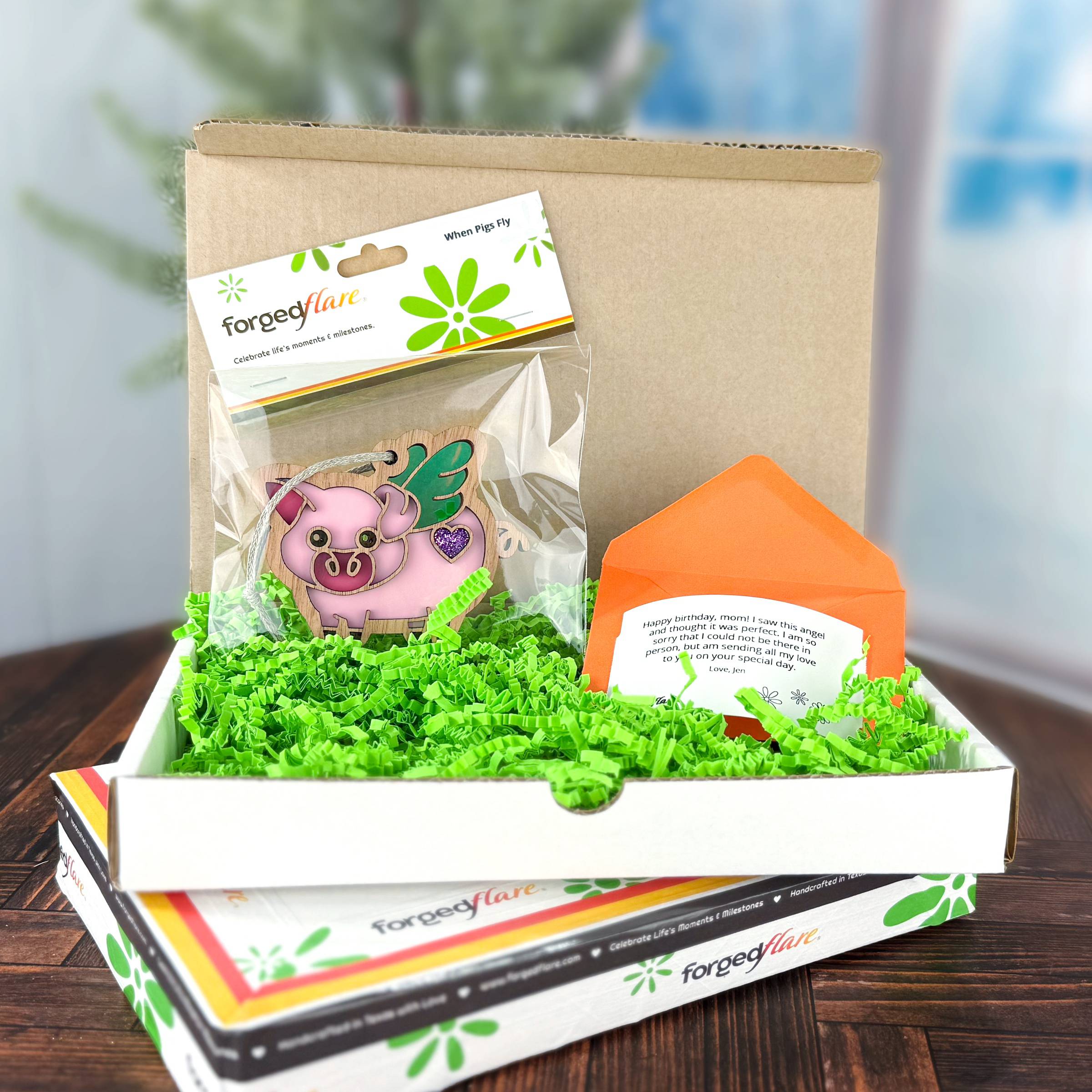
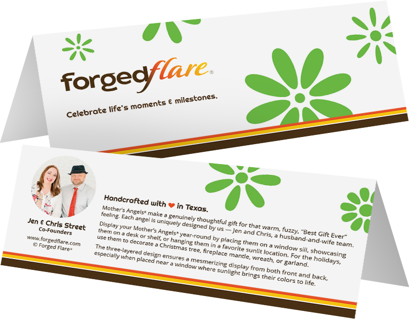
Forged Flare® products were sold across our own website and third-party marketplaces, each with different limitations on how we could communicate our brand. I designed printed materials that traveled with every order, introducing customers to who we are, reinforcing the handmade nature of our products, and giving them a way to discover Forged Flare® beyond the marketplace where they found us. Handwritten notes added another personal touch to every shipment.
DESIGNING FOR THE WAIT
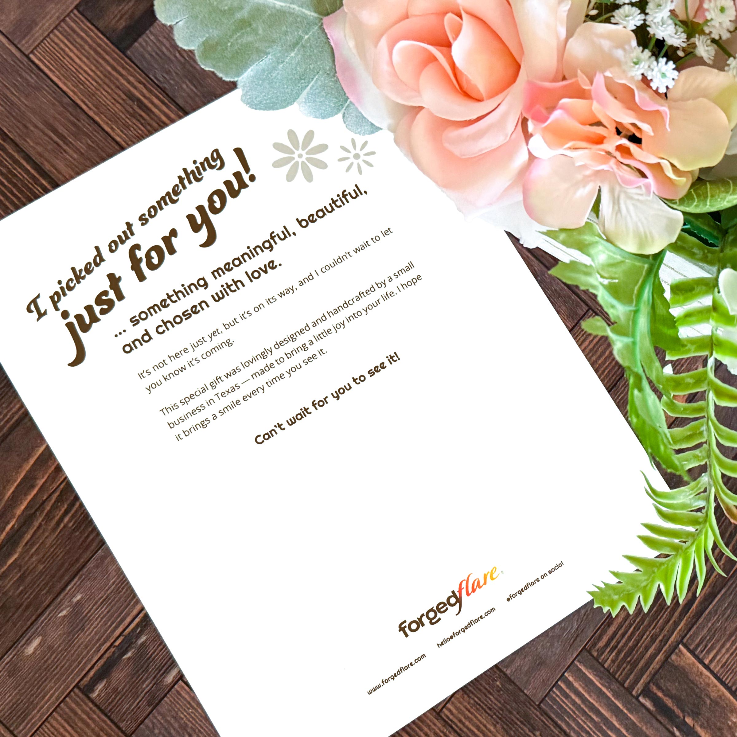
Because handcrafted products take time to make and ship, customers ordering close to a birthday or holiday sometimes needed something they could give before the actual gift arrived. I created a printable gift announcement they could download at home, wrap, and give in its place — turning a potentially disappointing wait into a more thoughtful gifting experience.
PACKAGING DESIGN
Packaging Design · Production Design · Vendor Management · Print Production · Customer Experience · Brand Communication
Project Overview
My ROLE
Founder & Creative Director
Industry
E-Commerce, Consumer Products
Challenge
Develop professional, scalable packaging that could evolve with the business while balancing cost, product protection, marketplace requirements, and brand experience.
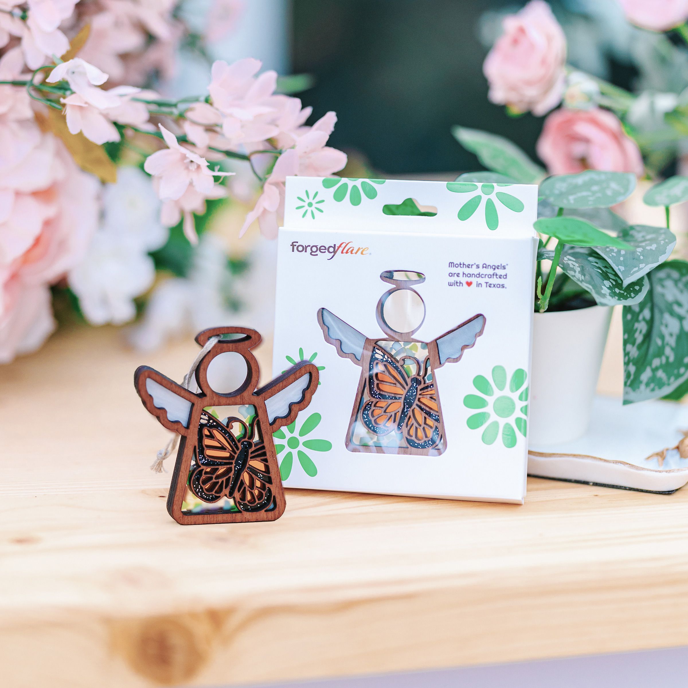
Packaging evolved alongside Forged Flare® as the business grew, but one requirement remained consistent: the packaging needed to let the product shine. Our ornaments are suncatchers, and their transparent colors come alive when light passes through them. Enclosing them in opaque packaging would hide one of the most important qualities of the product, especially in a retail environment where customers needed to immediately see their beauty.
Early on, I developed an affordable bag-and-topper system that kept the ornament visible while still creating a professional presentation that was quick and economical to assemble.
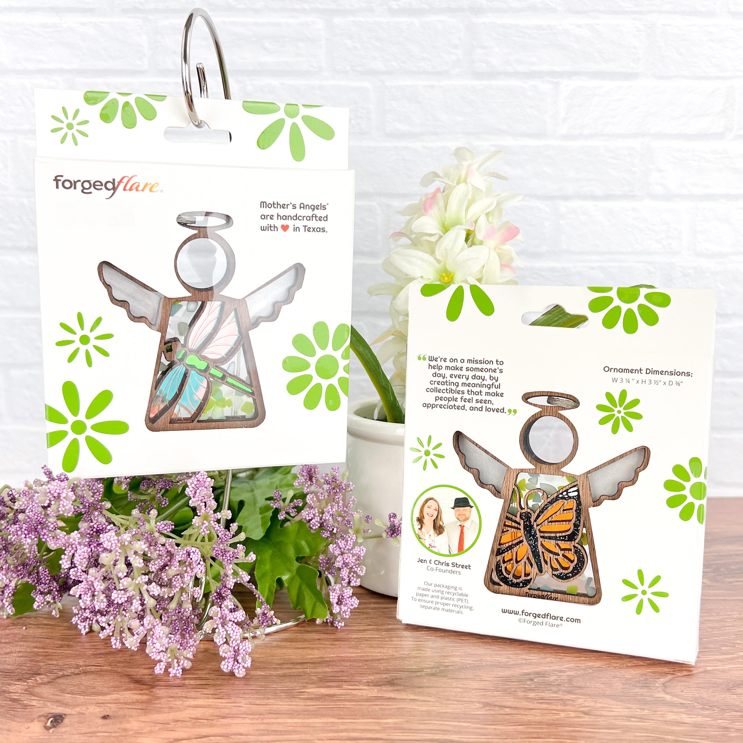
As we expanded into retail and Amazon, the packaging needed to feel more elevated while preserving that visibility. I designed a completely custom presentation box for Mother’s Angels® ornaments and worked directly with an overseas packaging manufacturer to take the concept through production.
Starting Smart
Cost-Conscious Packaging · Brand Design · Production Efficiency
Our original packaging needed to balance presentation with the realities of a growing small business. I developed a branded bag-and-topper system that was affordable, quick to assemble, and professional enough to create a consistent customer experience from the start.
The system remains in use today for Forged Flare® ornaments outside the Mother’s Angels® collection.
Elevating the Product
Structural Packaging · Print Production · Vendor Collaboration
As Mother’s Angels® expanded into retail and Amazon, I wanted the packaging to better reflect the quality and value of the product inside. I developed the concept and visual direction for a completely custom presentation box, including the structure, opening experience, graphics, finishes, and interior presentation.
I partnered directly with a packaging manufacturer in Pakistan to bring the concept into production. Physical products were shipped overseas for testing and fit, and I supplied the artwork and design direction while collaborating with the manufacturer as they engineered the final dieline and production specifications.
The finished package combines CMYK and PMS printing with spot gloss details and a custom die-cut foam insert designed specifically around the ornament.
Turning the Shipping Box Into Media
Shipping Experience · Brand Visibility · Cost Optimization
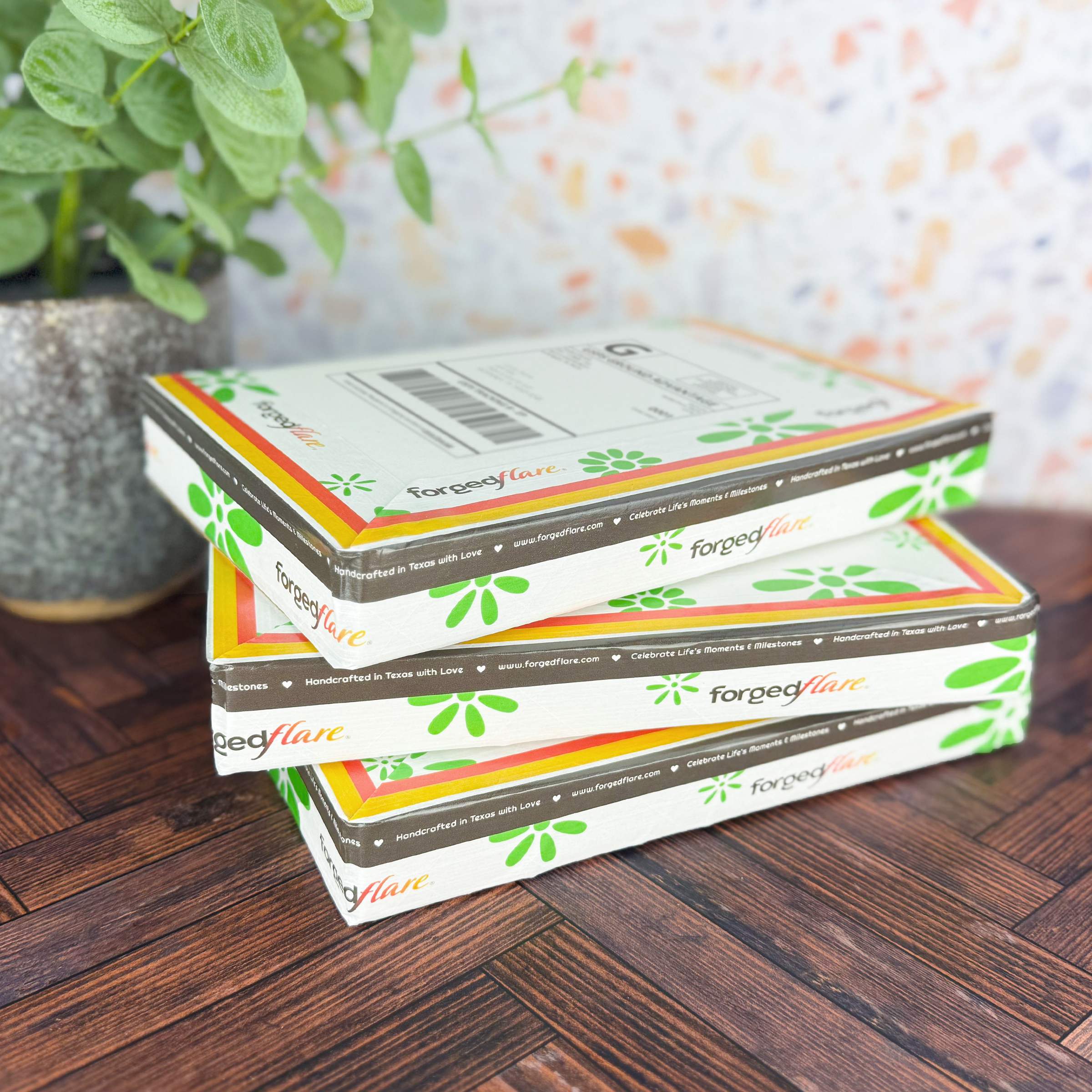
Custom-printed shipping boxes would have significantly increased packaging costs, so I looked for another way to create a branded delivery experience. The solution was custom-printed packing tape: highly visible, distinctly Forged Flare®, and flexible enough to use across standard shipping box sizes.
The tape identifies the brand, promotes our website, and transforms an ordinary shipping carton into another customer touchpoint. It also creates brand visibility throughout the delivery journey — before the customer ever opens the box.
The shipping box became part of the marketing.
Additional Brand & Print Projects
More projects from across my design career.
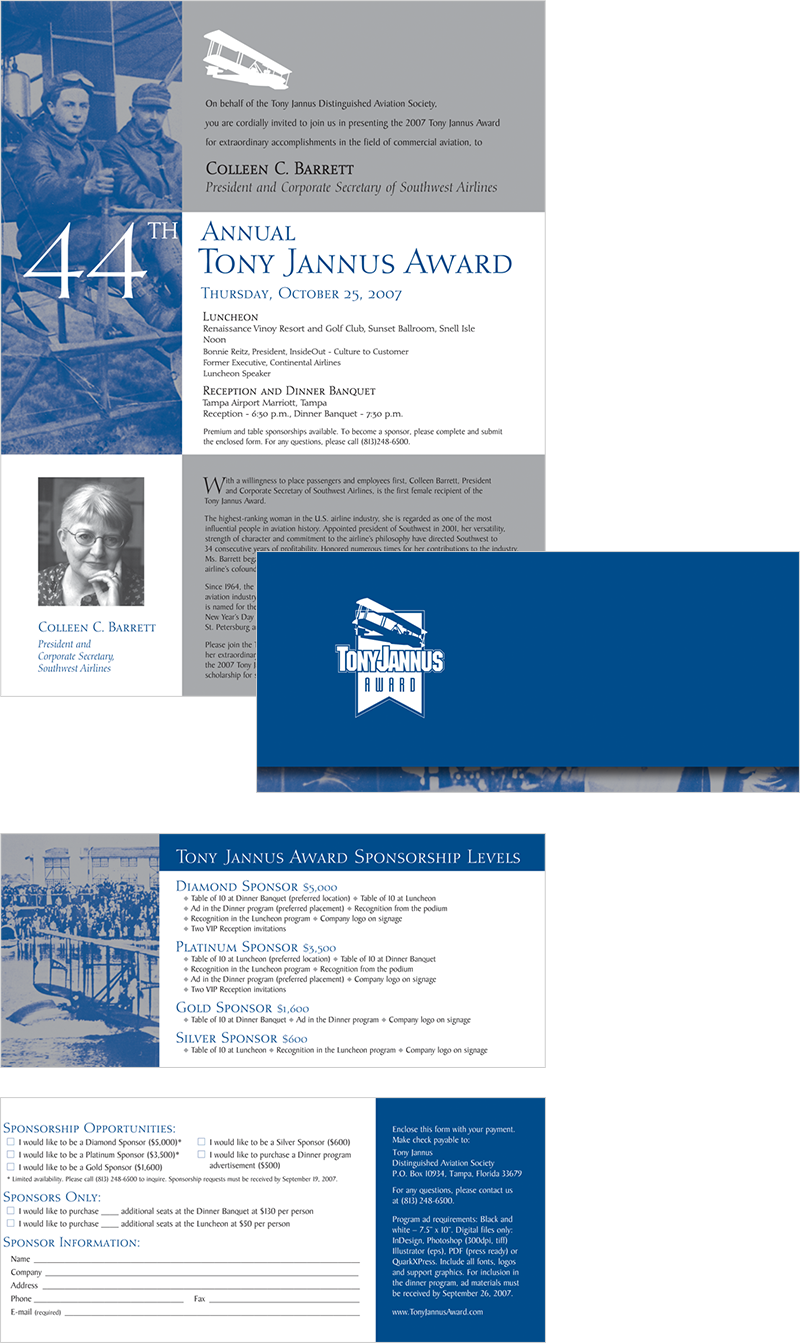
Sponshorship Package
Print Design · Tony Jannus Distinguished Aviation Society
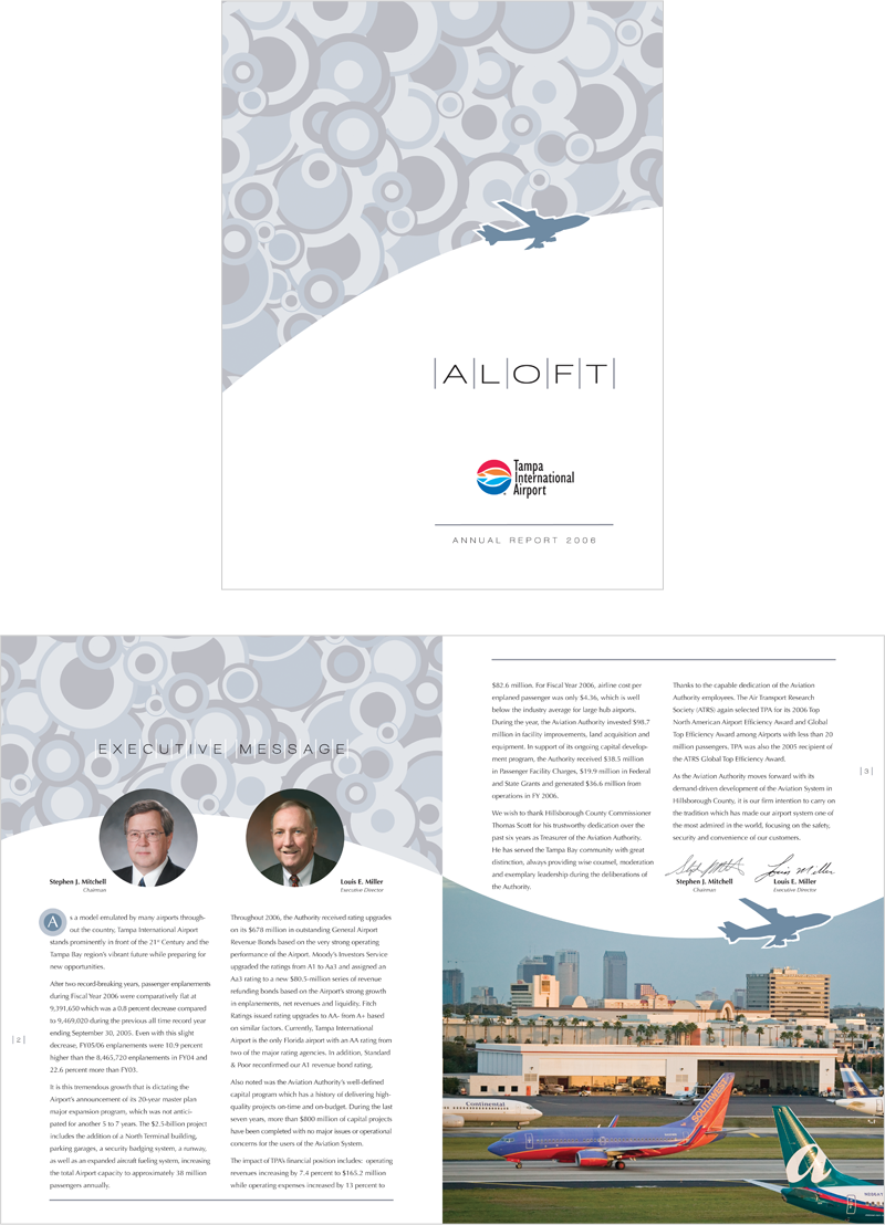
Annual Report
Print Design · Tampa International Airport
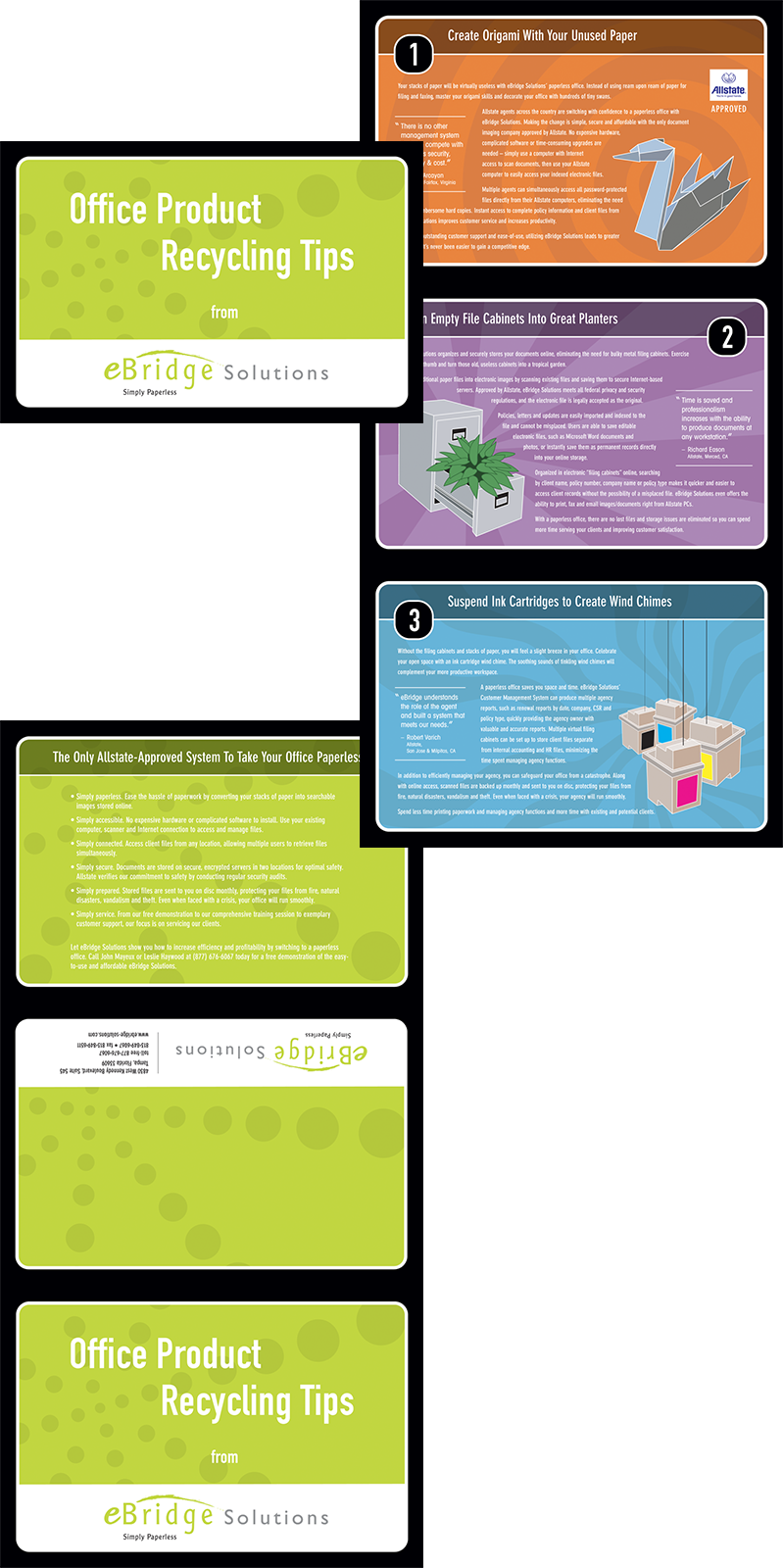
Allstate Insurance Sales Piece
Print Design · eBridge Solutions